


Matte vs. glossy prints: how to choose the right finish
TL;DR:
- Matte prints scatter light with a textured surface, making them ideal for glare-free, natural-toned art displays.
- Glossy prints feature a smooth, highly reflective coating that enhances vibrancy but can produce distracting glare in variable lighting environments.
Choosing between matte and glossy prints sounds simple until you hang a glossy piece across from a window and spend the next hour repositioning it to avoid the glare. The finish you select affects how color reads, how light behaves on the surface, how long the artwork lasts, and whether guests actually see the image or just their own reflection. For collectors investing in fine art prints, this decision carries real weight. This guide breaks down the material differences, visual performance, archival durability, and the specific display scenarios where each finish wins or fails.
Table of Contents
- What are matte and glossy prints?
- Visual performance: Light, color, and viewing experience
- Durability, maintenance, and archival quality
- How to choose: Use cases, style, and collector priorities
- A collector’s perspective: Why real-world context trumps theory
- Find your perfect art finish with Eman’s Gallery
- Frequently asked questions
Key Takeaways
| Point | Details |
|---|---|
| Matte reduces glare | Matte prints are ideal for bright, variable lighting and large displays because they prevent distracting reflections. |
| Glossy boosts color | Glossy prints offer more vivid colors and sharper details but can suffer from glare in well-lit rooms. |
| Matte lasts longer | Matte finishes with pigment inks on fine art paper provide exceptional archival quality and longevity. |
| Choose finish for context | Select your print finish based on room lighting, art size, and how you plan to display or rotate your art. |
What are matte and glossy prints?
The fundamental difference between matte and glossy prints comes down to surface structure and how each interacts with light.
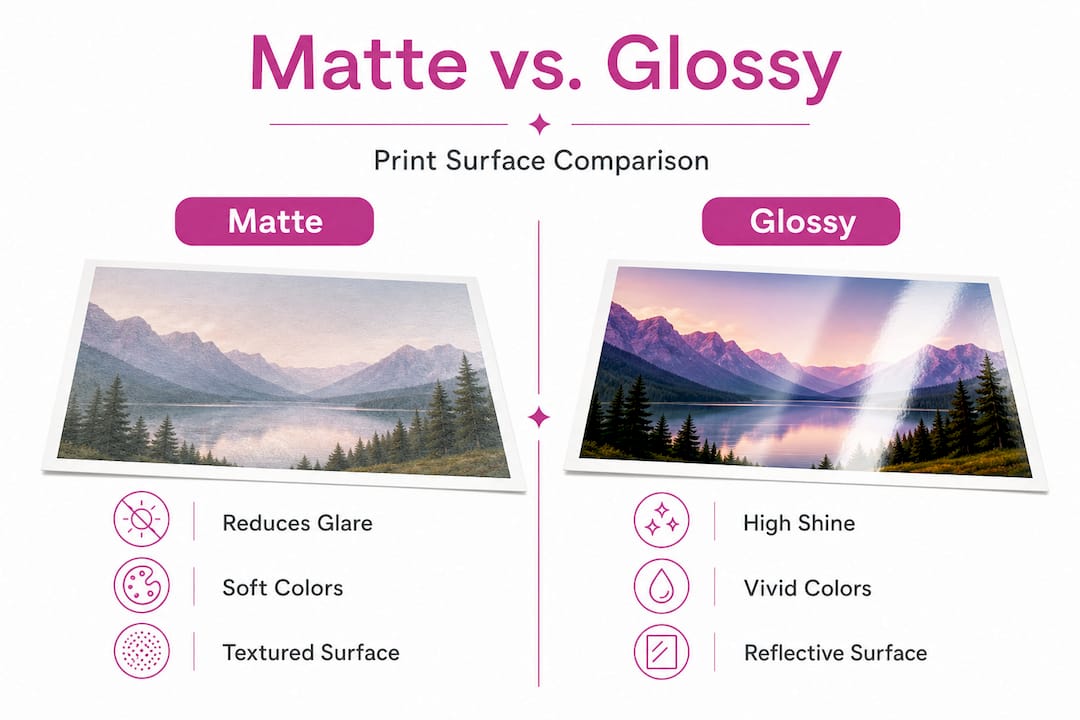
Matte prints feature a textured or micro-textured coating that scatters incoming light in multiple directions rather than reflecting it back at the viewer. Matte prints have a non-reflective surface with typically under 10% reflectivity, producing a softer, more subdued appearance with natural tones. The result is a finish that feels closer to fine art paper, with a tactile quality that many collectors associate with traditional printmaking. Colors appear accurate and faithful to the original, even if they don’t carry the same visual punch as gloss.
Glossy prints are coated with a smooth, highly polished layer that reflects light directly back toward the viewer. This creates the signature mirror-like quality that makes colors appear saturated and contrast appear sharp. Glossy surfaces are common in commercial photography printing, magazine reproductions, and promotional display contexts where immediate visual impact is the priority.
Here is a quick summary of the defining characteristics:
- Matte: Non-reflective, textured surface, under 10% reflectivity, soft color rendering, natural tonal range, minimal glare
- Glossy: Smooth, reflective surface, high reflectivity, vivid color reproduction, sharp contrast, prone to glare and fingerprints
“Matte prints diffuse or absorb light rather than reflecting it, making them the preferred choice for fine art applications where accuracy of color and distraction-free viewing are priorities.” This is especially relevant when fine art printing basics intersect with display planning in collector-grade contexts.
In practice, matte is the dominant choice for framed fine art, gallery installations, and archival collections. Glossy tends to appear in photographic portraiture, product prints, and commercial contexts where gloss amplifies visual appeal.
Visual performance: Light, color, and viewing experience
Understanding what each finish looks like on the wall is where theory meets reality.

Matte in variable or bright lighting: Matte surfaces diffuse incoming light evenly across the print surface, which means there are no bright spots, no mirror reflections, and no angle-dependent glare. This makes matte the reliable choice for rooms with multiple windows, overhead track lighting, or changing natural light throughout the day. Viewers can stand at different angles and still read the full image clearly.
Glossy in bright or variable lighting: The reflective coating that makes glossy prints look vivid in a controlled studio setting becomes a liability in real home environments. In bright or variable lighting, glossy creates distracting reflections and glare, especially for large prints or gallery displays, while matte ensures visibility from multiple angles without interference. A 24x36 inch glossy print hung near a window can become nearly unreadable at certain times of day.
| Feature | Matte finish | Glossy finish |
|---|---|---|
| Glare resistance | High | Low |
| Color vibrancy | Natural, accurate | Boosted, saturated |
| Contrast appearance | Subtle | Sharp |
| Viewing angle flexibility | Wide | Narrow |
| Fingerprint visibility | Low | High |
| Best lighting environment | Bright, variable | Dim, controlled |
| Recommended for large prints | Yes | With anti-reflective glass only |
For collectors displaying art prints in home environments, the living room lighting situation is the single most important variable. A print that looks extraordinary in a gallery showroom with carefully controlled spotlighting can look completely different at home under ceiling fixtures and natural daylight.
Pro Tip: Before ordering any large-format print, photograph your intended wall at three different times of day: morning, midday, and evening. If you see strong reflections or hot spots on existing frames or surfaces in that location, matte is almost certainly the right finish.
One edge case worth noting is the combination of glossy prints with museum-quality anti-reflective glass. In low-light galleries or dedicated art rooms with controlled lighting, glossy behind anti-reflective glazing can deliver exceptional color depth while managing reflections. For most residential spaces, though, this setup is expensive and impractical.
Durability, maintenance, and archival quality
Performance is only part of the story. Long-term preservation matters just as much for collectors investing in fine art.
Archival longevity: Matte prints are often superior for archival quality, with pigment inks on fine art papers lasting up to 100 to 200 years per Wilhelm Imaging Research data. This is because the ink sits within or below the surface coating rather than on top, offering physical protection against environmental degradation. Glossy coatings, by contrast, place the ink layer closer to the surface, where UV exposure and humidity can cause fading or cracking more readily over time.
UV fading and light exposure: Glossy prints resist surface scratches better in the short term due to their hard coating, but they are more susceptible to fading when placed in sunlit rooms without UV-filtering glass. The smooth surface also tends to show color shifts more visibly when degradation begins. Matte prints, even when they do show age, tend to do so more gradually and evenly.
Surface treatment in print durability plays a significant role in how both finishes hold up over time. Protective laminates, UV-resistant coatings, and archival-quality paper stocks all extend lifespan for both finish types. However, the baseline advantage still sits with matte for long-term preservation.
The following data summarizes how finish type affects durability across key variables:
| Variable | Matte | Glossy |
|---|---|---|
| Archival lifespan (pigment inks) | 100 to 200 years | Shorter without UV protection |
| UV fade resistance | Good | Moderate |
| Surface scratch resistance | Moderate | Better short-term |
| Humidity sensitivity | Lower | Higher |
| Fingerprint retention | Minimal | Significant |
Maintenance checklist for each finish:
-
Matte prints: Dust with a dry microfiber cloth using light, circular motions. Avoid liquids. Frame with UV-filtering glass to extend lifespan. Store flat or rolled in acid-free materials if unframed. Review art print care guidelines for specific handling procedures.
-
Glossy prints: Clean fingerprints with a lightly dampened microfiber cloth. Never use paper towels or abrasive materials. Frame with anti-reflective glass to manage glare and protect the surface. Use a print maintenance workflow to schedule regular inspections for color shifts or surface damage.
-
Storage for both: Keep prints away from direct sunlight, basements, and areas with fluctuating humidity. Acid-free sleeves and flat storage boxes are ideal. For detailed guidance on long-term preservation, the storing art prints resource covers both finish types with specific material recommendations.
When you factor in the full cost of a quality fine art print, including production, framing, and installation, paying attention to archival specifications at the point of purchase makes financial and aesthetic sense.
Pro Tip: Always ask for the paper specification and ink type before ordering any fine art print. Pigment-based inks on cotton rag or alpha-cellulose papers deliver the longest lifespan for matte prints. Dye-based inks on glossy stock may look vivid initially but fade significantly faster.
How to choose: Use cases, style, and collector priorities
With a clear picture of materials, visual behavior, and durability, it is straightforward to match your situation to the right finish.
The decision process:
-
Assess your room lighting. If the print will hang in a room with natural light from windows, skylights, or strong overhead fixtures, matte eliminates glare problems before they start.
-
Measure the intended print size. Large-scale fine art prints above 24 inches almost always perform better in matte to avoid glare dominance. Glossy is only practical at large scale behind anti-reflective glass in controlled, low-light galleries.
-
Identify your priority. If color vibrancy and immediate visual impact are the main goals and lighting is dim and controlled, glossy delivers. If texture, accuracy, and low maintenance are priorities, matte is the clear choice.
-
Consider the artwork style. Abstract pieces with flat color fields and geometric compositions often read beautifully in matte. Photographic or highly detailed figurative works may benefit from the added contrast of glossy in the right environment. When selecting art prints, it helps to view the original digital file alongside physical samples of both finishes before committing.
-
Factor in your display habits. Collectors who rotate art frequently or plan to store prints for periods of time benefit from matte’s lower maintenance and superior archival properties.
-
Review the framing plan. If you are not planning to frame, matte is significantly more practical. An unframed glossy print collects fingerprints, shows surface defects easily, and does not handle handling well over time.
Scenario-based guidance:
- Living room with large windows and natural light: Matte, always.
- Dedicated art room or home cinema with lighting control: Glossy behind anti-reflective glass is viable.
- Children’s rooms or high-traffic areas: Matte for lower maintenance.
- Gift for a collector with unknown display conditions: Matte as the safe, broadly compatible default.
- Commercial or hospitality display: Match to lighting plan, but matte is the standard professional choice.
The collecting art prints checklist is a useful reference for working through all these variables before a purchase. It covers room assessment, sizing, framing, and finish selection in a structured format suited to serious collectors.
Understanding finishes and use cases across different display and application types also provides broader context for how surface treatments affect visual outcomes beyond just art prints.
A collector’s perspective: Why real-world context trumps theory
There is a consistent pattern with collectors who are newer to acquiring fine art prints: they gravitate toward glossy finishes in showroom or online preview settings because glossy simply looks more dramatic at first glance. The colors appear to jump off the surface. The contrast feels striking. It photographs well for social media. This is understandable.
The problem appears three to six months after installation. The glossy print in the living room is only truly visible after dark, when ambient light no longer hits the surface at the wrong angle. During daylight hours, it competes with the reflection of the window, the ceiling light, or even the viewer’s own silhouette. The dramatic color punch that made the purchase feel exciting in the store becomes a daily frustration.
Experienced collectors almost uniformly default to matte for valued acquisitions. Not because matte is more visually exciting, but because matte is reliable across every lighting condition, every time of year, and every time of day. Art that you can actually see clearly every day is more valuable in practice than art that looks exceptional only under specific conditions.
The other factor is preservation. Collectors who build serious collections think in decades, not seasons. A matte print on pigment-based fine art paper is a fundamentally different investment than a glossy consumer-grade print. When pieces in a collection are intended to hold value and be passed on, archival quality outweighs showroom appeal. Thinking through how your chosen prints will elevate home spaces over the long term is part of the collector mindset that separates thoughtful acquisition from impulse buying.
The practical recommendation: unless you have a controlled lighting environment and plan to frame with anti-reflective glazing, buy matte for anything larger than 16x20 inches or anything you intend to keep for more than a few years.
Find your perfect art finish with Eman’s Gallery
Eman’s Gallery offers museum-quality canvas prints and wall art that reflect the considerations covered throughout this guide, with finish options suited to both collector-grade display and everyday living spaces.

Whether you are looking for a statement piece like the Private Eye canvas print or browsing the full wall art prints collection to find the right artwork for your space, each piece is produced to archival standards using materials selected for longevity and visual accuracy. Original handmade paintings by artist Eman Khalifa are available across abstract, geometric, floral, landscape, seascape, and still-life categories, with worldwide shipping from the UK, USA, Canada, Australia, Germany, France, Italy, Spain, Portugal, Greece, UAE, and the Netherlands.
Frequently asked questions
Which print finish is best for rooms with lots of windows or natural light?
Matte prints are the practical choice for bright or naturally lit rooms. Glossy creates distracting reflections and glare in variable lighting conditions, while matte maintains visibility from multiple angles without interference.
Do glossy prints always make colors appear more vibrant?
Glossy finishes boost perceived color intensity under controlled lighting, but glare and reflections can obscure detail and color accuracy. In bright environments, glossy creates significant reflections that effectively hide the image beneath.
How long do matte and glossy prints last with proper care?
Matte prints on fine art papers with pigment inks can last 100 to 200 years per Wilhelm Imaging Research standards. Glossy prints may fade faster, particularly when exposed to UV light without protective glazing.
Can I frame glossy prints without glass to reduce glare?
Framing glossy prints without glass leaves the surface exposed to dust, fingerprints, and physical damage. Large-scale glossy prints specifically require anti-reflective glass or acrylic to manage glare effectively, particularly in bright spaces.
Recommended
- Expert Guide to Framing Prints for Luxury Home Decor
- Canvas vs paper prints: choosing the best art for your space
- Art Print Maintenance Workflow for Long-Lasting Beauty - Eman’s Gallery
- Art Print Mediums Explained: Key Types and Uses - Eman’s Gallery
Stay Connected
- ✨ Explore Eman Khalifa’s original art and fine art prints
- 📸 Follow Eman Khalifa’s art journey on: Instagram @emans_gallery and Facebook Eman’s Gallery
- 📹 Watch Eman Khalifa creating live art on: YouTube @emans_gallery
