


How to Choose Wall Colors: A Room-by-Room Guide
TL;DR:
- Choosing the right wall color depends on defining the desired room mood first. Lighting orientation and LRV are crucial in selecting shades that complement natural and artificial light. Testing large samples in actual room conditions ensures accurate color matching before painting.
Choosing the right wall color starts with one decision: what mood do you want the room to create? From there, lighting direction, Light Reflectance Value (LRV), and undertone matching turn a guessing game into a reliable process. This guide covers how to choose wall colors using color science and in-room testing so you commit to a shade with confidence. The core principle is simple. Decide on mood first, measure your light second, and test samples third before you open a single can of paint.
1. how to choose wall colors based on lighting direction
Room orientation is the single most overlooked factor in selecting paint colors. The direction your windows face determines the quality and temperature of natural light throughout the day, and that light changes how every color reads on your walls.
Here is how each orientation behaves:
- North-facing rooms receive cool, indirect light all day. Colors read bluer and grayer than they appear on a chip. Warm undertones in paint, such as creamy whites or soft terracottas, counteract cold vibes in these spaces.
- South-facing rooms get warm, bright light for most of the day. Bold or warm hues can read as overwhelming. Cooler or more neutral tones balance the intensity without going flat.
- East-facing rooms receive warm morning light that shifts to cooler tones by afternoon. Colors with yellow or orange undertones look great at breakfast but can feel dull by evening.
- West-facing rooms do the opposite. They feel cool in the morning and warm and golden in the late afternoon. Neutral or slightly warm tones work well across both conditions.
Artificial lighting adds another layer. Incandescent and warm LED bulbs push colors toward yellow and amber. Cool white or daylight bulbs shift colors toward blue. The bulb type in your room at night can make the same paint look like a completely different color.
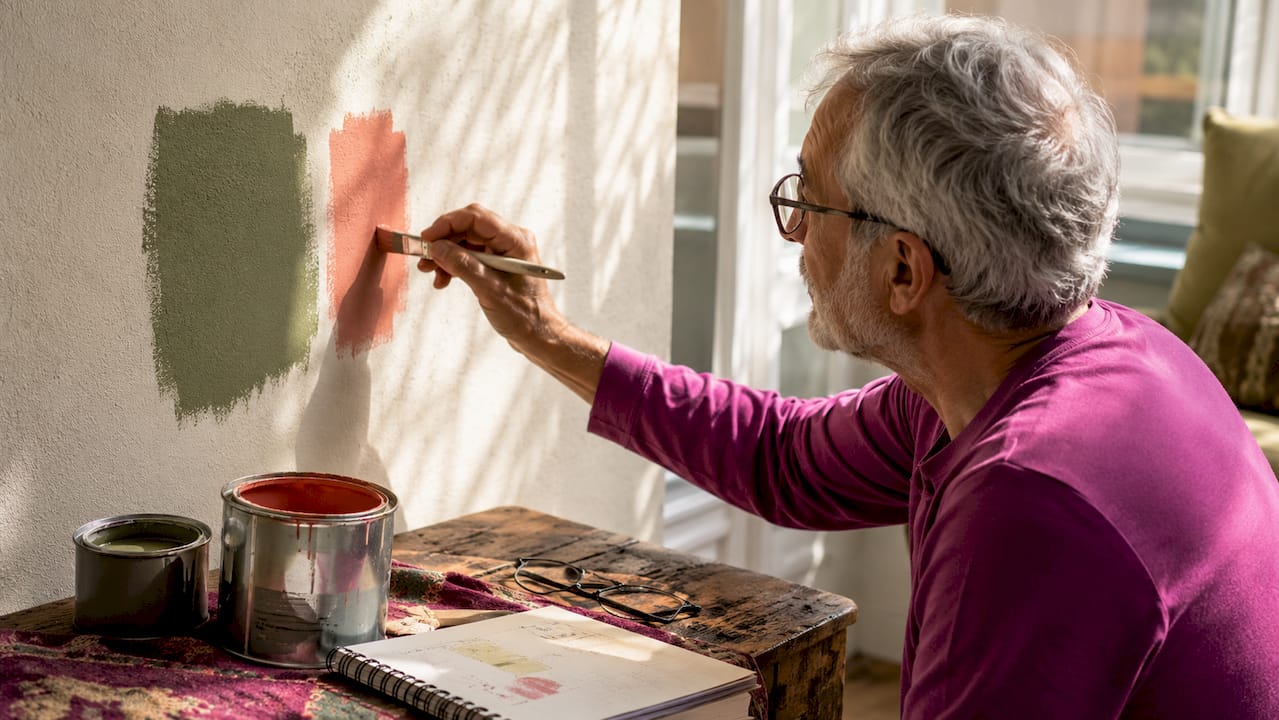
Pro Tip: Paint a large swatch on your wall and observe it at 8 a.m., noon, and 8 p.m. under both natural and artificial light before making a final decision.
2. understanding LRV and undertones for balanced color
Light Reflectance Value (LRV) is a number on a scale of 0–100 that measures how much light a paint color reflects. Zero is pure black, and 100 is pure white. This number predicts whether a color will make a room feel open and airy or intimate and enclosed.
| LRV Range | Effect on Space | Best Room Type |
|---|---|---|
| 75–100 | Very bright, expansive feel | Small rooms, dark hallways, basements |
| 55–74 | Light and comfortable | Bedrooms, living rooms, home offices |
| 35–54 | Medium depth, grounded feel | Dining rooms, libraries, accent walls |
| 0–34 | Dramatic, absorbs light | Feature walls, large rooms with good natural light |
Lighter hues brighten small or darker rooms, while deeper tones create intimacy in larger spaces. Soft creams and pale tones with an LRV above 70 are the standard recommendation for compact rooms to avoid a closed-in feeling.
Undertones are the secondary hues hiding inside a paint color. A white paint can carry pink, green, yellow, or gray undertones. Those undertones become visible once the paint is on the wall and surrounded by your room’s light and furnishings. Matching undertones to your room’s lighting orientation prevents the most common paint regret: a color that looked perfect in the store but reads completely wrong at home.
Pro Tip: Check the LRV of your trim and ceiling paint alongside your wall color. A high-contrast LRV gap between trim and walls creates a crisp, defined look. A close LRV match creates a softer, more unified feel.
3. applying the 60-30-10 rule to room color palettes
The 60-30-10 rule is the most practical framework for building a room color palette. It divides color distribution across three levels: 60% dominant color (usually walls and large surfaces), 30% secondary color (furniture, curtains, rugs), and 10% accent color (pillows, art, accessories). This structure prevents rooms from feeling visually chaotic or flat.
Here is how two common palettes apply the rule:
| Role | Calm Coastal Palette | Warm Earthy Palette |
|---|---|---|
| 60% Dominant (walls) | Soft sage green | Warm terracotta |
| 30% Secondary (furniture) | Natural linen | Cream and tan |
| 10% Accent (decor) | Deep navy | Burnt orange |
Hue, value, and chroma are the three dimensions designers use to build contrast and balance. Hue is the color family. Value is how light or dark it is. Chroma is how saturated or muted it appears. Walls and furnishings with the same value level create a flat, boring result. Mixing saturation levels, such as a muted wall with a vivid accent, creates the visual interest that makes a room feel designed rather than assembled.
A practical starting point is your existing rug or a piece of furniture you love. Pull the dominant color from that piece and use a lighter or softer version of it on the walls. Designers consistently recommend this approach because it ensures wall colors are pleasing and not overwhelming relative to what you already own.
4. matching color to room function and mood
Room function determines the emotional register your color needs to hit. A bedroom calls for colors that lower mental activity. A home office needs colors that support focus without inducing fatigue. A dining room can handle more drama than a bathroom.
Color psychology offers reliable guidance here. Blues and blue-greens consistently read as calm and restful, making them strong choices for bedrooms and bathrooms. Warm yellows and soft oranges promote conversation and appetite, which is why they appear frequently in dining rooms and kitchens. Greens with mid-range LRV values work well in home offices because they are neutral enough to avoid distraction while still feeling alive. Deep, saturated colors like charcoal, navy, or forest green work in rooms where you want focus or intimacy, such as libraries or media rooms.
The color you choose for emotional impact in interiors does not need to be a single wall color. An accent wall in a deeper shade of your dominant color adds depth without committing the entire room to a bold choice.
5. how to test paint colors before you commit
Small paint chips from a hardware store are the least reliable way to choose room colors. The chip is too small to show how a color behaves at scale, and store lighting is almost never representative of your home’s conditions.
The most reliable testing method uses large samples. Poster boards or large wall patches give a far more accurate preview of how a color will read in your actual space. Peel-and-stick paint samples, available from brands like Samplize, let you move the same swatch between rooms and walls without painting directly. Apply two coats and check in both direct and shaded areas of the room to avoid surprises from texture and light variation.
Common mistakes to avoid:
- Choosing a color based only on a chip held against a white store wall
- Testing only during the day and ignoring how the color reads under evening artificial light
- Skipping the test entirely for “safe” neutrals, which are the most undertone-sensitive colors of all
- Selecting a color that works in isolation without placing it next to your actual furniture and flooring
Pro Tip: If a color looks slightly too light on your test patch, it will read even lighter once it covers the full wall. Go one shade deeper than your instinct suggests for colors in the mid-to-light LRV range.
6. coordinating wall colors with existing decor
Most homeowners and renters are not starting from scratch. You have flooring, furniture, and fixed finishes that the wall color must work with. This constraint is actually an advantage. It narrows your choices significantly.
Start by identifying the undertone of your largest fixed element, typically the floor. Warm wood floors carry yellow, orange, or red undertones. Cool gray floors carry blue or green undertones. Your wall color’s undertone should either match or deliberately contrast with that base. Matching creates harmony. Contrasting creates energy.
For small spaces, the wall color carries more visual weight than in large rooms. A color that reads as a soft background in a spacious living room can feel dominant and heavy in a compact bedroom. Stick to higher LRV values and cooler or more neutral undertones in tight spaces to keep the room feeling open.
Art is the most flexible element in any room. Unlike furniture or flooring, a painting can be swapped out. Choosing a wall color that works with a range of art styles gives you more freedom to update the room over time without repainting.
7. avoiding the most common wall color mistakes
The most common mistake in determining wall paint shades is choosing based on trend rather than room conditions. A color that looks perfect in a magazine was photographed in a specific space with specific light. Your room is different.
The second most common mistake is ignoring the ceiling and trim. Walls do not exist in isolation. A warm white wall next to a stark bright-white ceiling creates an unintended contrast that makes the wall color look dingy. Coordinate all three surfaces, walls, ceiling, and trim, as part of a single color decision.
The third mistake is rushing. Paint is one of the least expensive ways to transform a room, but a wrong choice still costs time and money to fix. Spend at least one full week observing your test samples before committing. The color that looks perfect on day one sometimes reveals an unwanted undertone by day four when you see it under different conditions.
Key takeaways
Choosing wall colors correctly requires matching mood, lighting conditions, and LRV to your specific room before testing samples at scale in the actual space.
| Point | Details |
|---|---|
| Start with mood and function | Define the emotional goal of the room before selecting any color family. |
| Use LRV to predict brightness | Higher LRV values open up small or dark rooms; lower values create intimacy in larger spaces. |
| Match undertones to light direction | North-facing rooms need warm undertones; south-facing rooms benefit from cooler ones. |
| Apply the 60-30-10 rule | Distribute color across walls, furniture, and accents to avoid visual imbalance. |
| Test at scale, not on chips | Use large poster boards or peel-and-stick samples and observe across multiple lighting conditions. |
What i have learned about choosing wall colors
I have watched people spend weeks agonizing over paint chips and then commit to a color in five minutes at the store. The chip never tells the full story. The room does.
The insight that changed how I think about color selection is this: undertones are more important than the color itself. A gray that reads as sophisticated in a south-facing showroom can look cold and institutional in a north-facing bedroom. The hue is the same. The undertone interaction with the light is completely different.
I also think the design world underserves renters on this topic. Most advice assumes you can paint freely. But even if you cannot change your walls, understanding LRV and undertones helps you choose furniture, textiles, and art that work with what you have. The science applies regardless of whether you hold the paintbrush.
The 60-30-10 rule gets dismissed as too formulaic by some designers. I disagree. It is not a rigid prescription. It is a starting point that prevents the most common failure mode, which is a room where everything competes for attention at the same visual volume. Start with the rule and break it deliberately once you understand why it works.
Patience is the real skill here. The best wall color decisions I have seen come from people who tested, waited, observed, and tested again. The worst come from people who picked a color because it looked good on someone else’s Instagram.
— Eman
Complete your room with original art from Emansgallery
Once your wall color is set, the right artwork ties the entire room together. Emansgallery offers original handmade paintings and museum-quality canvas prints by artist Eman Khalifa, designed to complement a wide range of interior palettes.

For rooms with blue, teal, or ocean-inspired wall colors, the Good Tidings original painting brings fluid blue and gold tones that work beautifully against cool or neutral walls. For darker, moodier interiors, the Nocturned original painting adds depth and atmosphere. Browse the full collection of wall art prints to find pieces that match your chosen palette. Emansgallery ships worldwide from the UK, USA, Canada, Australia, and beyond.
FAQ
What is the first step in choosing wall colors?
Define the mood you want the room to create before selecting any color. Mood and room function narrow your color family, and lighting conditions then determine the specific shade and undertone.
How does LRV affect which color i should choose?
LRV measures how much light a color reflects on a scale of 0–100. Higher LRV values make rooms feel brighter and more open, while lower values create a more intimate, enclosed atmosphere.
Why do paint colors look different at home than in the store?
Store lighting is rarely representative of your home’s conditions. The color’s undertone interacts differently with your room’s natural light direction, artificial bulb type, and surrounding surfaces, which changes how the color reads.
How big should my paint test sample be?
Test patches should be at least the size of a poster board, roughly 20 by 28 inches. Small chips misrepresent how colors behave at scale, particularly for vivid or deep shades.
Can i use the 60-30-10 rule in a rented space?
Yes. The rule applies to any surface, not just walls. In a rental where you cannot paint, apply it to furniture (60%), textiles like rugs and curtains (30%), and accessories and art (10%) to create a cohesive color palette within your existing wall color.
Stay Connected
- ✨ Explore Eman Khalifa's original art, fine art prints and art-inspired merchandise.
- Follow Eman Khalifa's art journey on: Instagram @emans_gallery and Facebook
- Watch Eman Khalifa creating live art on: YouTube @emans_gallery
