
Role of Color in Wall Art: Creating Lasting Emotional Impact
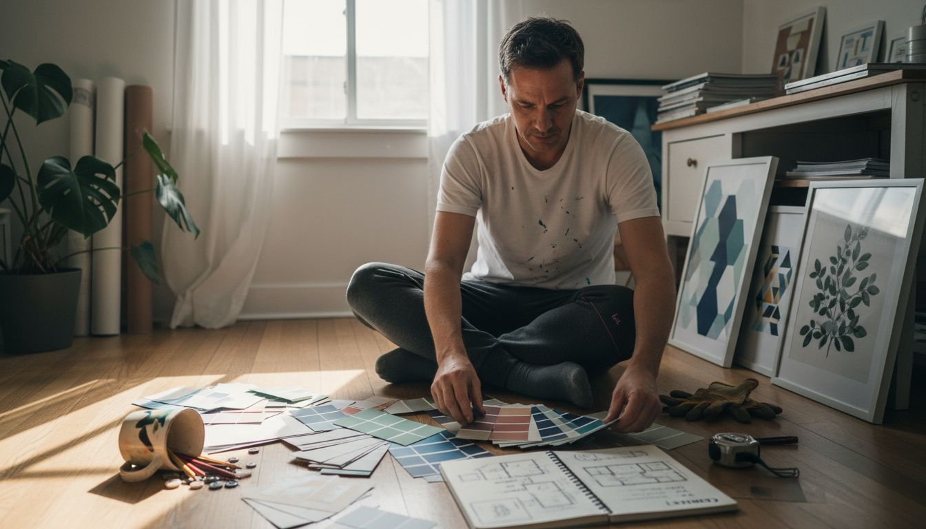
Selecting the perfect wall art for luxury interiors goes far beyond matching a color palette to a sofa or rug. Discerning European interior designers know that color in wall art acts as a powerful psychological tool, subtly shaping the emotional atmosphere of a space. Backed by research showing that specific color configurations profoundly influence emotional impact in wall art, this guide reveals how thoughtful color choices can transform residential projects into immersive experiences.
Table of Contents
- Role of Color in Wall Art Defined
- Key Color Categories and Their Effects
- Understanding Color Psychology in Interiors
- Strategies for Selecting Art Based on Color
- Common Pitfalls in Art Color Placement
Key Takeaways
| Point | Details |
|---|---|
| Emotional Influence of Color | Color in wall art significantly impacts mood, perception, and emotional response, functioning as a silent communicator of feelings. |
| Strategic Color Selection | Choosing the right colors is essential for creating a desired emotional atmosphere in interior spaces. |
| Cultural Context Matters | Understanding cultural symbolism of colors can enhance the emotional resonance of wall art within specific environments. |
| Avoiding Common Pitfalls | Effective color placement is crucial; avoid using conflicting colors and ensure alignment with the intended emotional impact of the space. |
Role of Color in Wall Art Defined
Color transcends mere visual aesthetics in wall art - it operates as a profound psychological communicator, transforming spaces through emotional resonance. Color configurations in artistic compositions directly influence human perception and emotional experience.
At its core, wall art color represents a sophisticated language of emotional expression, strategically using chromatic elements to evoke specific psychological responses. Researchers have consistently demonstrated that different color selections can dramatically alter viewer mood, spatial perception, and interior environment dynamics.
The emotional impact of color in wall art involves multiple intricate dimensions:
- Psychological Triggering: Colors activate specific neurological pathways, stimulating emotional and memory centers
- Spatial Perception: Color can visually expand or contract interior spaces
- Mood Modulation: Strategic color selections can induce calmness, excitement, introspection, or energy
- Cultural Symbolism: Color meanings vary across cultural contexts, adding layers of interpretative complexity
Through careful color selection, wall art becomes more than decoration - it transforms into a powerful emotional conduit that communicates without words, creating immersive sensory experiences that resonate deeply with viewers.
Pro tip: When selecting wall art, consider the emotional atmosphere you want to create and choose colors that authentically support that intended emotional landscape.
Key Color Categories and Their Effects
Color categories in wall art represent a sophisticated system of emotional communication, with each color group carrying unique psychological and aesthetic characteristics. Understanding these categories enables interior designers and art collectors to craft intentional visual experiences that resonate deeply with viewers.
The primary color categories - red, blue, and yellow - form the foundational emotional palette in wall art. Each primary color carries distinct psychological attributes that can dramatically transform interior spaces:
- Red: Represents passion, energy, and intensity
- Blue: Communicates calmness, stability, and introspection
- Yellow: Evokes optimism, intellectual stimulation, and warmth
Secondary and tertiary color interactions introduce additional complexity. Color theory principles reveal how complementary and analogous color schemes create nuanced emotional landscapes within artworks.
Color interactions become particularly sophisticated when considering factors like hue, saturation, and value. Complementary colors (opposite on the color wheel) create dynamic visual tension, while analogous colors (adjacent on the wheel) produce harmonious, soothing experiences. These relationships allow designers to craft precisely calibrated emotional responses through strategic color selections.
Pro tip: When selecting wall art, consider the emotional undertones of color categories and choose combinations that authentically reflect the mood you want to create in your space.
Here’s a concise comparison of color categories and their primary psychological effects in wall art:
| Color Category | Psychological Effect | Spatial Influence | Example Use in Interiors |
|---|---|---|---|
| Red | Stimulates energy | Makes spaces feel warmer | Dining rooms, art focal points |
| Blue | Encourages calmness | Expands visual space | Bedrooms, meditation areas |
| Yellow | Inspires optimism | Brightens environments | Workspaces, kitchens |
| Green | Promotes relaxation | Connects to nature | Living rooms, entryways |
| Gray/Neutral | Balances atmosphere | Sophisticated backdrop | Offices, minimalist settings |
Understanding Color Psychology in Interiors
Color psychology in artistic contexts reveals how colors profoundly influence human emotional and cognitive experiences within interior spaces. These subtle yet powerful interactions transform wall art from mere decorative elements into sophisticated emotional communication tools.
The psychological impact of colors extends far beyond visual aesthetics, touching deep neurological and emotional centers. Different color interactions can trigger specific psychological responses:
- Warm Colors (reds, oranges): Stimulate energy, excitement, and social interaction
- Cool Colors (blues, greens): Promote calmness, introspection, and relaxation
- Neutral Colors (whites, grays): Create balanced, sophisticated environments
Architectural color studies demonstrate that color selections directly shape psychological well-being. The strategic placement of wall art with carefully chosen color palettes can transform interior environments, influencing mood, productivity, and emotional state.
Designers and art collectors must recognize that color psychology operates on subconscious levels. Colors communicate silently, creating emotional landscapes that subtly guide human perception and behavior within interior spaces.
Pro tip: Select wall art colors that align with the intended emotional atmosphere of your space, understanding that each color choice carries a nuanced psychological message.
Strategies for Selecting Art Based on Color
Color selection strategies require a nuanced approach that balances aesthetic principles with emotional intelligence. Understanding how colors interact and communicate can transform wall art from a decorative element into a powerful psychological tool for interior spaces.
Key strategies for thoughtful color-based art selection include:
- Emotional Alignment: Match art colors with the desired psychological atmosphere of the space
- Harmonious Combinations: Use complementary or analogous color schemes
- Cultural Context: Consider cultural color meanings and interpretations
- Personal Connection: Select colors that resonate with individual emotional experiences
Artists approach color as an expressive medium, understanding its capacity to communicate beyond visual aesthetics. This perspective suggests that wall art color selection should transcend mere decorative choices, instead focusing on creating meaningful emotional landscapes.
Successful color selection involves analyzing color interactions, understanding psychological triggers, and recognizing how different hues can subtly influence mood and perception. Professional designers often employ color theory principles to create intentional, emotionally resonant interior environments.
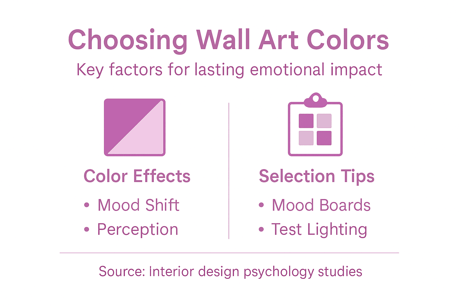
Pro tip: Create color mood boards before final art selection, experimenting with different color combinations to understand their emotional and visual dynamics.
Consider these art selection strategies to achieve targeted emotional impact in interior spaces:
| Strategy | Purpose | Practical Example |
|---|---|---|
| Harmonious Pairing | Enhance visual unity | Analogous colors for calm living room |
| Emotional Targeting | Match desired mood | Warm tones for welcoming entryway |
| Cultural Relevance | Respect symbolism | Red for luck in Asian-influenced spaces |
| Lighting Adaptation | Retain true color impact | Preview art under daylight and artificial light |
Common Pitfalls in Art Color Placement
Color placement errors in architectural spaces can dramatically undermine the emotional effectiveness of wall art, creating visual dissonance and psychological tension that detracts from interior design intentions.
Common color placement pitfalls that designers and art collectors must avoid include:
- Chromatic Overload: Using too many competing colors that create visual chaos
- Emotional Misalignment: Selecting colors that contradict the room’s intended psychological atmosphere
- Cultural Insensitivity: Ignoring cultural color symbolism and meaning
- Lighting Mismatch: Failing to consider how artificial and natural light affects color perception
Wall art color composition challenges often stem from neglecting the complex interactions between color, space, and human psychological response. Professional designers understand that color placement is not just about aesthetic appeal, but about creating intentional emotional experiences.
Systematic evaluation of color composition requires understanding subtle visual dynamics. Successful art placement demands careful consideration of color harmony, contrast, and the nuanced ways colors communicate within a specific environmental context.
Pro tip: Test potential wall art colors under different lighting conditions and against existing room elements to ensure harmonious emotional resonance.
Transform Your Space with Color-Driven Wall Art
Choosing the right wall art color is not just about decoration it is about creating a lasting emotional impact that truly resonates with your space and your mood. This article highlights how specific color choices can evoke feelings of calmness excitement or inspiration and how strategic color placement helps shape the atmosphere of any room. If you have ever struggled to find art that aligns with your emotional vision or worried about color harmony in your interiors then embracing the psychological power of color is key.
Explore our exclusive collection of Wall Art Prints | Canvas & Framed Art Prints by Eman Khalifa – Eman’s Gallery where every piece is thoughtfully created to convey emotion through color.
Feel the difference of professionally crafted, museum-quality Canvas Art Prints by Eman Khalifa | Premium Giclée Wall Art – Eman’s Gallery designed to complement your unique style and emotional needs. Elevate your interior with art that speaks the language of color psychology and creates the mood you desire today. Visit Eman’s Gallery now and start your journey toward inspired living with color that truly connects.
Frequently Asked Questions
How does color affect mood in wall art?
Color plays a significant role in influencing mood by activating specific emotional responses. For instance, warm colors like red can stimulate energy and excitement, while cool colors like blue promote calmness and introspection.
What are some effective color combinations for wall art?
Using complementary colors can create dynamic tension, while analogous colors provide a harmonious, soothing experience. It’s essential to choose combinations that align with the emotional atmosphere you want to achieve in your space.
How can I choose wall art colors that fit my interior design?
Consider the psychological effects of colors, the intended mood, and how different hues interact with the existing decor in your space. Creating a color mood board can help visualize potential combinations before making a selection.
What are common pitfalls when selecting colors for wall art?
Common pitfalls include chromatic overload, where too many competing colors clash, and emotional misalignment, where the chosen colors contradict the room’s intended atmosphere. It’s crucial to consider lighting conditions and cultural meanings as well.
Recommended
- Role of Color in Art – Impact on Mood and Space
- 7 Expert Wall Art Color Tips for Luxury Interiors
- Choosing Color Schemes for Art to Inspire Interiors
- Why Art Matters in Interiors: Transforming Spaces
Stay Connected
- ✨ Explore Eman Khalifa’s original art and fine art prints
- 📸 Follow Eman Khalifa’s art journey on: Instagram @emans_gallery and Facebook Eman’s Gallery
- 📹 Watch Eman Khalifa creating live art on: YouTube @emans_gallery