


How to choose artwork: a practical guide for your home
TL;DR:
- Choosing artwork involves assessing your space and defining the desired mood to ensure the piece complements your room’s function and style.
- A step-by-step selection process, including measuring, considering proportions, and confirming color harmony, builds confidence and results in visually balanced decor.
You find the perfect piece at a gallery or online. It looks amazing. You bring it home, hang it up, and something feels off. The scale is wrong, the colors clash, or it just floats on the wall with no presence. This experience is more common than most people realize, and it has nothing to do with your taste. It comes down to process. This guide walks you through a clear, step-by-step method for selecting artwork that fits your space, reflects your style, and actually looks the way you imagined.
Table of Contents
- Getting started: Assess your space and goals
- Step-by-step: How to select the right artwork
- Placement and hanging: Getting it just right
- Common mistakes and troubleshooting tips
- Embracing personal taste: Why rules aren’t everything
- Find your perfect piece at Eman’s Gallery
- Frequently asked questions
Key Takeaways
| Point | Details |
|---|---|
| Start with your space | Assess your room and goals before picking any artwork for the best results. |
| Use size and proportion rules | Artwork should usually be 2/3 to 3/4 the width of the furniture it’s placed above. |
| Hang at eye level | Keep art centered at 57–60 inches from the floor for natural viewing. |
| Express your style | Personal taste and story matter—mix styles for a space that feels truly yours. |
| Avoid common mistakes | Check sizing, alignment, and lighting to ensure your artwork looks cohesive and intentional. |
Getting started: Assess your space and goals
With the objective in mind, start by assessing where the artwork will go and what feeling you want. Before browsing any artwork, take time to evaluate the specific room and wall. This step saves time and prevents costly mistakes.
Define the mood first. Each room has a function, and artwork should reinforce it. A bedroom benefits from calm, soft imagery. A home office may call for focused, minimal compositions. A living room can handle bold, vibrant work. Think about what emotional tone you want visitors and family members to feel when they enter the space.
Take measurements before anything else. Measure the available wall space in width and height. Note the dimensions of key furniture pieces nearby, especially sofas, beds, and consoles. These measurements become your reference points for sizing decisions later.
Consider these practical factors before selecting any piece:
- Lighting conditions: Natural light shifts throughout the day, and artificial lighting affects how colors appear. Warm bulbs deepen reds and yellows; cool bulbs bring out blues and grays.
- Wall color and finish: A matte white wall reads very differently from a dark charcoal or textured wallpaper. Some artwork styles work better against neutral backgrounds, while others pop against bolder walls.
- High-traffic areas: Hallways and dining rooms see a lot of movement. Avoid fragile pieces or artwork on paper without proper framing in these areas.
- Sunlight exposure: Direct sunlight fades pigments over time. Original paintings and fine art prints in south- or west-facing rooms may need UV-protective glass.
Reviewing types of home decor art for modern spaces can help you narrow down which formats suit your room best. Understanding the role of artwork in design also gives useful context for how different art choices affect the overall feel of a room.
| Room | Recommended mood | Art style options |
|---|---|---|
| Living room | Welcoming, expressive | Abstract, large-scale, landscape |
| Bedroom | Calm, restful | Soft florals, muted abstracts |
| Home office | Focused, minimal | Geometric, black and white |
| Dining room | Warm, social | Still-life, seascape, color-rich |
| Hallway | Transitional, interesting | Photography, small groupings |
Pro Tip: Create a simple brief for your space. Write down the room, the wall dimensions, the dominant colors, and the mood in one sentence. Having this on hand while browsing artwork makes decisions faster and clearer.
Step-by-step: How to select the right artwork
After the initial assessment, move on to making step-by-step decisions for your ideal artwork. A structured process removes guesswork and builds confidence.
Step 1: Measure the wall and note surrounding furniture. You already have measurements from your assessment. Now use them. Identify the main furniture piece the artwork will relate to, usually a sofa, bed, or dining table.
Step 2: Apply the proportion rule. According to established sizing benchmarks, artwork width should be about 2/3 to 3/4 of the width of the furniture it hangs above. For a 90-inch sofa, that means artwork between 60 and 68 inches wide. This keeps the piece visually anchored rather than floating or overwhelming the space.
Step 3: Choose a style that complements your room. Style selection should follow your mood brief. Abstract paintings bring energy and movement. Geometric artwork adds structure and order. Floral pieces introduce softness and color. Landscapes and seascapes open up a room visually. Still-life compositions create a sense of intimacy and warmth.
Step 4: Confirm color harmony. Pull two or three dominant colors from the room, including walls, furniture, and textiles. Artwork does not need to match exactly, but it should relate to these colors in some way. A complementary color can add dynamic contrast. A near-neutral piece can anchor a colorful room. Avoid pulling a color that does not appear anywhere else in the space, as it tends to look disconnected.
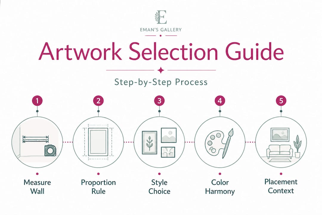
Step 5: Consider the placement context. Will this piece hang alone as a statement? Or will it be part of a larger grouping? A single large canvas reads differently than a set of three smaller prints. Consulting an interior designer’s art guide can clarify which approach suits your space best.
| Art type | Best room placement | Visual effect |
|---|---|---|
| Abstract | Living room, office | Energy, movement |
| Geometric | Office, hallway | Structure, precision |
| Floral | Bedroom, dining room | Softness, warmth |
| Landscape | Living room, dining room | Depth, openness |
| Seascape | Bathroom, bedroom | Calm, space |
| Still-life | Kitchen, dining room | Coziness, intimacy |
Exploring the full range of types of art for interiors helps you see all available options before settling on one direction.
Pro Tip: If you are unsure between a statement piece and a flexible smaller format, consider your long-term plans. Statement pieces define the room around them. Smaller formats are easier to rearrange or supplement later. New homeowners often benefit from starting with one considered statement piece per main room.
Placement and hanging: Getting it just right
Once you’ve selected your piece, ensuring proper placement makes all the difference. Even the most well-chosen artwork can feel wrong if hung incorrectly.
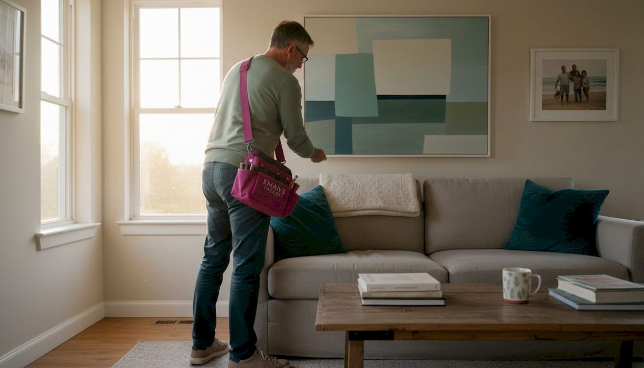
1. Use the 57 to 60-inch rule. The standard for comfortable viewing is to hang artwork so its center is 57 to 60 inches from the floor. This aligns the visual center of the piece with average eye level. Museums and galleries use this standard universally.
2. Align artwork with nearby furniture. When hanging above a sofa or console, the bottom edge of the artwork should sit 6 to 10 inches above the top of the furniture. This creates a visual connection between the piece and the object below it. Leaving too large a gap makes the artwork look unmoored.
3. Plan gallery walls on paper first. For groupings of two or more pieces, lay them out on the floor before making any holes. Trace each frame on paper, cut it out, and tape it to the wall temporarily. This approach lets you test different arrangements without committing.
4. Use consistent spacing within groupings. For gallery walls, 2 to 3 inches between frames creates a cohesive cluster. More than 4 inches between frames can make the grouping feel like separate, disconnected pieces.
“Anchor wall art at eye level: the center height is commonly around 57 to 60 inches from the floor for comfortable viewing.” This rule applies whether you are hanging in a bedroom, hallway, or living room.
Common placement mistakes to avoid:
- Hanging too high. This is the single most common error. Artwork that sits near the ceiling loses its connection to the furniture and the viewer.
- Choosing artwork that is too small. A small piece on a large wall looks timid and forgotten. When in doubt, size up.
- Crowding a wall. Too many pieces in a tight space create visual noise. Negative space around artwork gives it room to breathe.
- Ignoring the room’s eye level. A dining room where guests sit has a lower effective eye level than a standing room. Adjust hanging height accordingly.
Reviewing best art prints tips from experienced sources gives additional practical guidance for prints and canvas work specifically.
Pro Tip: Use painter’s tape to mark the exact dimensions of your artwork on the wall before hanging. This gives you a realistic sense of scale and placement without any commitment.
Common mistakes and troubleshooting tips
Even with the right steps, it is easy to make simple mistakes. Here is how to avoid them and how to fix common problems once you notice them.
Artwork that is too small for the space. This is the most reported issue among new art buyers. A piece that looked substantial online can appear underwhelming against a large blank wall. Proportion rules benchmark artwork at 2/3 to 3/4 of the furniture width. If you are unsure, use painter’s tape on the wall to simulate the dimensions before purchasing.
Hanging artwork too high. Most people instinctively hang artwork too high because a higher position feels more formal. In practice, it just creates disconnection. Use the 57 to 60-inch center rule consistently.
Ignoring furniture alignment. Artwork that does not relate visually to the furniture below it loses its anchoring effect. A painting hung above a narrow side table on a wide wall needs horizontal balance, either through framing choices, additional pieces, or positioning the table more centrally.
Neglecting lighting conditions. Artwork in a dimly lit corner will not read well regardless of its quality. If a wall receives little natural or artificial light, add a picture light or directional spot to illuminate the piece properly.
Common mistakes at a glance:
- Choosing artwork too small relative to the wall or furniture
- Hanging pieces too high above furniture or at ceiling height
- Using poor or no lighting on the artwork
- Mixing frames and styles without a unifying element
- Placing delicate originals in direct sunlight without UV protection
- Ignoring the visual weight of dark versus light artwork in small spaces
Reviewing art collector tips from collectors with experience can help you avoid the pitfalls that are easy to miss the first time.
Pro Tip: Before drilling, use a strip of repositionable tape on the back of the frame and press it against the wall. Step back and evaluate it from all angles and under different lighting conditions throughout the day. This simple test catches proportion and placement issues before they become permanent.
Embracing personal taste: Why rules aren’t everything
Now that you know how to avoid mistakes, remember that the best art choices sometimes defy conventions. The guidelines above are tools, not laws. Understanding them gives you the confidence to break them intentionally.
Standard proportion rules create harmony, but personal meaning carries more weight in the long run. A painting inherited from a family member, a piece bought on a trip abroad, or an original work by an emerging artist you discovered early, these items carry stories that no style guide can account for. A home that follows every rule but lacks personal history often feels like a showroom rather than a living space.
The most interesting interiors tend to mix scales, periods, and styles with one common thread: the owner’s genuine preferences. A large abstract painting next to a small framed sketch, a geometric print beside a landscape, these combinations can work when they reflect a real collecting sensibility rather than random selection.
Rules around color harmony are helpful starting points, but many striking interiors deliberately introduce a color that exists nowhere else in the room. That single point of contrast creates visual tension in a positive way. It draws the eye and gives a room energy that perfectly coordinated spaces sometimes lack.
Reviewing art collection basics for luxury homes illustrates how experienced collectors approach this balance. The best collections build gradually, with some pieces chosen for their beauty, some for their meaning, and some simply because they could not be left behind.
The goal is not a perfectly decorated room. The goal is a room that feels like yours.
Find your perfect piece at Eman’s Gallery
Ready to put these strategies to use? Eman’s Gallery offers a carefully selected range of original handmade paintings, museum-quality canvas prints, and contemporary works across abstract, geometric, floral, landscape, seascape, and still-life styles.

Every piece is shown with detailed imagery to help you visualize scale and color before purchasing. Whether you are looking for a single statement original like Good Tidings or a bold canvas print such as Private Eye, each work is ready to hang and ships worldwide. Browse the full wall art prints collection to find the right piece for your wall dimensions, color palette, and personal style. New homeowners, interior designers, and gift buyers will find one-of-a-kind options suited to every space and budget.
Frequently asked questions
What size should artwork be over a sofa?
Artwork should span two-thirds to three-quarters the width of the sofa for balanced proportions. For a standard 84-inch sofa, that means artwork between 56 and 63 inches wide.
How high should I hang my artwork?
The center of artwork should sit 57 to 60 inches from the floor for comfortable eye-level viewing. Adjust slightly lower in rooms where people are typically seated.
Should art always match my sofa or walls?
Not necessarily. Art can complement, contrast, or introduce a new theme as long as the overall balance feels intentional. Exact matching often results in a flat, uninteresting space.
Can I mix different styles of art in one room?
Yes. Blending different art styles adds interest and personality when the arrangement is thoughtful. A unifying element such as consistent framing, a shared color, or similar scale helps the grouping feel cohesive.
What is the best way to start building an art collection?
Start with pieces you genuinely love and add artwork gradually over time. A collection built around personal preference tends to feel more authentic and satisfying than one assembled to match a design trend.
Recommended
- Choosing Art for Clients: An Interior Designer’s Guide
- Discover inspiring types of home decor art for modern spaces
- 7 Tips for Choosing Best Art Prints for Home - Eman’s Gallery
- Selecting Art Prints Guide: Find Your Perfect Art Print - Eman’s Gallery
Stay Connected
- ✨ Explore Eman Khalifa’s original art and fine art prints
- 📸 Follow Eman Khalifa’s art journey on: Instagram @emans_gallery and Facebook Eman’s Gallery
- 📹 Watch Eman Khalifa creating live art on: YouTube @emans_gallery
