

Role of Color in Art – Impact on Mood and Space
Over 70 percent of American luxury homeowners believe that art with thoughtful color palettes creates a stronger emotional atmosphere in their spaces. The psychology of color in art speaks directly to how a room feels and how its occupants respond. Whether curating for a gallery in New York or designing a European penthouse, understanding color’s emotional influence helps collectors and designers choose impactful art that elevates the experience of luxury living.
Table of Contents
- Defining Color’s Influence In Artistic Expression
- Color Theory Fundamentals And Its Artistic Uses
- How Color Choices Shape Viewer Emotions
- Color In Modern Interior And Art Curation
- Common Pitfalls Using Color In Artworks
Key Takeaways
| Point | Details |
|---|---|
| Color as Emotional Language | Color transcends mere aesthetics, serving as a powerful tool for expressing emotions and psychological states in art. |
| Color Psychology in Art | Artists strategically manipulate color to evoke specific emotional responses, transforming visual experiences into profound emotional journeys. |
| Importance of Color Theory | Understanding color theory enables artists to create harmony, tension, and emotional resonance through thoughtful color choices. |
| Common Color Pitfalls | Artists should avoid misapplying color theories, as improper combinations can undermine art’s emotional impact and viewer engagement. |
Defining Color’s Influence in Artistic Expression
Color represents far more than a visual element in art. It serves as a powerful language of emotional communication, capable of conveying complex psychological states and triggering profound viewer responses. Artists have long understood that color transcends mere aesthetic decoration, functioning instead as a sophisticated tool for expressing internal landscapes of feeling and perception.
Research reveals fascinating insights into how colors interact with human psychology. Color perception studies demonstrate that specific hues can systematically evoke distinct emotional reactions. Orange, for instance, tends to generate positive emotional responses, while blue often communicates more subdued or contemplative states. This nuanced understanding transforms color from a passive visual component into an active, intentional artistic strategy.
Professional artists strategically leverage color psychology to communicate without words. By manipulating saturation, brightness, and hue, creators can guide viewer emotions and construct immersive visual narratives. Psychological color research demonstrates how masters like Picasso and Mondrian deliberately selected color palettes to reflect specific emotional and psychological conditions, transforming their canvases into sophisticated emotional landscapes.
Pro tip: When selecting art for interior spaces, consider the emotional impact of color palettes and choose pieces that harmonize with the desired psychological atmosphere of your environment.
Exploring Color’s Emotional Spectrum
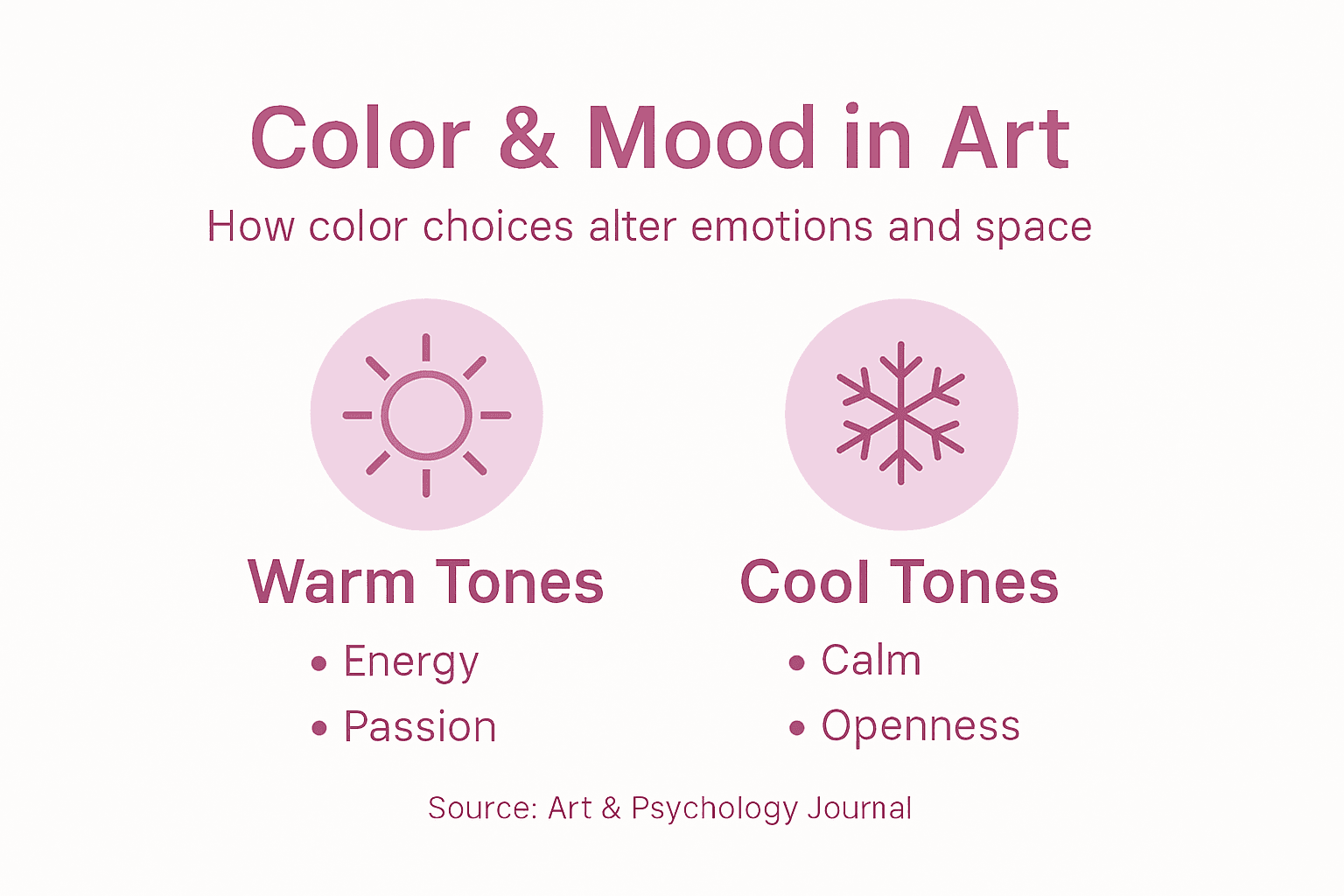
- Warm colors (reds, oranges) typically communicate energy and passion
- Cool colors (blues, greens) often represent calmness and introspection
- Neutral colors provide balance and can modulate emotional intensity
- Complementary color combinations create visual tension and dynamic emotional experiences
Technical Color Considerations
- Hue: Base color identity
- Saturation: Color intensity
- Brightness: Light reflection and perception
- Context: Surrounding colors and environmental factors
Color in art is a sophisticated communication system. Professional artists understand that every chromatic choice carries psychological weight, transforming visual experiences into profound emotional journeys.
The following table summarizes how artists use color to evoke specific emotions and guide viewer perception:
| Artistic Strategy | Intended Emotional Effect | Application Example |
|---|---|---|
| High saturation | Amplifies energy and tension | Vibrant scenes with bold colors |
| Limited color palette | Enhances focus and cohesion | Minimalist modern art |
| Soft transitions | Induces calm and introspection | Watercolor landscapes |
| Contrasting hues | Creates drama and visual tension | Abstract expressionist works |
Color Theory Fundamentals and Its Artistic Uses
Color theory represents a sophisticated framework that enables artists to understand and manipulate visual communication through chromatic relationships. At its core, this discipline provides a scientific and aesthetic approach to understanding how colors interact, combine, and evoke emotional responses. Historical art foundations reveal that artists have long used systematic color principles to create powerful visual experiences that transcend simple visual representation.
The color wheel serves as a fundamental tool in this complex system, organizing colors into primary, secondary, and tertiary categories. Primary colors (red, blue, yellow) form the foundational palette from which all other colors emerge. Secondary colors result from mixing primary colors, while tertiary colors represent nuanced blends that create sophisticated visual depth. Design color elements demonstrate how these relationships enable artists to construct intricate emotional landscapes through strategic color selection.
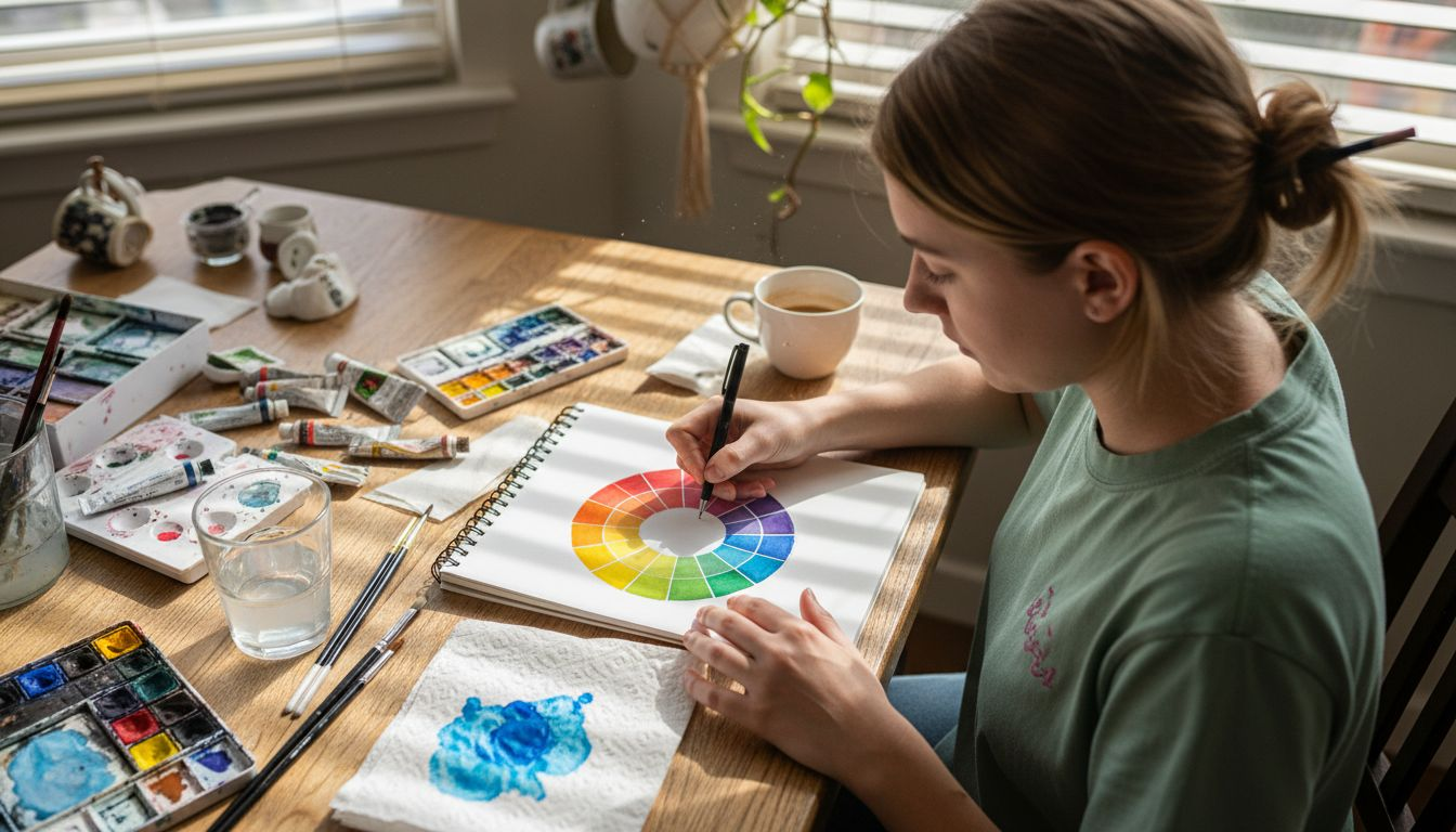
Professional artists leverage color theory’s principles to create visual harmony, tension, and emotional resonance. Complementary colors, situated opposite each other on the color wheel, generate dynamic visual energy when placed together. Analogous color schemes, featuring colors adjacent to one another, produce harmonious and soothing compositions. These sophisticated strategies transform color from a passive visual element into an active tool for emotional and psychological communication.
Color Interaction Principles
- Complementary colors create visual contrast
- Analogous colors generate visual harmony
- Warm colors advance visually
- Cool colors recede in visual perception
Color Psychological Impact
- Red: Energy and passion
- Blue: Calmness and introspection
- Yellow: Optimism and intellectual stimulation
- Green: Balance and growth
Pro tip: When selecting artwork, consider the emotional landscape created by color relationships and how they interact with your existing space.
Color theory transcends mere technical understanding. It represents a profound language of visual communication, allowing artists to construct complex emotional narratives through strategic chromatic choices. By understanding these fundamental principles, viewers can appreciate art as a sophisticated system of psychological and aesthetic expression.
Compare how complementary and analogous color schemes influence artwork atmosphere:
| Color Scheme | Visual Impact | Ideal Usage |
|---|---|---|
| Complementary | Dynamic, high contrast | Energizing contemporary designs |
| Analogous | Harmonious, seamless transitions | Relaxing residential interiors |
How Color Choices Shape Viewer Emotions
Colors are not merely visual elements but powerful psychological triggers that profoundly influence human emotional experience. Emotional color research demonstrates that specific color choices can systematically evoke and modulate viewer emotional states, transforming art from a passive visual experience into an active psychological interaction. Artists strategically leverage this understanding, using color as a nuanced language of emotional communication.
Different color palettes generate distinctly varied psychological responses. Warm colors like red and orange typically stimulate energy and passion, while cool blues and greens invite feelings of calmness and introspection. Psychological color design reveals that color saturation, brightness, and contextual placement further refine these emotional resonances. A vibrant red might communicate excitement in one context, while the same hue could represent danger or aggression in another, highlighting color’s complex emotional vocabulary.
Professional artists understand color’s transformative potential as an emotional conduit. By carefully selecting and combining colors, they craft visual experiences that communicate beyond literal representation. Subtle shifts in color temperature, intensity, and relationship can trigger profound emotional journeys, allowing viewers to experience complex feelings through visual perception.
Emotional Color Spectrum
- Red: Passion, energy, intensity
- Blue: Calmness, trust, depth
- Yellow: Optimism, intellectual stimulation
- Green: Balance, growth, harmony
- Purple: Creativity, spirituality, mystery
Color Emotional Impact Factors
- Hue and base color
- Saturation level
- Brightness and contrast
- Cultural and personal associations
- Surrounding color context
Pro tip: When selecting artwork, consider how color combinations might emotionally interact with your personal or professional space.
Color represents a sophisticated emotional language. By understanding its intricate psychological mechanisms, viewers can appreciate art not just as a visual experience, but as a profound communication of human emotion and perception.
Color in Modern Interior and Art Curation
Modern interior design and art curation have evolved into sophisticated disciplines where color serves as a primary language of spatial communication. Psychological painting research reveals that color choices are far more than aesthetic decisions, functioning as complex psychological tools that shape viewer perception and emotional experience. Artists and designers now understand color as a strategic medium for creating intentional psychological environments.
The contemporary approach to color curation involves meticulous consideration of spatial dynamics and emotional resonance. Color aesthetics in decorative art demonstrates that color selections can transform interior spaces from mere physical environments into dynamic emotional landscapes. Curators and designers strategically layer colors, creating visual narratives that communicate mood, energy, and psychological depth through carefully orchestrated chromatic relationships.
Professional art curation now recognizes color as an active participant in spatial storytelling. By understanding color’s psychological implications, curators can create immersive experiences that guide viewer emotions and perceptual journeys. A single artwork’s color palette can dramatically influence the entire emotional temperature of a room, turning interior spaces into sophisticated emotional canvases that communicate beyond visual representation.
Color Curation Strategies
- Analyze room’s existing color temperature
- Consider natural and artificial lighting conditions
- Balance emotional and visual energy
- Create harmonious or intentionally contrasting palettes
- Use color to define spatial zones
Psychological Color Interaction Levels
- Individual color perception
- Emotional color response
- Cultural color associations
- Personal color memories
- Spatial color integration
Pro tip: Select artwork with color palettes that complement or intentionally challenge your existing interior color scheme to create dynamic visual narratives.
Color in modern curation transcends decoration. It represents a sophisticated communication system that transforms spaces into emotionally intelligent environments, bridging visual aesthetics with psychological experience.
Common Pitfalls Using Color in Artworks
Artists frequently encounter significant challenges when navigating the complex landscape of color selection and application. Color design research reveals that improper color combinations can dramatically undermine an artwork’s emotional impact, leading to visual dissonance and unintended psychological responses. Understanding these potential pitfalls becomes crucial for creating meaningful and resonant artistic expressions.
Color psychology studies warn against simplistic interpretations of color meaning, highlighting the risk of relying on stereotypical emotional associations without considering cultural and individual nuances. Artists who mechanically apply color theories without understanding their complex psychological implications often create works that feel disconnected or emotionally inauthentic.
Professional artists recognize that color selection involves far more than aesthetic preference. Successful color application requires a sophisticated understanding of visual harmony, emotional resonance, and perceptual complexity. Common mistakes include oversaturating color palettes, neglecting color temperature relationships, and failing to consider how different hues interact and communicate within the artwork’s broader context.
Typical Color Application Mistakes
- Overusing saturated colors without strategic intent
- Ignoring color temperature relationships
- Misunderstanding cultural color symbolism
- Neglecting lighting and environmental context
- Forcing color combinations without organic flow
Color Harmony Warning Signs
- Visual discomfort when viewing the artwork
- Lack of emotional coherence
- Unintentional dramatic tension
- Disconnected color zones
- Inconsistent emotional messaging
Pro tip: Always test color combinations in multiple lighting conditions and seek feedback from diverse viewers to understand the true emotional impact of your color choices.
Mastering color in art requires continuous learning and sensitivity. Artists must approach color not as a technical skill, but as a nuanced language of emotional communication, respecting its profound psychological complexity.
Transform Your Space with Emotionally Powerful Original Art
Understanding how color shapes mood and space is essential for creating environments that resonate with feeling and personality. This article highlights how deliberate choices in hue, saturation, and brightness can influence emotional experiences and spatial harmony. If you struggle with selecting artwork that truly enhances your home or office atmosphere, you are not alone. Many find it challenging to balance color psychology with interior design needs while avoiding visual dissonance.
At Eman’s Gallery discover one-of-a-kind original paintings and museum-quality prints that harness artistic color strategies to evoke passion, calmness, or energy exactly where you need it. Every piece is crafted by artist Eman Khalifa with a deep understanding of color theory and emotional impact. Whether you seek vibrant abstracts to energize a creative studio or soothing landscapes for a tranquil living space, our curated collections offer thoughtful solutions that go beyond decoration.
Elevate your space now with emotionally intelligent art that speaks your unique psychological language.
Explore the transformative power of color and find artwork tailored to your mood and environment today at Eman’s Gallery. Experience how original art can redefine your emotional and spatial experience. Start your journey toward a more inspired living or working space by visiting our collection now.
Frequently Asked Questions
How does color influence mood in art?
Color significantly impacts mood by evoking specific emotional responses. Warm colors like red and orange generally convey energy and passion, while cool colors like blue and green promote calmness and introspection. Artists use these psychological associations to guide viewer emotions.
What are the key elements of color theory in art?
Color theory encompasses the principles of hue, saturation, brightness, and context. Understanding these elements allows artists to create visually appealing and emotionally resonant artworks through strategic color combinations and interactions.
How can I choose artwork based on color for my interior space?
When selecting artwork, consider the emotional impact of color palettes and how they align with the desired atmosphere of your environment. Utilize color interactions, such as complementary or analogous schemes, to create a cohesive and harmonious aesthetic.
What common mistakes should artists avoid when using color?
Artists should avoid overusing saturated colors, neglecting color temperature relationships, misunderstanding cultural symbolism, and failing to consider lighting conditions. It’s vital to test color combinations and seek feedback to ensure emotional coherence in their work.
Recommended
- Role of Art in Workspaces – Impact on Well-being
- Art Styles Explained: Shaping Luxury Interiors
- Why Display Art at Home: Transforming Modern Spaces
- Art and Interior Design Explained: Transforming Modern Spaces
Stay Connected
- ✨ Explore Eman Khalifa’s original art and fine art prints
- 📸 Follow Eman Khalifa’s art journey on: Instagram @emans_gallery and Facebook Eman’s Gallery
- 📹 Watch Eman Khalifa creating live art on: YouTube @emans_gallery