

Choosing Color Schemes for Art to Inspire Interiors
Over 60 percent of luxury residential clients in American and British markets request color schemes that feel truly original yet seamlessly fit with contemporary art trends. For interior designers, balancing client preferences with the intricate demands of high-end interiors requires more than instinct. This guide reveals proven strategies to fine-tune lighting, understand personal artistry, and build cohesive palettes that elevate every aspect of a luxury space.
Table of Contents
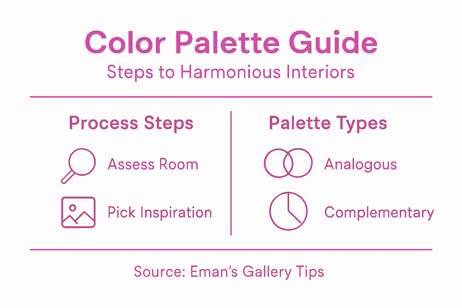
- Step 1: Assess The Room’s Lighting And Style
- Step 2: Identify Client Preferences And Inspiration
- Step 3: Select A Harmonious Color Palette
- Step 4: Align Art Colors With Interior Elements
- Step 5: Test Combinations With Sample Visuals
- Step 6: Finalize And Confirm Color Choices
Quick Summary
| Key Insight | Explanation |
|---|---|
| 1. Assess Room Lighting | Understand how natural and artificial light impacts colors before selecting artwork. Document variations in intensity and temperature. |
| 2. Identify Client Preferences | Conduct deep consultations to capture client’s unique artistic vision and preferences for colors and styles. Create mood boards. |
| 3. Select Harmonious Colors | Use color harmony theories to choose a palette that reflects emotional intent and complements existing elements in the space. |
| 4. Align Art With Interior | Ensure colors in artwork echo or complement existing decor to create a cohesive visual conversation throughout the space. |
| 5. Test Color Combinations | Use mockups and sample boards to experiment with color interactions under various lighting conditions to ensure harmony. |
Step 1: Assess the Room’s Lighting and Style
Choosing the right color scheme starts with understanding your room’s unique lighting and architectural character. This critical first step helps you create a cohesive art selection strategy that transforms your interior into a stunning visual experience.
Begin by examining the room’s natural and artificial light sources. Observe how sunlight enters through windows at different times of day and how artificial lighting interacts with walls and surfaces. Pay attention to the color temperature of your light bulbs warm yellow tones create different visual effects compared to cool white or daylight spectrum bulbs. Track the light intensity and direction track how shadows move and where bright spots appear during morning afternoon and evening hours.
Professional interior designers recommend creating a lighting journal or using smartphone photography to document these subtle variations. Analyze principles of composition and color perception to understand how different lighting conditions will impact your artwork and color selections. Take note of architectural elements like wall textures exposed beams or unique molding that might influence your color choices.
Pro Tip: Use a simple color temperature meter app on your smartphone to precisely measure and record the lighting characteristics of your space before selecting artwork.
Step 2: Identify Client Preferences and Inspiration
Understanding your client’s unique artistic vision is the cornerstone of creating a personalized color scheme that resonates deeply with their lifestyle and aesthetic sensibilities. This critical step transforms a generic art selection into a meaningful visual narrative.
Begin by conducting an in-depth consultation that goes beyond surface level discussions. Use color harmony assessment tools to explore the emotional and cultural dimensions of your client’s preferences. Ask open ended questions about their favorite art styles memories associated with specific colors and the mood they want to create in their space. Some clients might be drawn to bold geometric abstracts while others prefer soft impressionist landscapes pay close attention to the subtle cues they reveal.
Professional designers recommend creating a visual mood board that captures the client’s personality and design aspirations. Utilize artistic preference evaluation techniques to uncover nuanced insights into their aesthetic values. Encourage them to share personal photographs artwork that inspires them and objects with sentimental significance. These conversations and visual references will help you craft a color palette that feels authentic and meaningful.
Pro Tip: Create a digital mood board app or shared folder where clients can spontaneously add inspiration images during your consultation process to capture their evolving artistic vision.
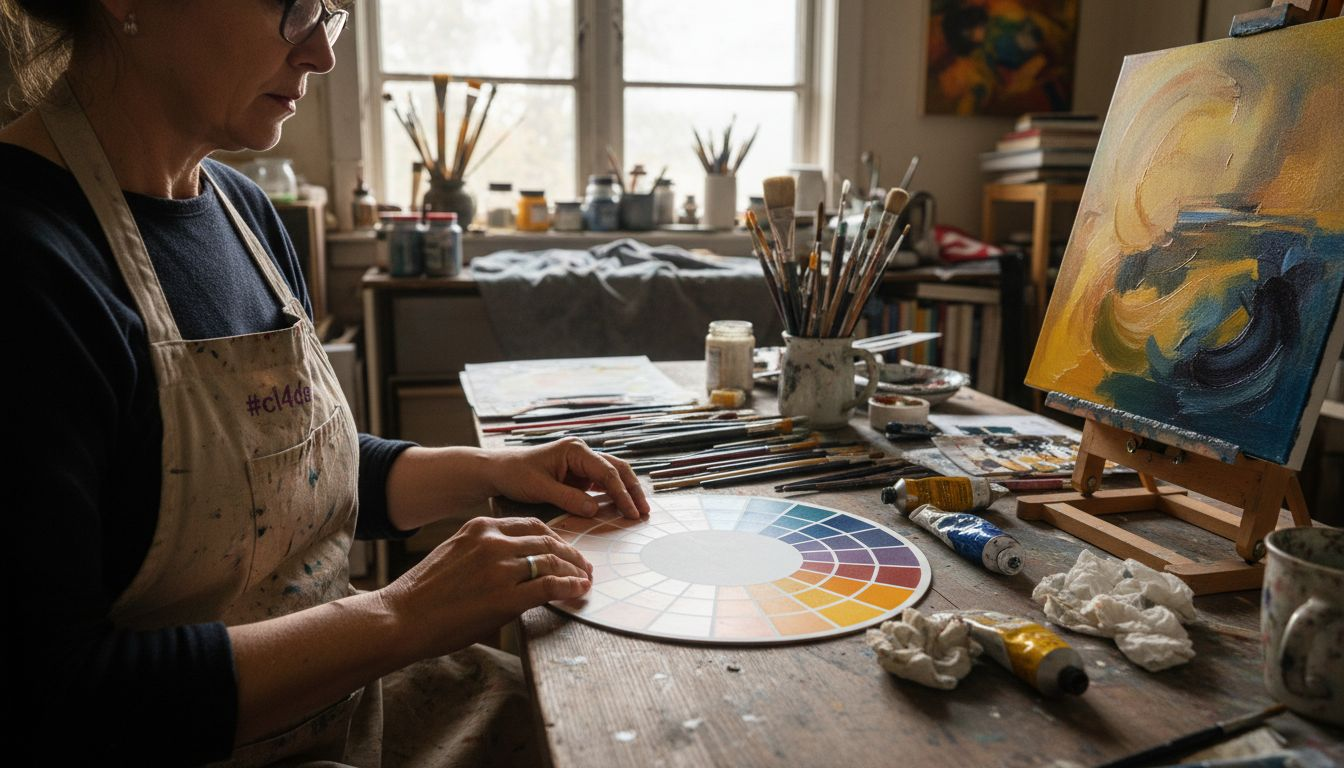
Step 3: Select a Harmonious Color Palette
Selecting the perfect color palette is an art form that transforms your interior design from ordinary to extraordinary. This crucial step bridges the gap between your client’s vision and the actual visual experience of their space.
Start by exploring color harmony theories that provide structured approaches to color selection. The color wheel becomes your strategic tool for understanding relationships between different hues. Consider classic color schemes like analogous palettes that use colors adjacent to each other creating a smooth sophisticated look or complementary schemes that pair opposite colors for dramatic contrast. Remember that each color scheme communicates a different emotional temperature warm tones might create intimacy while cool tones suggest calm and spaciousness.
Professional designers understand that color harmony is more nuanced than rigid rules. Color interaction experiments reveal that context matters more than predetermined guidelines. Test your color combinations by creating small swatches and observing how they interact under different lighting conditions. Pay attention to how colors shift and influence each other create sample boards that include your artwork and surrounding interior elements to see how the entire palette communicates.
Pro Tip: Always create large color test panels and observe them at different times of day to truly understand how natural and artificial light transforms your selected palette.
Here’s a comparison of popular color scheme types and their impact on interior design:
| Color Scheme Type | Key Characteristics | Typical Effect on Space |
|---|---|---|
| Analogous | Uses colors side by side | Calm and harmonious look |
| Complementary | Opposite colors on wheel | Bold and energetic contrast |
| Monochromatic | Variations of one hue | Unified and subtle palette |
| Triadic | Three evenly spaced hues | Vibrant, balanced feel |
Step 4: Align Art Colors With Interior Elements
Successfully aligning art colors with your interior requires a strategic approach that transforms individual design elements into a cohesive visual narrative. This step is about creating intentional color conversations between your artwork and the surrounding space.
Begin by understanding principles of compositional design that treat color as a structural component. Examine your existing interior palette carefully noting dominant colors secondary tones and architectural details. Look for opportunities to extract accent colors from your artwork that can subtly echo or complement existing elements. For instance a painting with deep navy undertones might connect beautifully with navy throw pillows or a matching picture frame trim.
Professional designers recognize that holistic design approaches create more harmonious spaces. Consider how each color interacts not just visually but emotionally. A warm terracotta artwork might softly reference similar tones in wooden furniture while creating a sense of warmth. Pay attention to proportions ensure that your art colors enhance rather than overwhelm the existing interior palette. Sometimes this means selecting artwork with colors that are present in small quantities creating a subtle visual thread that ties the room together.
Pro Tip: Take a smartphone photo of your interior in black and white to objectively analyze color balance and distribution without being distracted by specific hues.
Step 5: Test Combinations With Sample Visuals
Testing color combinations is your critical quality control moment where theoretical design meets practical visual reality. This step transforms abstract color choices into concrete visual experiences that reveal the true potential of your art and interior design.
Utilize color combination testing tools that help evaluate color interactions under various conditions. Create digital mockups or physical sample boards that simulate actual room environments. Position your artwork against different background colors take photographs and review them critically. Pay special attention to how colors shift and interact under different lighting scenarios morning sunlight will render colors differently compared to evening artificial lighting.
Professional designers leverage palette visualization technologies to experiment and refine color selections rapidly. Create multiple iterations of your color scheme testing subtle variations. Consider photographing your samples in black and white to objectively assess tonal relationships and contrast levels. Look for visual harmony where colors complement each other without competing for attention. The goal is creating a sophisticated visual dialogue between your artwork and interior elements that feels intentional and seamless.
Pro Tip: Use digital color sampling apps that allow you to extract exact color codes from your artwork to match with interior paint and fabric swatches precisely.
Below, find a summary of essential technology tools used throughout the color selection process:
| Tool Type | Core Function | Benefit for Designers |
|---|---|---|
| Color Meter Apps | Measure light & color | Increases color accuracy decisions |
| Mood Board Platforms | Gather visual examples | Clarifies client preferences visually |
| Palette Visualization | Preview color schemes | Accelerates palette experimentation |
| Digital Color Samplers | Extract color codes | Ensures precise color matching |
Step 6: Finalize and Confirm Color Choices
The final stage of your color selection journey is about strategic validation and ensuring your artistic vision translates perfectly into the interior space. This critical moment transforms your carefully curated palette from a concept into a tangible design reality.
Apply color theory principles to systematically evaluate your selections. Assess each color’s hue value and saturation critically. Consider how different colors interact emotionally and visually. Professional designers recommend breaking down your color palette into precise percentages using the 60-30-10 rule. This approach suggests using 60% of a dominant color 30% of a secondary color and 10% of an accent color to create balanced visually compelling spaces. This methodical approach helps prevent color overwhelm and ensures a sophisticated harmonious design.
Schedule a final review with your client presenting large scale color samples that demonstrate how artwork and interior elements will integrate. Create digital renderings or physical mockups that showcase the complete color experience. Walk them through your color rationale highlighting how each selection supports the overall design narrative. Be prepared to make nuanced adjustments that reflect their feedback while maintaining the integrity of your original artistic vision.
Pro Tip: Always present color choices using large format samples viewed under multiple lighting conditions to provide the most accurate representation of the final design.
Elevate Your Interior with the Perfect Art Color Scheme
Struggling to select a color palette that truly brings your space to life and harmonizes with your unique lighting and style Consider how aligning art colors with your interior elements can transform your room into an emotional and visual masterpiece. The article discussed how critical it is to assess light sources, understand client preferences, and carefully test color combinations to create an inspiring interior design that feels authentic and balanced.
Discover exclusive Art Prints on Canvas for Inspired Home Decor | Shop Unique Designs at Eman’s Gallery, where every piece reflects a thoughtful color harmony meant to complement a variety of interior styles and lighting conditions.
Explore premium Canvas Art Prints by Eman Khalifa | Premium Giclée Wall Art – Eman’s Gallery crafted to help you finalize your curated palette with artwork that speaks to your personal vision. Don’t wait to turn your color scheme dreams into reality. Visit Eman’s Gallery now and transform your home into a stunning sanctuary with art designed to inspire and bring cohesion to your interior space.
Frequently Asked Questions
How can I assess my room’s lighting when choosing a color scheme for art?
To assess your room’s lighting, observe how natural light enters at different times of day and consider the effects of your artificial lights. Document these variations with a lighting journal or smartphone photos to inform your art selection.
What should I discuss with my client to identify their art preferences?
Engage your client in an in-depth consultation, asking open-ended questions about their favorite art styles, colors that evoke certain memories, and the mood they want to create. This conversation will help you understand their unique tastes and guide your color palette choices.
How can I create a harmonious color palette for interior art?
Start by exploring color harmony theories using the color wheel to choose schemes like analogous or complementary colors. Test small swatches in your space to see how they interact under different lighting conditions before finalizing your palette.
What steps should I take to align art colors with existing interior elements?
Examine your current interior palette, noting dominant and secondary colors along with architectural details. Extract accent colors from your artwork to create subtle connections with existing elements like pillows or frames for a cohesive look.
What is the 60-30-10 rule in color selection, and how do I apply it?
The 60-30-10 rule suggests using 60% of a dominant color, 30% of a secondary color, and 10% as an accent color to achieve balance in your design. Apply this method to create visually appealing spaces that prevent color overwhelm and ensure harmony in your selections.
How can I effectively test color combinations before making final decisions?
Create digital mockups or physical sample boards to visualize your color combinations in a real environment. Analyze how the colors interact under various lighting conditions to ensure a cohesive look before committing to your final choices.
Recommended
- Role of Color in Art – Impact on Mood and Space
- Complete Guide to Types of Art for Interiors – Eman’s Gallery
- Art Styles Explained: Shaping Luxury Interiors
- Art and Interior Design Explained: Transforming Modern Spaces
- The Role of Color Psychology in Web Design: Captivating Users through Emotional Connections – Lind Creative
- Trendy w kolorystyce | Emmi kuchnie meble na wymiar bydgoszcz
Stay Connected
- ✨ Explore Eman Khalifa’s original art and fine art prints
- 📸 Follow Eman Khalifa’s art journey on: Instagram @emans_gallery and Facebook Eman’s Gallery
- 📹 Watch Eman Khalifa creating live art on: YouTube @emans_gallery