


What Is Abstract Print? A Guide for Art Enthusiasts
TL;DR:
- Abstract prints are non-representational artworks constructed from deliberate arrangements of color, line, and texture. They range from fully non-objective to partially stylized compositions, created through techniques like giclée or screenprinting. Understanding their visual elements, techniques, and emotional impact enhances appreciation and informed purchasing decisions.
If you’ve ever stood in front of a print and wondered what it actually means, you’re not alone. The question of what is abstract print trips up even seasoned art buyers. Abstract prints are not random marks or unfinished ideas. They are compositions built from deliberate arrangements of color, line, shape, and texture, with no obligation to represent the visible world. Understanding how they work, how they’re made, and what separates a giclée from a screenprint will change how you see, select, and live with them.
Key Takeaways
| Point | Details |
|---|---|
| Abstract print defined | Abstract prints use non-representational visual elements like shape, line, and color instead of realistic depictions. |
| Abstraction is a spectrum | Prints range from pure non-objective compositions to partially stylized forms with recognizable cues. |
| Technique shapes the work | Giclée and screenprinting produce different textures, finishes, and collector values from the same source image. |
| Emotional impact is real | Research shows abstract compositions follow hidden mathematical structures that influence human perception. |
| Buying smart matters | Ask about ink type, substrate, and edition size before purchasing any abstract print. |
What is abstract print: characteristics and core visual elements
Abstract print is the term most commonly used to describe printed artwork that does not attempt to represent recognizable objects, people, or places. The more precise industry term is non-objective or non-representational printmaking, though “abstract print” has become the dominant label in both the art market and interior design world.
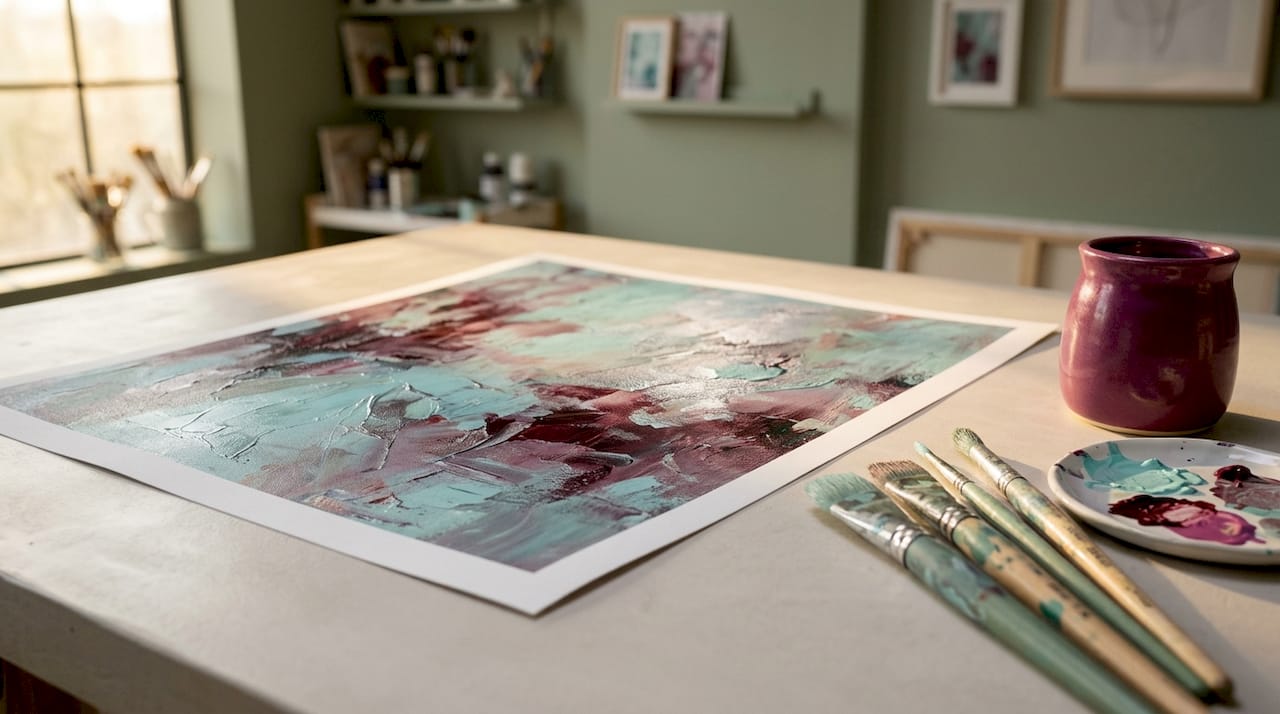
The six core elements of abstract art, line, shape, form, color, texture, and space, serve as the primary building blocks of any abstract print. Rather than describing a scene, these elements become the subject itself. A sweeping arc of cobalt blue is not a sky. It is a line with weight, direction, and emotional charge.
In the fashion and textile industries, the term carries a specific technical meaning. Abstract prints in textiles describe non-objective motifs emphasizing geometric shapes, lines, and colors over any realistic imagery. That definition holds across wall art, canvas prints, and fabric goods alike.
Key characteristics that define abstract prints:
- Non-representational content. No recognizable subjects. Shapes, lines, and color relationships carry the entire visual message.
- Formal element dominance. Line, shape, form, color, texture, and space drive composition.
- Intentional structure. Despite appearing spontaneous, most abstract prints reflect deliberate artistic choices.
- Range of abstraction. Some works are purely non-objective. Others are partially abstract, simplifying or distorting real forms until they become unrecognizable.
That last point matters. Abstract art spans a spectrum from full non-representation to partial stylization with recognizable cues. A print that reduces a forest to vertical color bands is still abstract, even though a viewer might sense something organic in it.
Pro Tip: When evaluating an abstract print, ask yourself whether the visual impact comes from what is depicted or from how the elements are arranged. If it’s the latter, you’re looking at abstraction.
Abstract print techniques: giclée vs. screenprinting
How a print is made determines nearly everything about how it looks, feels, and lasts. Two methods dominate the contemporary abstract print market, and understanding them protects you from paying the wrong price for the wrong product.
Giclée printing is a digital process. A high-resolution digital file is output through a precision inkjet printer using pigment-based inks on archival substrates, producing smooth, continuous tones with extraordinary color depth. The result is mechanically consistent. Every print in an edition is virtually identical. Giclée works well for abstract compositions with subtle gradients, layered transparencies, or fine textural detail that would be difficult to replicate through other means.
Screenprinting, also called serigraphy, works differently. Ink is pushed through a mesh screen using stencils, one color at a time. The ink sits on the surface with physical body, creating tactile, opaque layers you can sometimes feel with a fingertip. That texture is not a flaw. For geometric abstractions or bold color-field compositions, the ink’s physical presence adds a dimension that giclée cannot replicate.
| Attribute | Giclée | Screenprinting |
|---|---|---|
| Process | Digital inkjet from file | Stencil and mesh, hand or mechanical |
| Ink type | Pigment-based, archival | Opaque, surface-sitting layers |
| Surface texture | Smooth, continuous | Tactile, visible ink body |
| Color range | Virtually unlimited gradients | Limited to defined color separations |
| Archival quality | Up to 200 years with proper materials | Variable, depends on ink and substrate |
| Collector perception | Reproductions and editions | Often associated with limited-edition fine art |
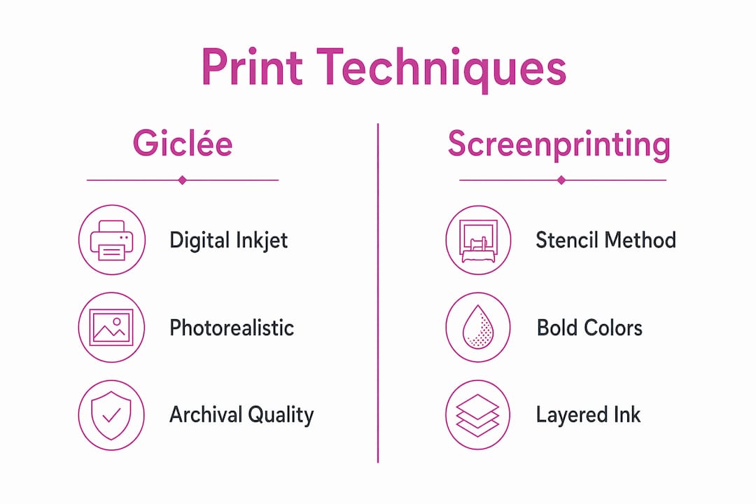
One practical issue in the market is that confusion between giclée and screenprinted works affects both secondary market pricing and buyer expectations. Sellers sometimes use “fine art print” to describe both without clarification. Always ask which process was used.
Registration is another technical factor worth knowing. In screenprinting, precise alignment across color layers is critical for maintaining optical rhythm in geometric abstractions. Misalignment across color passes can disrupt the intended visual harmony. Inspecting the registration on a multi-color screenprint tells you a great deal about production quality.
Pro Tip: Request a close-up photo of the print surface before buying online. Giclée will appear smooth and photographic. A screenprint will show ink texture or slight layering at the edges of color shapes. That difference matters for both aesthetics and value.
The significance and emotional impact of abstract prints
Abstract prints communicate without describing. That sounds like a paradox, but color, line, and texture carry genuine emotional content independent of any subject matter. A dense, dark composition with compressed forms reads differently than an open field of pale washes, even without a single recognizable object.
Research supports what many viewers sense intuitively. A study on mathematical patterns in abstract art identified structural characteristics shared by renowned abstract artists that correlate with human visual perception, distinguishing authentic works from AI-generated imitations. The implication is that skilled abstract artists embed structural logic into their compositions, even when working through instinct.
“Abstract art is not the absence of content. It is content freed from the obligation of description.” This framing helps explain why viewers often feel a strong response to a print before they can articulate why.
Color theory plays a significant role here. Warm tones tend to advance visually and provoke energy. Cool tones recede and calm. A predominantly ochre and crimson abstract print will activate a room differently than one built from slate and ivory. These effects are not symbolic. They are perceptual, grounded in how the human visual system processes wavelength and contrast.
Partial abstraction adds another layer. When an abstract print retains faint suggestions of landscape, figure, or botanical form, it creates a more participatory experience. The viewer fills in the gaps, which makes the engagement more personal and often more lasting.
Selecting and displaying abstract prints
Choosing an abstract print for your space is not a mystery, but it does require some deliberate thinking. The process works best when you treat it as a series of concrete decisions rather than a search for the “right” feeling.
- Assess your space’s dominant tones. Note the wall color, flooring, and upholstery. An abstract print should create either a harmonious extension of those tones or a deliberate contrast. Neither approach is wrong, but mixing both in the same room rarely works.
- Consider scale relative to the wall. A small, intricate abstract print on a large wall will disappear. Large-scale abstract work on an overfull wall overwhelms. Measure before you order.
- Match compositional complexity to the room’s function. High-energy abstract compositions with saturated color and dynamic line work can energize a studio or entryway. A bedroom or reading space typically benefits from calmer compositions with greater open space and softer color relationships.
- Understand what you’re buying. Distinguish between a decorative reproduction, a limited-edition print, and an original work. Each has different implications for price, care, and long-term value.
- Check archival specifications. For giclée prints, ask whether the substrate is acid-free or cotton rag and whether pigment inks were used. Archival pigment inks on quality substrates can extend print life to 75 to 200 years.
Pro Tip: For professional or commercial spaces, consider print technique as part of the interior specification. A screenprinted abstract work adds tactile presence and perceived authenticity that a digital reproduction cannot match at the same price point.
You can find structured advice on choosing prints for home that addresses lighting conditions, frame selection, and placement in relation to furniture. These practical details affect how the print reads in the room as much as the image itself.
Common types and styles of abstract prints
Abstract prints appear across a wide range of styles and contexts. Recognizing the main categories helps you articulate what you respond to and what you’re actually looking for.
- Geometric abstraction. Hard edges, precise forms, and structured color relationships. These prints favor order and visual logic. They work particularly well in contemporary interiors with clean architecture.
- Color field abstraction. Large areas of flat or subtly modulated color with minimal compositional incident. Mark Rothko’s paintings are the canonical reference point, though printed interpretations vary widely.
- Expressionistic abstraction. Visible gesture, energetic mark-making, and organic form. The composition feels like it retains the movement of its creation.
- Ink splash and fluid abstraction. Poured, splashed, or flowed pigment creates unpredictable forms that the artist directs but does not fully control. These prints often carry striking tonal depth and movement.
- Textural abstraction. Surface quality is the primary interest. Layered media, mixed pigment, or collage elements create prints with physical and visual richness.
In textiles and fashion, types of abstract prints include all of the above applied to fabric design, where scale, repeat patterns, and color limitations shift how the abstraction reads on the body or on home goods.
My perspective on abstract prints in contemporary art
I’ve spent years working with abstract compositions, and one thing I’ve come to believe firmly is that most people undervalue the role of process in abstract printmaking. Buyers focus on the image and overlook the technique. That’s understandable, but it means they sometimes pay equivalent prices for works with very different physical presence and longevity.
What I find genuinely interesting about abstraction right now is how printing technology has complicated the line between original and reproduction. A giclée of an original painting is a faithful, archival reproduction. A hand-pulled screenprint is itself an original work in a different medium. Those are not the same thing, and the market doesn’t always make that distinction clear.
My honest advice: spend time with prints in person before committing. A photograph of a screenprint cannot communicate the ink’s surface texture or how light falls across layered color. The definition of abstract art may be intellectual, but the experience of living with an abstract print is physical. Trust your response to the actual object, not just the image.
I also think people underestimate how much abstraction rewards repeated viewing. A work that seems simple on first encounter often reveals compositional logic or subtle color relationships over time. That depth is what separates a print worth collecting from one worth decorating.
— Eman
Discover abstract prints at Emansgallery
Emansgallery offers a curated selection of original abstract paintings and museum-quality canvas prints created by artist Eman Khalifa. Each work is produced using archival pigment inks on fine art substrates, with options ranging from intimate formats to large-scale wall installations. The fluid abstract original Good Tidings exemplifies the kind of movement and color depth that abstract painting achieves at its most direct. For collectors preferring printed editions, the canvas print collection spans expressionist, ink-splash, and conceptual styles. Worldwide shipping is available from the UK, USA, Canada, Australia, Germany, the UAE, and beyond.
FAQ
What is an abstract print in simple terms?
An abstract print is a printed artwork that uses shapes, lines, colors, and textures as its primary subject rather than depicting recognizable objects or scenes. The six elements of abstract art — line, shape, form, color, texture, and space — replace realistic imagery as the content of the work.
What is the difference between giclée and screenprinting for abstract art?
Giclée is a digital inkjet process producing smooth, continuous tones using archival pigment inks. Screenprinting pushes ink through a mesh stencil to create tactile, opaque layers with visible surface texture. The two methods produce different visual and physical qualities that affect both appearance and collector value.
How do I know if an abstract print is archival quality?
Ask whether the print uses pigment-based inks and an acid-free or cotton rag substrate. Archival pigment prints on quality materials can last 75 to 200 years. Dye-based inks or standard paper will fade significantly faster under normal display conditions.
Can abstract prints work in any interior style?
Abstract prints adapt well across interior styles because their impact comes from color, scale, and composition rather than subject matter. Geometric abstractions suit contemporary and minimalist spaces. Fluid or expressionistic prints work in eclectic, maximalist, or transitional interiors. Scale and color palette selection matter more than style matching.
What makes one abstract print more valuable than another?
Edition size, printmaking technique, substrate quality, and the artist’s involvement in the production all affect value. A hand-pulled limited-edition screenprint carries different collector weight than an open-edition digital reproduction, even when the source image is identical.
Stay Connected
- ✨ Explore Eman Khalifa's original art,
- Follow Eman Khalifa's art journey on: Instagram @emans_gallery and Facebook Eman's Gallery
- Watch Eman Khalifa creating live art on: YouTube @emans_gallery
