


How to Plan a Gallery Wall: 2026 Design Guide
TL;DR:
- Planning a gallery wall involves precise measurements, cohesive frame choices, and testing layouts before hanging. Using templates and fixing the artwork at an eye level of 57–60 inches creates a balanced and intentional display. Proper spacing and secure mounting techniques ensure the gallery remains level and visually appealing over time.
A gallery wall is a curated arrangement of framed artwork, photographs, and objects displayed together on a single wall to create a unified visual statement. Knowing how to plan a gallery wall before you touch a single nail saves you from crooked frames, awkward spacing, and layouts you will want to redo in a week. This guide covers every step: measuring your wall, selecting frames, choosing a layout strategy, and hanging artwork with the precision of a professional installer. You will also find specific tools, spacing standards, and design principles used by interior designers in 2026.
What tools and measurements do you need before planning a gallery wall?
Preparation is the step most homeowners skip. It is also the step that determines whether your finished wall looks intentional or improvised.
Start by measuring your wall’s full width and height. Note every obstruction: light switches, electrical outlets, vents, and the top edge of any furniture sitting against the wall. A sofa or console table sets a visual floor for your arrangement. Your gallery wall should sit above it, not float independently of it.
The industry standard for hanging artwork places the center point at 57–60 inches from the floor. This matches museum eye level and keeps art grounded relative to the furniture below it.
Recommended tools checklist
- Tape measure: Record wall width, height, and furniture clearance in inches
- Painter’s tape: Mark the outer boundary of your planned arrangement directly on the wall
- Kraft paper: Cut templates matching each frame size for a damage-free dry run
- Level: Confirm horizontal alignment before and after hanging
- Digital layout apps: Tools like Canva, RoomSketcher, or a simple photo editing app let you mock up arrangements on screen before committing
Standard measurements at a glance
| Measurement | Standard value | Notes |
|---|---|---|
| Center point height | 57–60 inches from floor | Matches museum hanging standard |
| Spacing between frames | 2–3 inches | For frames smaller than 16x20 inches |
| Spacing for large frames | ~4 inches | For frames larger than 16x20 inches |
| Minimum wall clearance | 6–8 inches above furniture | Keeps arrangement visually anchored |
Planning typically takes about two hours of focused work, and 92% of homeowners revise their layouts multiple times after creating digital mockups. That number tells you one thing: do the planning work before you pick up a hammer.
How do you choose the right artwork and frames for a cohesive look?
Frame selection is where most gallery walls fall apart. Too many sizes, too many finishes, and the wall reads as chaotic rather than curated.

Limiting frame sizes to two or three standard options and working within a unified color palette creates a professional, cohesive result. Architectural Digest identifies this as the single most reliable principle for gallery wall design. It removes visual noise and lets the artwork carry the story.
Mixing frame styles without losing unity
You can mix wood, metal, and gold-accent frames successfully. The rule is to keep one variable consistent. If you vary the frame material, keep the color family the same. If you vary the color, keep the profile width consistent. Mixing both simultaneously creates clutter.
For artwork selection, consider these principles:
- Color continuity: Choose pieces that share at least one color. A blue abstract, a coastal photograph, and a botanical print can coexist if they all carry the same teal undertone.
- Genre balance: Mix one large statement piece with smaller supporting works. A large abstract painting anchors the wall; smaller photographs or prints fill the surrounding space.
- Orientation variety: Alternate vertical and horizontal frames to create rhythm. A wall of all vertical frames feels rigid. A wall of all horizontal frames feels flat.
- Subject coherence: Your pieces do not need to match literally. They need to tell a consistent story, whether that story is “calm coastal living” or “bold geometric energy.”
Pro Tip: Lay all your frames on the floor before touching the wall. Photograph the arrangement from above with your phone. That bird’s-eye view reveals imbalances you cannot see when standing in front of the wall.
Designers at Architectural Digest stress curation over calculation. A gallery wall is a visual story, not a math problem. Rigid formulas produce stiff results. Thoughtful selection produces walls people stop to look at.
What are the most effective layout strategies for arranging artwork?
Layout is where planning becomes visible. The arrangement you choose determines whether your wall feels balanced, dynamic, or crowded.
Start with your largest or most dominant piece and build the arrangement outward from there. This anchor piece sets the visual weight for everything else. All other frames respond to it.
Symmetric vs. asymmetric arrangements
Symmetric layouts place the largest piece at the center and mirror the surrounding frames on both sides. This approach works well in formal spaces: dining rooms, entryways, and hallways. It reads as deliberate and structured.
Asymmetric layouts place the anchor piece slightly off-center and distribute visual weight through size variation and spacing. This approach suits living rooms and creative spaces. It feels more organic and less predictable.
Neither is superior. The right choice depends on your room’s existing symmetry and the mood you want to create.
Step-by-step layout process
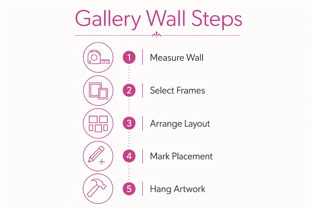
- Measure your wall and mark the outer boundary with painter’s tape
- Cut kraft paper templates matching each frame and tape them to the wall
- Leave the templates up for at least 24 hours and view them at different times of day
- Adjust positions until the arrangement feels balanced from your normal viewing distance
- Photograph the final template arrangement before removing the paper
- Use the photo as your hanging reference
Pro Tip: Step back at least 10 feet to evaluate your layout. Most people stand too close and miss the overall composition. Distance reveals the arrangement’s actual visual weight and balance.
Spacing matters as much as placement. Standard spacing of 2–3 inches works for smaller frames. Frames larger than 16x20 inches need about 4 inches of clearance to avoid visual crowding. Each piece needs room to register as an individual work.
Negative space around the gallery wall’s edges is not wasted space. House Beautiful identifies it as a deliberate design choice that creates an editorial, intentional look. Your arrangement does not need to fill every inch of wall. Breathing room makes each piece more impactful.
For a complete step-by-step reference, the gallery wall checklist for modern homes at Emansgallery covers every stage from wall prep to final adjustment.
How do you hang and maintain a gallery wall that stays level?
Hanging is the final physical step, and it is where small errors become permanent problems. Two common mistakes are using a single nail per frame and eyeballing spacing without measuring.
Two drywall screws per frame keep artwork level and prevent rotation when someone bumps the wall or closes a nearby door. A single nail allows the frame to pivot. Two anchor points eliminate that movement entirely.
Hanging tips that prevent common mistakes
- Mark nail positions through the kraft paper template before removing it. This transfers your planned layout directly to the wall without guessing.
- Use a level on every frame after hanging, not just the first one. Frames that look level in isolation often reveal a slight tilt when viewed as a group.
- Measure spacing between frames with a ruler, not by eye. Two inches looks different depending on frame size and wall color.
- Check alignment against your furniture once all frames are up. The arrangement should sit visually above the sofa or console, not drift upward or crowd the furniture.
Options for renters
Renters cannot always use screws. Removable mounting putty prevents frame shifting without wall damage and works well for lighter frames under 5 pounds. For heavier pieces, adhesive strips rated for the frame’s weight are a reliable alternative. Both options allow you to adjust and remove artwork without patching walls when you move.
Pro Tip: Install a picture ledge or floating shelf as part of your gallery wall. Ledges let you swap artwork without new nail holes, which makes updating your display as your collection grows much easier.
Maintaining a gallery wall over time is straightforward. Dust frames with a dry microfiber cloth every few weeks. Check that frames remain level every few months, especially in homes with high foot traffic or frequent door use. When you add new pieces, lay the full arrangement on the floor again to confirm the new addition fits before hanging it.
For detailed hanging guidance, the step-by-step hanging guide at Emansgallery covers tool selection and nail placement in full.
Key takeaways
Successful gallery wall planning requires accurate measurements, deliberate frame selection, and a tested layout before any nails go into the wall.
| Point | Details |
|---|---|
| Set the center height first | Hang artwork so the arrangement’s center sits 57–60 inches from the floor. |
| Limit frame variety | Use two to three frame sizes and one color palette to keep the wall cohesive. |
| Use kraft paper templates | Cut and tape paper templates for 24 hours before hanging to test your layout. |
| Space by frame size | Use 2–3 inch gaps for small frames; increase to 4 inches for frames over 16x20 inches. |
| Anchor with the largest piece | Place your dominant artwork first and build the arrangement outward from it. |
What I have learned from planning gallery walls
Most people overthink the art selection and underthink the wall preparation. I have seen beautifully curated collections hung badly, and the result is always disappointing regardless of how good the individual pieces are. The wall prep, the templates, the spacing measurements: those are what separate a gallery wall that looks designed from one that looks decorated.
The advice I give most often is this: spend more time on the floor than on the wall. Lay everything out. Photograph it. Live with the photo for a day. Your eye catches problems in a photograph that it misses when you are standing in the room surrounded by the actual frames.
I also think the “rules” around matching frames are overused as a reason not to start. A mix of wood and metal frames can work beautifully if the artwork connects them. What actually matters is that the pieces share a visual language, whether that is color, subject, mood, or scale. Rigid matching produces safe results. Thoughtful mixing produces memorable ones.
One practical note for renters: ledge displays are genuinely underrated. A single floating ledge at the right height lets you build a gallery wall that evolves with your collection without committing to a fixed layout. You can add, remove, and rearrange without touching a wall.
— Eman
Find original artwork for your gallery wall at Emansgallery

Emansgallery offers original handmade paintings and museum-quality canvas prints in styles that work as gallery wall anchors or supporting pieces. Artist Eman Khalifa’s work spans abstract, geometric, floral, landscape, and seascape genres, with pieces available in multiple sizes to fit standard frame dimensions. Whether you need a large statement piece to anchor your arrangement or a series of smaller prints to fill the surrounding space, the wall art prints collection at Emansgallery covers both. Pieces like the fluid blue gold ocean painting and the geometric urban canvas print are sized and styled for gallery wall use. Emansgallery ships worldwide from the UK, USA, Canada, Australia, and beyond.
FAQ
What is the correct height for a gallery wall?
The center point of a gallery wall should sit 57–60 inches from the floor, matching the museum eye-level standard. This height keeps artwork grounded relative to furniture below it.
How many frames should a gallery wall have?
Most well-designed gallery walls contain between 5 and 15 frames. Fewer than 5 pieces rarely creates the layered effect; more than 15 can become difficult to arrange without visual crowding.
How do you arrange artwork on a gallery wall without damage?
Cut kraft paper templates matching each frame, tape them to the wall, and leave them for 24 hours before hanging. This method lets you test and adjust the full layout without making a single nail hole.
What spacing should you use between gallery wall frames?
Use 2–3 inch gaps between frames smaller than 16x20 inches. For larger frames, increase spacing to about 4 inches to prevent visual crowding and preserve each piece’s individual impact.
Can renters create a gallery wall without damaging walls?
Yes. Removable mounting putty works for lighter frames, and adhesive strips rated for the frame’s weight handle heavier pieces. A floating picture ledge is another option that requires only a few screws and allows full flexibility to rearrange artwork without new wall damage.
Stay Connected
-
✨ Explore Eman Khalifa's original art, fine art prints & art merchandise
-
Follow Eman Khalifa's art journey on: Instagram @emans_gallery and Facebook Eman's Gallery
-
Watch Eman Khalifa creating live art on: YouTube @emans_gallery
-
Supported by BabyLoveGrowth
