


How to Make a Gallery Wall: A Step-by-Step Guide
TL;DR:
- A gallery wall is a curated arrangement of art, photographs, and decor objects displayed on a single wall. It transforms a blank wall into a personal, visually balanced space using diverse pieces and careful planning.
A gallery wall is a curated arrangement of art, photographs, and decor objects displayed together on a single wall to create a unified visual statement. Done well, it turns a blank wall into the most personal corner of your home. This guide covers how to make a gallery wall from start to finish, including what to include, how to arrange a gallery wall for balance, and how to hang everything cleanly. You will need a measuring tape, a level, painter’s tape, and a clear sense of your own style before you begin.
How to make a gallery wall: choosing what to include
The pieces you select define the entire character of your arrangement. A strong gallery wall mixes types, not just styles.
Start by gathering a range of items across these categories:
- Paintings and original art. Original works carry the most visual weight and personality. An abstract canvas or a landscape painting from Emansgallery gives the wall a focal point no print can replicate.
- Photographs. Personal photos, travel shots, or fine art photography add narrative depth. Black-and-white prints create instant cohesion when mixed with color art.
- Prints and posters. Affordable and widely available, prints fill gaps and reinforce a color story.
- 3D objects. Mixing 2D and 3D art such as fiber art, mirrors, woven textiles, and small sculptures adds depth that flat frames cannot achieve. This breaks the monotony of a frame-only wall.
- Heirloom and found objects. Vintage clocks, ceramic plates, and travel souvenirs tell a story that purchased art alone cannot.
Cohesion does not require matching frames. A unifying common thread like a shared color palette, a consistent matte board color, or a repeating material such as wood or brass ties diverse pieces together. You can mix black frames with natural wood frames as long as the matte boards are all white, for example.
Balancing larger and smaller frames while mixing landscape and portrait orientations adds movement to the arrangement. A wall of identically sized, same-orientation frames reads as flat and static.
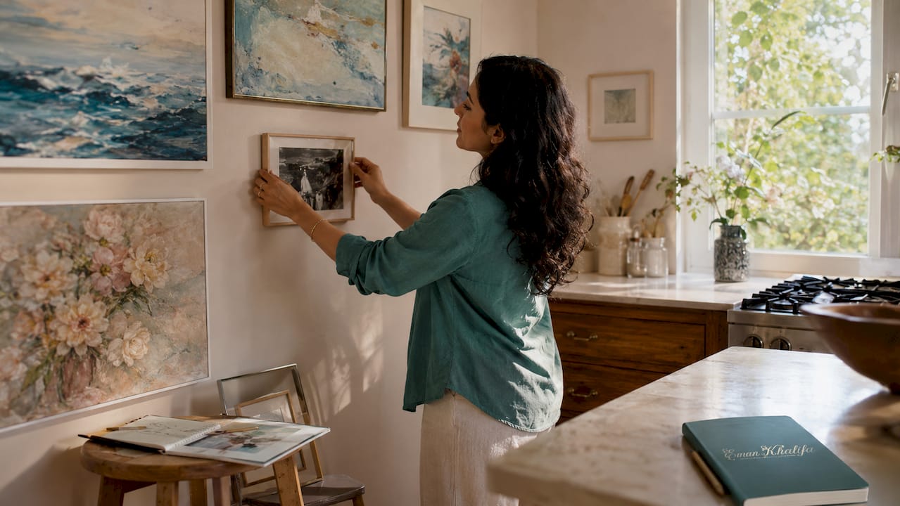
Pro Tip: Add at least one 3D element, even a small woven wall hanging or a convex mirror. It gives the eye a place to rest and adds a layer of texture that photographs cannot replicate.
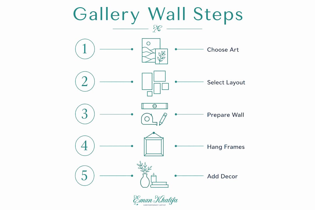
How to plan your gallery wall layout
Planning on paper before touching the wall saves time and prevents unnecessary nail holes. Follow these steps in order.
- Measure your wall space. Note the width and height of the area you want to fill. A common mistake is underestimating how much space a full arrangement needs. Most gallery walls work best when they span at least 4 feet wide.
- Choose a layout style. Grid layouts use uniform frames in even rows and suit beginners. Asymmetric cluster styles give a more curated, collected feel but require more planning. Salon style fills the wall densely from floor to ceiling for a maximalist effect.
- Cut paper templates. Life-sized paper templates cut from kraft paper let you arrange and rearrange frames on the wall without a single nail. Tape them up, step back, and adjust until the layout feels right.
- Set your center height. The center of your gallery wall should sit 57–60 inches from the floor. This is the industry-standard eye-level rule used in professional galleries and interior design.
- Anchor with the largest piece. Hang the largest artwork off-center first. Centering the biggest piece creates a rigid, symmetrical look. Placing it slightly off-center gives the arrangement room to breathe and grow organically.
- Space pieces consistently. Spacing of 2–3 inches between frames creates cohesion without overcrowding. Wider gaps make the arrangement feel disconnected.
| Layout style | Best for | Visual effect |
|---|---|---|
| Grid | Beginners, uniform frames | Ordered, clean, symmetrical |
| Asymmetric cluster | Mixed frames and objects | Curated, personal, dynamic |
| Salon style | Large walls, many pieces | Bold, maximalist, layered |
Pro Tip: Avoid making every gap exactly the same. Slight spacing variation prevents the “tramline” effect, where the arrangement looks mechanical rather than naturally collected.
How to hang your gallery wall safely and accurately
Hanging is where most people make mistakes. Precision here determines whether the final result looks professional or crooked.
Tools you need:
- Level (a small torpedo level works well)
- Measuring tape
- Hammer and picture hooks
- Painter’s tape
- Pencil
- Command strips (for lighter pieces or renters)
Follow this sequence for clean results:
- Keep your paper templates on the wall. Do not remove them yet. Mark the nail position through each template by measuring the distance from the top of the frame to the hanging hardware on the back. Transfer that measurement onto the template and mark it with a pencil.
- Nail through the template. Drive your nail or hook directly through the paper at the marked point. Then tear away the paper. The nail sits exactly where it needs to be.
- Hang the anchor piece first. Start with the largest piece and confirm it is level before moving on. Every other piece positions relative to this one.
- Work outward from the anchor. Add pieces to the left, right, and below the anchor. Step back after every two or three additions to check the overall balance.
- Check level constantly. A small level on top of each frame after hanging catches problems before they compound across the whole arrangement.
Consistent spacing and balanced visual weight are the two factors that separate a gallery wall that looks intentional from one that looks accidental. Measure twice, hang once.
For renters or those who want flexibility, Command strips rated for the frame weight work well on lighter pieces. Floating ledges and picture rails eliminate nail holes entirely and allow easy rotation.
Gallery wall ideas: styles, themes, and creative approaches
The style you choose shapes how the wall feels in the room. Each approach suits different spaces and personalities.
Grid vs. salon vs. asymmetric cluster
| Style | Pros | Cons |
|---|---|---|
| Grid | Easy to execute, clean look | Can feel rigid or corporate |
| Salon | High impact, dramatic | Requires many pieces, hard to edit |
| Asymmetric cluster | Personal, dynamic, flexible | Needs careful visual weight balancing |
Asymmetric clusters achieve a more curated look when the visual weight is balanced on both sides of the arrangement. This means distributing heavier, darker, or larger pieces evenly rather than stacking them all on one side.
Ideas for mixing mediums and themes:
- Pair oil paintings with black-and-white photography for a classic editorial look.
- Combine geometric prints with abstract canvases for a contemporary feel. Emansgallery’s geometric canvas prints work particularly well as anchor pieces in modern arrangements.
- Use a single color as the unifying thread across otherwise unrelated pieces. Deep navy, warm terracotta, or forest green all work as connective tissue across a mixed collection.
- Incorporate African wall art or artisan objects to add cultural depth and texture to an eclectic arrangement.
- Add a mirror to reflect light and make the wall feel larger, especially in narrower rooms.
Floating shelves and ledges add flexibility that fixed nails cannot. You can rotate pieces seasonally, layer smaller objects in front of larger ones, and update the arrangement without touching the wall.
Pro Tip: Treat your gallery wall as a living collection, not a finished project. Add a piece from a trip, swap out a print for a new original, or shift the arrangement as your taste evolves. The best gallery walls grow over time.
Key takeaways
A successful gallery wall requires a clear anchor piece, consistent 2–3 inch spacing, and a unifying element such as a shared color palette or matte board to hold diverse pieces together.
| Point | Details |
|---|---|
| Start with an anchor piece | Hang the largest artwork off-center first at 57–60 inches center height. |
| Use paper templates | Cut kraft paper to frame sizes and tape to the wall before nailing anything. |
| Unify without matching | A shared matte board color or palette ties mixed frames into a cohesive arrangement. |
| Mix 2D and 3D elements | Adding mirrors, textiles, or sculptures creates depth that flat frames alone cannot achieve. |
| Space pieces 2–3 inches apart | Consistent spacing creates cohesion; slight variation prevents a mechanical look. |
What I have learned from building gallery walls that actually feel personal
Gallery walls fail for one reason more than any other: people treat them like a math problem instead of a creative act. They obsess over perfect symmetry, identical frame finishes, and even spacing until the result looks like a hotel corridor rather than a home.
The walls I find most compelling break at least one rule. A vintage ceramic plate next to a fine art print. A child’s drawing framed alongside a museum-quality original. A piece of fiber art where a painting “should” go. These choices signal that a real person lives there.
My honest advice is to start with one piece you genuinely love, not one that “goes” with the room. Build outward from that. When I work with collectors who want to display original paintings alongside personal photographs and travel finds, the results are always stronger than walls assembled purely for aesthetic coordination.
One thing most guides understate: the anchor piece carries the whole arrangement. If that first piece is weak or feels like a placeholder, the rest of the wall will never fully work. Invest in one piece that earns its position. An original painting from Emansgallery’s seascape or abstract collection gives a wall that kind of gravity. Everything else can be flexible, affordable, and personal.
Finally, do not wait until you have “enough” pieces. Hang what you have, live with it for a few weeks, and let the gaps tell you what is missing.
— Eman
Original art for your gallery wall from Emansgallery
A gallery wall built around original art has a presence that print-only arrangements rarely match.

Emansgallery offers original handmade paintings by artist Eman Khalifa across abstract, geometric, floral, landscape, and seascape styles. Each work ships worldwide from the UK, USA, Canada, Australia, and beyond. Whether you need a bold abstract canvas print to anchor a modern arrangement or an original oil painting to anchor a more traditional collection, Emansgallery carries pieces sized for real walls. Browse the full wall art prints collection to find your anchor piece, or explore originals like Good Tidings and Mystic Sea for statement pieces that hold a gallery wall together.
FAQ
What is the correct height for a gallery wall?
The center of a gallery wall should sit 57–60 inches from the floor. This is the industry-standard eye-level rule used in professional galleries and interior design.
How much space should I leave between frames?
2–3 inches between frames is the standard spacing for a cohesive gallery wall. Slight variation within that range prevents a mechanical, overly uniform look.
What should I include in a gallery wall?
A gallery wall works best with a mix of paintings, photographs, prints, and at least one 3D object such as a mirror, textile, or sculpture. A unifying element like a shared matte board color or palette ties diverse pieces together.
Which layout style is easiest for beginners?
Grid layouts are the most beginner-friendly because they use uniform frames in even rows. Asymmetric clusters require more planning but produce a more personal, curated result.
How do I hang a gallery wall without damaging the wall?
Cut kraft paper templates to the size of each frame and tape them to the wall first. Mark nail positions through the paper, drive the nails, then remove the paper. This method eliminates guesswork and reduces unnecessary holes.
Stay Connected
- ✨ Explore Eman Khalifa's original art, fine art prints and art-inspired merchandise.
- Follow Eman Khalifa's art journey on: Instagram @emans_gallery and Facebook
- Watch Eman Khalifa creating live art on: YouTube @emans_gallery
