


Good Living Room Color Schemes for Every Light and Style
The living room color schemes that work reliably fall into four families: warm neutrals, sage and green tones, earthy terracotta or plaster pink, moody navy, or charcoal. Pick based on your room’s light and how you use the space, then confirm the choice with large swatches before committing. Everything else, including the 2026 trends worth caring about, builds from that starting point.
TL;DR:
- For north-facing rooms, choose warmer neutrals like pink or yellow undertones, or go dark with deep greens or charcoals for a cozy feel.
- A dominant wall color should cover 60 percent of the room, supported by secondary furnishings and accents in a 30-10 proportion for a balanced look.
- Testing large swatches at different times of the day helps determine if a color maintains its tone under various lighting conditions before committing.
- Starting with art can simplify the palette, as a single piece with a strong secondary color can guide the entire room’s color scheme.
- Warmth and earthy tones dominate 2026 trends, with sage green remaining the top choice due to its versatility and ability to pair with natural materials.
Table of Contents
- The Best Living Room Colors: 15 Curated Palettes to Steal
- How to Choose a Living Room Color Based on Light and Use
- Building a Balanced Palette: The 60-30-10 Rule and the Undertone Test
- What’s Actually Trending for Living Rooms in 2026
- Testing Your Color Before You Commit to a Full Room
- Coordinating Wall Color with Art, Textiles, and Finishes
- Eman’s Tips: Letting Artwork Finish the Palette
- Matching Your Color Scheme to Your Living Room Style
- Coordinating Color with Flooring, Ceilings, and Architectural Details
- Adding Pattern and Texture Without Fighting Your Color Scheme
- Trends Fade, Warmth Doesn’t
- Another Way to Set Your Palette: Start With the Art
- Sources
- FAQ
The Best Living Room Colors: 15 Curated Palettes to Steal
A good palette is never just one color. It is a dominant wall tone, a secondary furnishing shade, and an accent that ties the room together. Below are fifteen combinations that designers return to again and again, organized from the safest choices to the boldest.
Warm neutral anchors:
- Accessible Beige + White Dove + brushed brass. This pairing reads warm without tipping into tan-heavy 1990s territory. Bobby Berk’s 2026 color list names both shades as standout picks for their ability to flatter almost any light. Use Accessible Beige on the walls, White Dove on trim, and let brass hardware or a single lamp carry the accent. Works in nearly any orientation, though it glows best in rooms that get afternoon sun.
- Agreeable Gray + linen textiles + walnut wood. A slightly warmer alternative to true gray, this scheme suits traditional and transitional rooms with existing wood furniture you don’t want to fight against.
- Alabaster + oatmeal boucle + black iron accents. Nearly white but never sterile, this combination is a favorite for north-facing rooms that need help feeling bright rather than cold.
Sage and green families:
- Dry Sage + cream + rattan. Sage has become the breakout color of the decade, and Dry Sage in particular pairs with almost any wood tone. Dominant on walls, cream on a sofa, rattan baskets or a coffee table as the secondary texture.
- Evergreen Fog + camel leather + brass. A deeper, moodier green that works as an accent wall or full-room commitment in south-facing rooms that can handle saturation.
- Sage green + terracotta pillow accents + oak flooring. This is the pairing designers keep coming back to for 2026, because the warmth of terracotta balances sage’s cooler undertone.
Terracotta and plaster pink:
- Caramelized (terracotta) + warm white + black metal. Bold on a single wall, this works especially well in living rooms with large windows and plenty of natural light to soften the intensity.
- Dusty plaster pink + charcoal + gold. Softer than it sounds, this combination reads sophisticated rather than sweet when paired with dark furniture legs and matte gold fixtures.
- Honey amber accent + white walls + walnut. Keep the walls neutral and let a honey amber sofa or rug do the work. Lower commitment, same warmth.
Moody navy and charcoal:
- Hale Navy + cream + brass. A classic for rooms used mostly in the evening, since navy reads richer under lamp light than daylight.
- Charcoal + camel + black leather. Cocooning and masculine leaning, best suited to larger rooms or those with high ceilings that can absorb the depth without feeling cramped.
- Deep forest + rust accents + brushed nickel. An alternative to navy for readers who want drama with a warmer undertone.
Soft black and jewel-box statements:
- Soft black (like Wrought Iron) + warm white trim + brass. Full commitment, but confining it to one wall or a built-in reduces the risk.
- Emerald accent wall + neutral base + gold frames. A jewel tone used sparingly, ideal for a formal or art-focused living room.
- Burgundy accent + warm neutral base + dark wood. The boldest option on this list, best kept to upholstery or a single architectural feature rather than four walls.
Every one of these pairs a dominant tone with a secondary and an accent. That is not incidental. It is the palette-building rule the next section breaks down.
How to Choose a Living Room Color Based on Light and Use
The fastest way to pick a good living room color scheme is to stop thinking about the color first and start with two questions: which direction do your windows face, and what do you actually do in this room?
North-facing rooms receive flat, cool light most of the day. Designers interviewed by Livingetc recommend warmer undertones here, pink or yellow-based neutrals rather than blue-gray, because cool colors in cool light can feel flat and uninviting. Alternatively, you can lean into the low light and go dark, using a cocooning charcoal or deep green that reads intentional rather than gloomy.
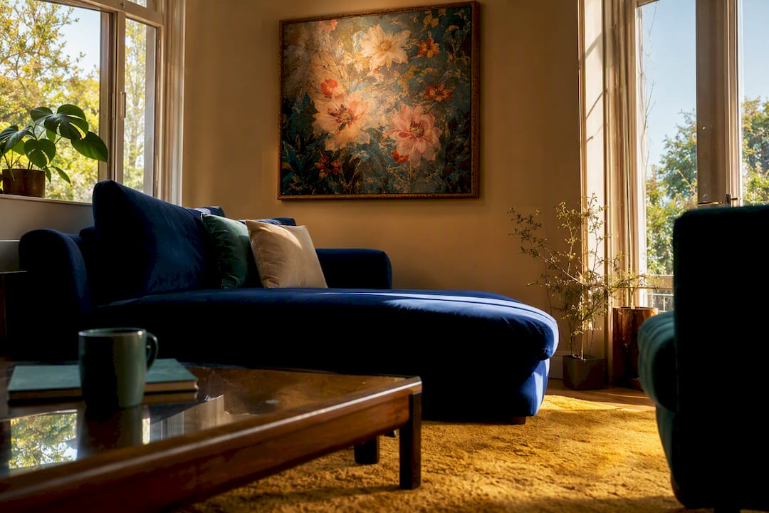
South-facing rooms get the most consistent, warm daylight, which gives you the most flexibility. Pale, saturated, or cool shades all read well here, since the light itself corrects for a color’s tendency to feel cold. East-facing rooms run warm in the morning and cooler by afternoon, so a true neutral tends to perform best across both conditions. West-facing rooms do the opposite, cooler light early, warm and golden by evening, which makes them forgiving for bolder colors that need that late warmth to look their best.
Function matters just as much as orientation. A living room used mainly for quiet evenings and reading benefits from color that slows the eye down: deeper greens, warm charcoals, dusty plaster tones. A room built for entertaining and daytime gathering does better with energizing warmth, terracotta accents, or a crisp warm white that keeps things feeling open. This mirrors what color psychology research emphasizes: choose a color for how the room should feel and function, then let aesthetics follow.
Before you touch a paint chip, decide on your anchors. If you already own a sofa, a rug, or a fireplace surround you’re not replacing, that piece dictates the family of colors you’re choosing from, not the other way around. Walk through this order:
- Identify the one or two pieces you’re not replacing (sofa, flooring, stone fireplace).
- Note their undertone: is that “beige” sofa actually pink, yellow, or gray underneath?
- Pick a wall color family that complements that undertone rather than fighting it.
- Only then shop for paint chips within that family.
Pro Tip: If you’re unsure of an existing piece’s undertone, hold it next to a pure white sheet of paper in daylight. Warm undertones will make the white look slightly blue by comparison; cool undertones do the opposite.
Building a Balanced Palette: The 60-30-10 Rule and the Undertone Test
A living room that feels finished rather than accidental almost always follows a proportion rule. Designers call it 60-30-10, and it applies to color exactly the way it applies to a wardrobe: one dominant note, one supporting note, one flash of personality.
Here’s how the math plays out in a real room, based on the Undertone Test methodology:
- Dominant (60%): your wall color, or in some rooms, a large upholstered sectional. This is the color your eye registers first when you walk in.
- Secondary (30%): curtains, an area rug, or a substantial piece of furniture like an accent chair. It should relate to the dominant tone without matching it exactly.
- Accent (10%): pillows, art, lamps, small objects. This is where you can take the biggest risk, since it’s the easiest and cheapest to change later.
Before locking in any of it, run the Undertone Test. Paint a sample at least two feet wide, not a four-inch chip, and place it on the wall you intend to commit to. Photograph it at 8 AM, 1 PM, and 7 PM. Colors that look sophisticated at noon can turn muddy or greenish under evening lamp light, and a chip alone will never reveal that.
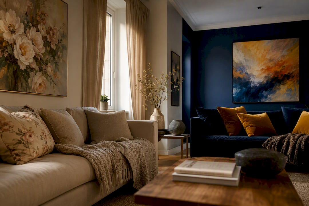
Once you’ve confirmed the undertone holds up, decide between tonal and contrasting structures. A tonal scheme, several shades within one family like sage, moss, and cream, feels calm and cohesive. A contrasting scheme, say charcoal walls against warm terracotta accents, feels more dynamic and works best in larger rooms with strong architectural bones to support the tension.
What’s Actually Trending for Living Rooms in 2026
The consensus among colorists heading into 2026 is a decisive move away from cool gray toward warmth. Warm whites, earthy terracotta, moody greens, and soft clay tones dominate the current forecasts, and sage green in particular has emerged as the standout pick of the year.
That warmth shows up differently depending on commitment level:
- Low commitment: a terracotta or honey-amber throw pillow, a single piece of art with warm undertones, or a sage accent on one wall.
- Medium commitment: a full accent wall in Dry Sage or Caramelized, paired with a neutral base on the remaining three walls.
- Full commitment: four walls in a warm neutral or sage tone, which reads as durable rather than trend-chasing because these families have staying power beyond a single design cycle.
Sage green earns its reputation partly because it pairs easily with warm wood, brass, and terracotta accents, which means it doesn’t box you into one aesthetic. If you want the current moment without redecorating again in two years, that flexibility is the safer bet over a narrower trend color. Rug and textile trends echo the same warm, enveloping direction, reinforcing that this shift is cross-category, not a paint-brand marketing push.
Testing Your Color Before You Commit to a Full Room
Skipping this step is the single most common reason a paint job disappoints. Tape up a swatch at least two feet square on two different walls, ideally one that gets direct light and one that doesn’t. Photograph both at morning, midday, and evening.
- Compare the swatch against your existing flooring and any adjoining room visible from the living room, since clashing sightlines are easy to miss until the paint is dry.
- Choose sheen deliberately: matte or eggshell for walls to hide imperfections, satin for trim, and semi-gloss only on doors or built-ins that need to withstand touching.
- Hold your art and textiles up against the swatch before buying a gallon, not after.
Pro Tip: Skip the tiny paint chip entirely. A chip the size of a business card cannot show you how a color shifts under your specific light, and it is the number one cause of repainting regret.
Coordinating Wall Color with Art, Textiles, and Finishes
A wall color only looks finished once it’s talking to everything else in the room. The easiest method: pick your art or your rug first, pull two or three colors directly from it, and repeat those same shades in smaller doses across pillows, throws, and small objects.
Art scale matters more than most people expect. A small piece on a large wall reads as an afterthought regardless of how good the color pairing is, while an oversized piece anchors a room even against a busy palette. Frame tone should echo your metal finishes, brass frames with brass hardware, black frames with iron fixtures, rather than introducing a third competing metal.
- Warm woods (walnut, oak) ground sage and terracotta palettes without competing with them.
- Brass and unlacquered metals add warmth that plain neutrals sometimes lack.
- Leather in cognac or chocolate tones bridges warm neutrals and deeper jewel accents.
A room-by-room guide to wall color can help you map this out before you buy a single can of paint.
Eman’s Tips: Letting Artwork Finish the Palette
I always tell people to choose the art before the last can of paint, not after. A single painting with a strong secondary color, a rust red in a landscape, a sage undertone in an abstract piece, can dictate your entire accent palette without another swatch stick in sight.
Once you have that focal piece, echo one or two of its colors in a throw pillow or a ceramic vase, nothing more. Overmatching kills the effect. For readers building a scheme around art rather than paint alone, our guide on wall art color tips for luxury interiors and our piece on choosing color schemes for art to inspire interiors both walk through the process in more depth.
Matching Your Color Scheme to Your Living Room Style
Modern living rooms lean on restraint: a single dominant neutral, one contrasting tone, and color introduced almost entirely through texture rather than pattern. Charcoal, warm white, and a single sage or terracotta accent piece suit this style far better than a busy multicolor scheme.
Traditional rooms carry more layered color history, deep navy, hunter green, burgundy, often paired with warm wood paneling or trim. These schemes tolerate more saturation because the architecture (crown molding, wainscoting) gives the eye somewhere else to rest.
Eclectic living rooms are the hardest to get “wrong” but the easiest to get chaotic. The trick is choosing one neutral wall color as a stabilizer, then letting furniture, art, and textiles carry the bolder or clashing tones. Without that neutral anchor, an eclectic room can tip from curated to cluttered fast.
Coastal and Scandinavian-leaning rooms favor the palest end of the warm neutral spectrum, think Alabaster or White Dove, paired with natural fiber textures instead of heavy color contrast. Farmhouse-style rooms do well with warm off-whites and sage greens paired with black iron accents, a combination that also happens to align with where 2026 trends are heading anyway.
Coordinating Color with Flooring, Ceilings, and Architectural Details
Wall color never exists in isolation from what’s above and below it. Warm-toned flooring, oak, honey pine, red-toned hardwood, pushes you toward warm neutrals, sage, or terracotta rather than cool grays, which tend to fight warm wood rather than complement it. Cooler flooring like gray-washed wood or light stone gives you more room to experiment, including navy or charcoal schemes that would otherwise clash with warm boards.
Ceilings are the most underused color opportunity in most living rooms. A ceiling painted in a soft warm white rather than stark white keeps a room feeling cohesive from floor to ceiling, while a bolder ceiling color, even a pale sage or blush, can make a room with low ceilings feel less boxed in by removing the visual “lid” a stark white creates.
Architectural features, crown molding, wainscoting, exposed beams, deserve their own decision. Trim in a slightly lighter or darker version of the wall color reads as intentional; stark white trim against a deep saturated wall creates more contrast and drama. If you have exposed beams in a warm wood tone, they function as a built-in secondary color, which means your wall choice should support them rather than introduce a competing wood-toned neutral.
Adding Pattern and Texture Without Fighting Your Color Scheme
Pattern is where a lot of otherwise good color schemes fall apart, usually because too many patterns compete for attention. The safer approach: pick one dominant pattern scale (a large-scale rug, for instance) and keep everything else, pillows, throws, curtains, solid or textured but pattern-free.
Texture does a lot of the same work as pattern without the visual noise. A boucle sofa in a neutral tone adds depth to a room without introducing another competing motif, and a woven jute rug can ground a sage or terracotta palette the same way a patterned rug would, just more quietly.
- Stick to one bold pattern per room and let everything else stay solid or subtly textured.
- Match pattern color palettes to your existing 60-30-10 breakdown rather than introducing new hues through fabric.
- Layer texture (linen, boucle, rattan, leather) even in a monochromatic scheme to prevent flatness.
If your palette already leans bold, terracotta walls, a navy sofa, keep patterns minimal and let texture carry the visual interest instead.
Trends Fade, Warmth Doesn’t
Every few years the “in” color shifts, but the rooms that still feel good a decade later are the ones chosen for mood first, trend second. Warmth reads as intentional far longer than any specific shade does.
My honest advice: treat big paint decisions as long-term and small accessories as seasonal. Swap a few pillows or a throw when you want a refresh, rather than repainting every time a new color trend arrives.
— Eman
Another Way to Set Your Palette: Start With the Art
Repainting an entire living room is a weekend lost and a real expense, and it’s not always the right first move. If you already like your walls but the room still feels unfinished, a single strong artwork can do the job a paint job would otherwise have to do, dictating your secondary and accent colors without a drop of primer.

Eman Khalifa’s original paintings work this way by design: her landscape, abstract, and floral pieces carry the kind of layered, intentional color that gives a room somewhere to build from. A piece like the Private Eye canvas print or the Fragments of Memory canvas print can anchor a warm neutral or sage scheme instantly, pulling accent colors straight from the canvas into your pillows and throws instead of a paint can. If you’re not ready to repaint but want your room to feel resolved, browse the collection and let one piece set the direction before you touch a swatch.
Sources
- The Best Living Room Paint Colors | 2026 - Bobby Berk
- Best Paint Colors for Living Rooms in 2026: What Designers Are Actually Using | Muro Blog
- Living Room Color Palette Guide — The Undertone Test
- How do you choose a color scheme for a living room? Designers share their secrets - Livingetc
FAQ
What is the 2/3 rule for living rooms?
Most designers apply a 60-30-10 proportion rule for color balance: a dominant color for most of the room, a secondary color for supporting elements, and a smaller accent color for decorative details.
What are the best colors for a living room?
Warm neutrals like Accessible Beige and White Dove, sage greens like Dry Sage, and warm whites are consistently rated as the safest, most durable choices, with terracotta and navy as strong bolder options.
What are the top 10 living room colors?
Designer-favorite shades currently include Accessible Beige, White Dove, Dry Sage, Evergreen Fog, Agreeable Gray, Alabaster, Hale Navy, Caramelized terracotta, dusty plaster pink, and soft black tones like Wrought Iron.
What is the in-color for 2026 living rooms?
Sage green is the breakout color for 2026, with terracotta, warm whites, and honey amber close behind as the broader trend moves away from cool gray toward warmth.
How do I know if my room’s light works with a color?
Photograph a sample at 8 AM, 1 PM, and 7 PM using the Undertone Test, then choose warmer undertones for north-facing rooms, while south-facing rooms offer the most flexibility for shades.
Stay Connected
- ✨ Explore Eman Khalifa's original art, fine art prints and art-inspired merchandise.
- Follow Eman Khalifa's art journey on: Instagram @emans_gallery and Facebook
- Watch Eman Khalifa creating live art on: YouTube @emans_gallery
