


9 Designer Backed Bedroom Color Schemes You Can Build From One Artwork
The best bedroom color schemes generally include soft tonal blue for calm sleep, sage green or warm neutral for flexibility, plaster pink or terracotta for warmth with personality, and deep navy or moody plum for a cocooning primary suite. Lighter, brighter rooms can handle many of these; small or dim rooms often benefit from lighter values, while larger rooms with good natural light can carry deeper tones. The list and how-to steps below turn that verdict into an actual palette.
TL;DR:
- Testing paint samples in various lighting conditions before committing is crucial, as colors can appear very different in natural versus artificial light.
- Deep, saturated colors like navy or plum are suitable for larger, well-lit rooms, but may feel overwhelming in smaller or darker spaces.
- Matching undertones among walls, textiles, and furniture ensures a cohesive look, avoiding muddy or mismatched appearances.
- Using the 60-30-10-1 method helps balance dominant, secondary, and accent colors effectively, tailored to room function and lighting.
- Starting with artwork and pulling its palette into the room’s design creates a more harmonious and personalized bedroom environment.
Table of Contents
- Good Bedroom Color Schemes Worth Considering First
- How to Choose a Bedroom Palette Without Guesswork
- Adjusting Your Color Choice for Light, Size, and Ceiling Height
- Pairing Paint With Textiles, Wood, and Artwork
- Building a Palette Around a Single Piece of Art
- Matching the Palette to the Room’s Purpose
- How Seasonal Light Changes the Way a Color Reads
- Common Mistakes to Avoid When Choosing Bedroom Color Schemes
- What Actually Moves the Needle in Bedroom Color Choices
- Sources
- FAQ
Good Bedroom Color Schemes Worth Considering First
Designers keep returning to a short list of dependable directions rather than chasing every new paint chip. That consistency shows up across Homes & Gardens’ survey of designer-favorite bedroom palettes, which points to soft blues, sage greens, warm neutrals, dusty mauves, and terracotta as the schemes that balance calm with actual character. Here are nine that hold up in real rooms, not just on a moodboard.
- Soft blue tonal. A pale, dusty blue on walls with a slightly deeper blue on bedding creates a hushed, sleep-friendly room. Pair with light oak and brushed brass. Lighter blues read as calming, while a few shades darker starts to feel enveloping, according to Livingetc’s breakdown of bedroom color psychology. Pro Tip: Keep the ceiling a whisper lighter than the walls rather than stark white, so the blue doesn’t feel capped.
- Sage green plus warm neutrals. Sage carries the same restorative, biophilic pull that deeper blues offer, but reads softer in low light. Works beautifully with linen bedding, rattan, and unlacquered brass.
- Warm neutral (greige or cream). The most forgiving option for renters or anyone who swaps decor often. Pairs with almost any wood tone and lets accent colors do the heavy lifting.
- Plaster pink or dusty rose. Warmer than blush, cooler than terracotta. Sits well against walnut furniture and aged brass hardware, and flatters most skin tones in lamp light.
- Terracotta and clay. Brings earthy warmth to a north-facing room that never gets direct sun. Pair with cream linens and black iron fixtures to keep it from feeling heavy.
- Deep navy cocoon. A primary bedroom favorite for anyone who wants the room to feel like a retreat at night. Best in rooms with generous natural light during the day.
- Moody plum or burgundy. A jewel-toned alternative to navy that leans more dramatic. Pairs with velvet textiles and warm gold accents.
- Chocolate brown or earthy neutral. A 2026 favorite for guest rooms that want warmth without commitment to a bold hue; grounds well against cream and rust textiles.
- Black and white with one accent. High contrast for a modern or traditional room that wants graphic punch rather than a soft palette; works best with one strong accent color, not three.
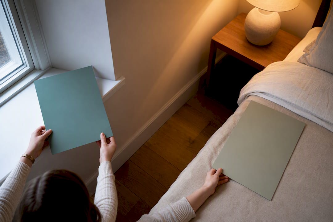
If you’re stuck between two colors, testing each on poster board in the room over time before committing is recommended.
How to Choose a Bedroom Palette Without Guesswork
The most reliable framework designers use is the 60-30-10-1 method: 60% dominant color (usually the walls), 30% secondary color (bedding, rug, upholstered furniture), 10% accent (throw pillows, art frame, lamp), and 1% jewel detail (a small object in a saturated hue), according to this breakdown of the 60-30-10-1 method. Assign colors this way before you buy a single sample:
- Pick your 60% first. This is your wall color and should match how you want the room to feel, whether that’s calm, cocooning, or energized.
- Choose the 30% from bedding and upholstery. Keep it in the same undertone family (warm with warm, cool with cool) so the room doesn’t fight itself.
- Save the 10% for accents you can change cheaply: pillows, a throw, a lamp shade.
- Add the 1% jewel note last, a small object like a vase or picture frame in a saturated color that ties the room together.
Before finalizing anything, check your undertones. A cool gray wall next to warm oak furniture can read muddy, while a warm greige next to the same wood feels intentional. Designers recommend picking your color based on the mood you want first, then using a color wheel to find analogous or tonal pairings, testing every sample directly on your walls, according to Veranda’s interview with interior designers. Run through this checklist before you buy the gallon: room function, available light, existing floor and trim finishes, and how the swatch looks morning versus evening.
Adjusting Your Color Choice for Light, Size, and Ceiling Height
Natural light shifts color temperature throughout the day, and artificial light at night can flatten a color that looked rich at noon. North-facing rooms benefit from warmer tones like terracotta or warm neutral to offset the cooler light; south-facing rooms can handle cooler blues and greens without feeling cold. Testing paint on poster board and viewing it at different times of day is essential, since lighting and sheen materially change how a color reads, per Behr’s bedroom paint guidance.
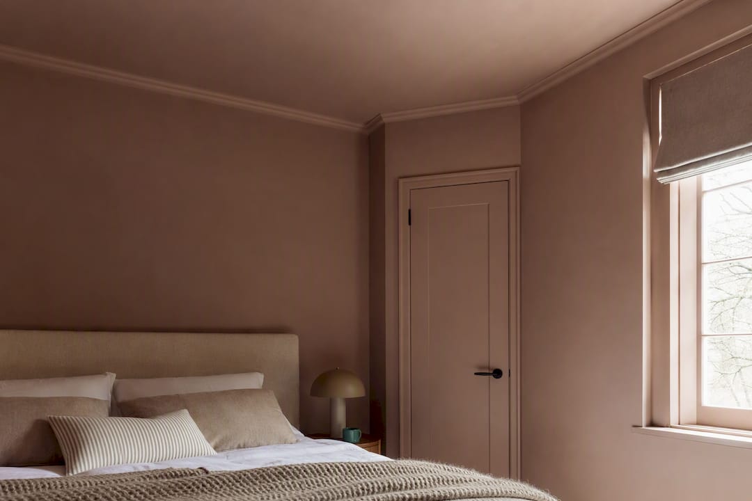
Small bedrooms don’t have to default to white. Color drenching, painting walls, trim, and ceiling in closely related tones, can make a small room feel enveloping rather than cramped. Larger rooms with good light have more room to carry deep, saturated colors like navy or plum as a full backdrop rather than just an accent wall. For ceilings, tint toward the wall color instead of defaulting to flat white, and match the sheen level so the ceiling reads as a soft continuation rather than a stark cap.
Pairing Paint With Textiles, Wood, and Artwork
Undertone consistency matters more than color name. A warm terracotta wall next to cool gray-toned wood flooring will always feel slightly off, no matter how good each looks alone.
- Match metal finishes to your paint’s temperature: brass and gold with warm neutrals or terracotta, chrome and nickel with cooler blues and grays.
- Use textiles, not paint, to carry your 10% accent color, and vary the value within your 30% zone so the room doesn’t read flat or overly matched.
- Pull one dominant hue from your artwork into your 60% or 30% zone so the piece feels built into the room rather than added afterward.
- Hang art at eye level from a seated position on the bed, roughly 57 to 60 inches to the center, so the color connection actually registers when you’re in the room.
Pro Tip: If your bedding and walls are both mid-tone, add one lighter and one darker textile layer, like a pale throw and a dark woven basket, so the eye has somewhere to rest. For more on matching wall color to a room’s specific function, Emansgallery’s room-by-room color guide walks through the same undertone logic in more detail.
Building a Palette Around a Single Piece of Art
Designers often work backward from art rather than forward from a paint chip, pulling recurring hues from a chosen piece to keep furniture and textiles feeling intentional instead of assembled at random, a method Livingetc also points to when discussing how color choices shape mood. Eman Khalifa’s fluid and atmospheric paintings work particularly well for this because each piece already carries a resolved palette of two or three dominant tones, built from oil, acrylic, and mixed media layering that shifts subtly under different light.
Here’s the process:
- Choose one artwork you genuinely respond to before you choose paint.
- Pull two or three colors directly from the piece and assign them to your 60%, 30%, and 10% zones.
- Hold the artwork (or a printed swatch of it) against your wall in both morning and evening light before committing to the wall color.
- Scale matters: a large original or a large-format canvas print above the bed anchors the whole room, while a smaller print works if you’re building the palette gradually.
A piece like Good Tidings, with its fluid blue and gold movement, pairs naturally with a soft blue tonal or warm neutral scheme and gives you both colors to pull from in one canvas. Emansgallery’s guide on choosing color schemes for art covers this pairing logic in more depth if you’re starting from the art rather than the wall.
Matching the Palette to the Room’s Purpose
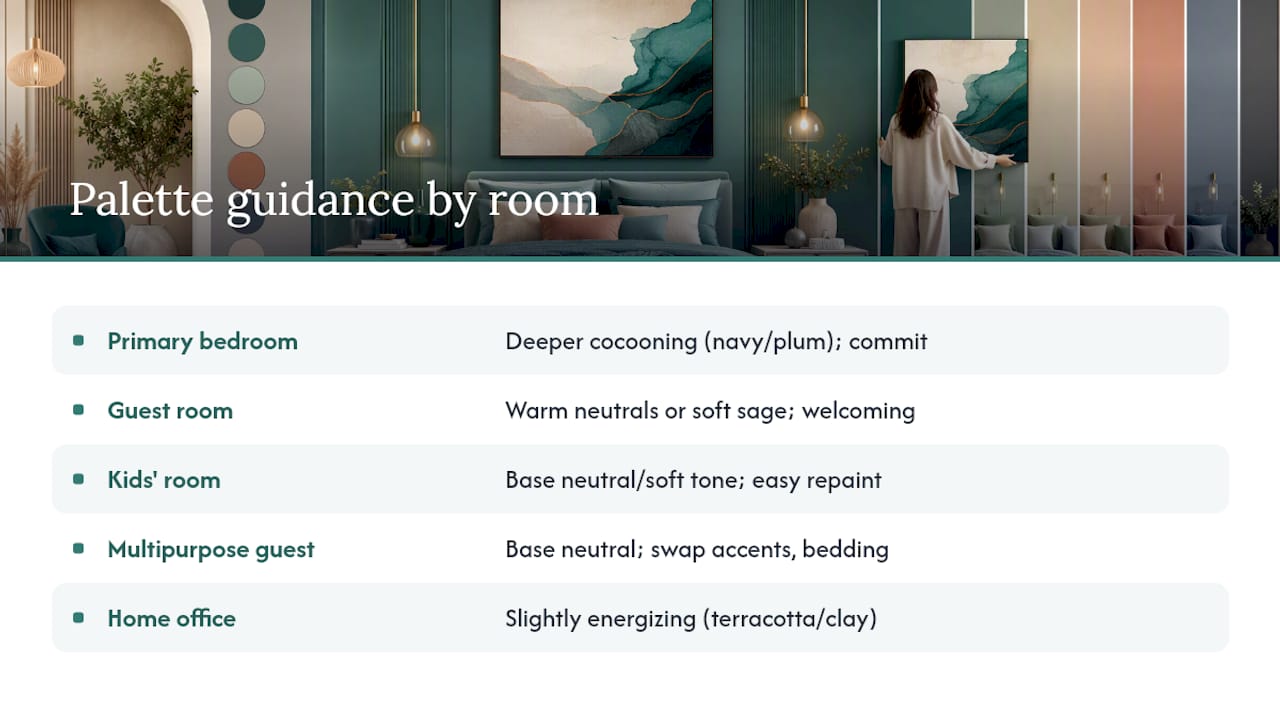
A primary bedroom and a guest room don’t need the same palette, even if you love the same colors. A primary suite is where you can justify a deeper, more cocooning scheme like navy or plum, since it’s a space you control daily and can commit to fully. A guest room benefits more from warm neutrals or soft sage, colors that feel welcoming to someone unfamiliar with the space and that photograph well if you ever list the home.
Style direction should shape your value choices as much as your hue choices. A modern bedroom tends to favor higher contrast, crisp whites against deep charcoal, or a single saturated accent wall against neutral surroundings. A traditional bedroom leans toward tonal layering: several closely related shades of the same color family, like three warm creams in different finishes, rather than one bold statement.
Kids’ rooms and multipurpose guest spaces call for a different calculation entirely. You’ll want a base neutral or soft tone that can absorb a color change every few years without repainting the whole room, then add personality through bedding and art instead. A home office that doubles as a guest room benefits from a slightly more energizing tone, like a warm terracotta or clay, than a room used purely for sleep. Match the palette to how the room actually gets used, not just how it looks in a single photo.
How Seasonal Light Changes the Way a Color Reads
The same wall color can look completely different in January than it does in July, especially in rooms with strong seasonal light shifts. A cool blue that feels crisp and calming in summer can read as cold and flat during darker winter months, particularly in rooms that rely heavily on artificial light for half the year.
Warm neutrals and terracotta tend to hold up best across seasons because they carry enough warmth to stay inviting in winter without feeling overheated in summer. Neutrals also make it easy to swap accent colors as the seasons change, using warmer textiles in fall and winter and lighter, cooler accents in spring and summer, according to Benjamin Moore’s guidance on relaxing bedroom colors.
If you live somewhere with dramatic seasonal light changes, test your main swatch in both a bright afternoon and a gray, overcast day before finalizing. A color that only works in ideal light isn’t a good long-term choice for a room you’ll use year-round. Deep, saturated colors like navy or plum are more forgiving here, since they don’t rely on bright light to look intentional. They tend to hold their character in low winter light almost as well as they do in summer.
Common Mistakes to Avoid When Choosing Bedroom Color Schemes
The most common error is choosing a color from a small paint chip or a photo online without ever testing it on the actual walls. Paint chips are notoriously unreliable at full-wall scale, and a shade that looks perfect in a 2 inch swatch can shift dramatically once it covers four walls.
A second mistake is ignoring undertones entirely. Two whites, two grays, or two beiges can clash badly if one leans warm and the other leans cool, even though they look nearly identical in the can. Deep, saturated colors can successfully anchor even a small bedroom, so ruling out navy or plum for a compact room, without testing it first, often means missing a scheme that would have worked. A ceiling left stark white against a warm terracotta wall will always look like an afterthought rather than a finished decision, so consider experts’ advice on the best color to paint interior doors to enhance the overall room aesthetic.
What Actually Moves the Needle in Bedroom Color Choices
Most bedroom color advice online treats palette selection as an aesthetic exercise: pick a mood, pick a color, done. However, undertone discipline is key to ensuring the room’s cohesion over time. A soft blue and a warm greige can both be objectively good bedroom colors, and still clash badly with the same oak floor if nobody checked whether the floor leans warm or cool first.
The conventional advice also underuses art as a starting point. Most guides treat wall art as the last decision, something you hang once the paint and bedding are done. Working the other way, choosing a piece you respond to and pulling its palette into your 60-30-10 allocation, produces a more cohesive room and removes the guesswork of matching accent colors after the fact. It’s a smaller step than most people assume, and it tends to produce a more personal room than starting from a paint deck ever does.
Test your top two candidates on the actual wall, in your actual light, before you commit to either. That single habit prevents more bedroom color regrets than any amount of research into what’s trending.
— Eman
Sources
- What Color to Paint Your Bedroom, According to Color Psychology | Livingetc
- Bedroom Color Palette: The 60-30-10-1 Method
- How to Use Color Theory to Decorate Your Bedroom, According to Interior Designers | Veranda
- 18 Bedroom Color Ideas Designers Return to Time and Time Again – From Soft Palettes to Statement Shades
FAQ
What are the top 3 bedroom colors?
Soft blue, warm neutral (greige or cream), and sage green consistently top designer lists for their calming, restorative qualities and flexibility with other decor.
What are the top 5 bedroom colors?
Beyond soft blue, warm neutral, and sage green, designers frequently add dusty pink or plaster tones and deep navy for a more cocooning primary bedroom look.
What colors are trending for bedrooms in 2026?
Plaster pinks, terracotta, and richer jewel tones like plum are gaining ground alongside the enduring popularity of soft neutrals and blue, according to Architectural Digest’s roundup of bedroom color trends.
What is the most popular color for bedrooms?
Soft, muted blue remains a highly recommended bedroom color among designers because it pairs calming psychology with broad flexibility across styles and lighting conditions.
Stay Connected
- ✨ Explore Eman Khalifa's original art, fine art prints and art-inspired merchandise.
- Follow Eman Khalifa's art journey on: Instagram @emans_gallery and Facebook
- Watch Eman Khalifa creating live art on: YouTube @emans_gallery
