


The Pop Art Movement: Origins, Artists, and Legacy
Pop Art is a mid-20th-century art movement that elevated imagery from advertising, comic strips, product packaging, and celebrity culture to the status of fine art. It emerged in Britain in the mid-1950s, then took hold in the United States by the late 1950s and early 1960s, with artists like Andy Warhol and Roy Lichtenstein bringing it to international prominence. Tate places its British origins with the Independent Group, a circle of London-based artists and critics who began interrogating mass media and American consumer culture years before the term “Pop Art” entered common use. MoMA frames the movement as a deliberate strategy of borrowing from popular culture to challenge the boundaries of fine-art tradition. The result was one of the most recognizable visual languages of the 20th century.
Key Takeaways
Pop Art is a mid-20th-century movement that used commercial imagery, mechanical reproduction, and deliberate irony to challenge the boundary between fine art and popular culture, with lasting influence on design, advertising, and contemporary art.
| Point | Details |
|---|---|
| Definition and era | Pop Art emerged in Britain in the mid-1950s and the U.S. by the early 1960s, drawing from advertising, comics, and consumer goods. |
| Founding figures | The Independent Group (London, 1952) and artists like Paolozzi and Hamilton established British Pop; Warhol, Lichtenstein, and Rosenquist defined American Pop. |
| Core technique | Screen-printing, collage, and mechanical reproduction replaced painterly gesture, distancing Pop from Abstract Expressionism. |
| Postmodern legacy | Pop Art is widely considered one of the first major expressions of postmodernism, questioning originality and the artist’s role. |
| Emansgallery connection | Emansgallery offers canvas prints and original works that carry Pop Art’s graphic clarity into contemporary wall art for collectors and interiors. |
Table of Contents
- What is the Pop Art movement and where did it begin?
- What are the defining characteristics of Pop Art?
- Who are the major Pop Art artists and their iconic works?
- How did British Pop Art differ from American Pop Art?
- Which exhibitions and groups made Pop Art visible?
- Why does Pop Art still matter today?
- What are the main criticisms of Pop Art?
- How do you recognize Pop Art by sight?
- Pop Art’s relevance to contemporary studio practice
- Bold graphic art for contemporary walls
- Sources
- FAQ
What is the Pop Art movement and where did it begin?
Postwar context and the Independent Group
The conditions that produced Pop Art were specific. After World War II, Britain faced austerity while American consumer goods, Hollywood films, and glossy magazines flooded popular culture. For a generation of young British artists and critics, that flood of imagery was not background noise. It was subject matter.
The Independent Group, founded in London around 1952, was the first organized forum for these ideas. Members included Eduardo Paolozzi, Richard Hamilton, Lawrence Alloway, and the architects Alison and Peter Smithson. They met at the Institute of Contemporary Arts and debated advertising, science fiction, car design, and cinema with the same seriousness that earlier modernists had brought to formal composition. Paolozzi’s 1947 collage I Was a Rich Man’s Plaything predates the group’s founding and is widely cited as one of the earliest art-context uses of the word “pop,” appearing on a comic-book explosion rendered in cut-and-paste imagery drawn from American magazines.
Parallel developments in the United States
American Pop did not emerge from a single group but from several overlapping tendencies. Jasper Johns and Robert Rauschenberg are often called Neo-Dada precursors: Johns painted targets and flags, Rauschenberg incorporated newspaper clippings and found objects into his “Combines.” Neither was strictly a Pop artist, but both dismantled the assumption that fine art must be purely abstract or expressive. By the early 1960s, Warhol, Lichtenstein, James Rosenquist, and Claes Oldenburg were working in New York with commercial imagery at the center of their practice.
The Sidney Janis Gallery’s “New Realists” exhibition in 1962 brought American and European artists together under one roof and gave critics a framework for the emerging style. That show, alongside early museum acquisitions, helped establish Pop Art as a movement rather than a trend.
Key dates in Pop Art’s history
| Year | Event |
|---|---|
| 1947 | Eduardo Paolozzi creates I Was a Rich Man’s Plaything, an early use of “pop” in an art context |
| 1952 | Independent Group founded at the Institute of Contemporary Arts, London |
| 1956 | Richard Hamilton creates Just What Is It That Makes Today’s Homes So Different, So Appealing? |
| 1957 | Hamilton publishes his list of Pop characteristics: “Popular, Transient, Expendable, Low cost, Mass produced, Young, Witty, Sexy, Gimmicky, Glamorous, Big business” |
| 1962 | Sidney Janis Gallery “New Realists” exhibition, New York; Warhol exhibits Campbell’s Soup Cans |
| 1963–1965 | Pop Art reaches peak institutional recognition in the U.S. and U.K. |
What are the defining characteristics of Pop Art?
Pop Art is visually distinctive. Once you know its markers, you can spot it across a gallery, a magazine spread, or a printed canvas. According to Tate, Richard Hamilton’s 1957 shorthand remains the most concise definition: the movement prized work that was popular, transient, expendable, low-cost, mass-produced, young, witty, sexy, gimmicky, glamorous, and tied to big business.
Core characteristics:
- Appropriation of mass imagery. Pop artists lifted images directly from advertising, comic books, product labels, and news photography rather than inventing original compositions.
- Collapse of high and low culture. A Campbell’s Soup can and a Rembrandt occupied the same conceptual space. The hierarchy was the point being questioned.
- Repetition. Warhol’s grid of Marilyn Monroe portraits mirrors the logic of mass production: the image loses uniqueness through multiplication.
- Irony and ambiguity. The tone is rarely straightforward. A work can look celebratory and read as critique simultaneously.
- Bold, flat color. Gradients and painterly texture gave way to the clean, unmodulated color of commercial printing.
- Photographic and comic-book aesthetics. Ben-Day dots (the mechanical halftone pattern used in cheap printing) appear in Lichtenstein’s work; photographic silkscreen defines Warhol’s portraits.
- Text and brand imagery. Words, logos, and slogans appear as visual elements, not labels.
Techniques that set Pop Art apart
Screen-printing was central to American Pop, particularly Warhol’s practice. It allowed photographic images to be transferred onto canvas at scale and repeated with slight variations, mimicking the logic of industrial production. Collage and photomontage were the British equivalents: Paolozzi and Hamilton assembled found printed materials into dense, layered compositions. Oldenburg worked in sculpture, fabricating oversized soft versions of everyday objects in vinyl and canvas. Rosenquist brought billboard-painting technique directly into the gallery, working at a scale that overwhelmed the viewer.
Wikipedia’s overview of Pop Art notes that these commercial production techniques were a deliberate choice to distance the work from the painterly tradition of earlier modernism, particularly Abstract Expressionism.
Pro Tip: When looking at a work and trying to decide whether it is Pop Art or homage, ask whether the source material is identifiable. Pop Art keeps the original image recognizable — a Campbell’s label, a DC Comics panel, a Marilyn Monroe press photo. Homage typically transforms the source until the origin is secondary.
Who are the major Pop Art artists and their iconic works?
Andy Warhol (1928–1987)
Warhol is the movement’s most recognizable figure. A former commercial illustrator, he applied advertising logic to fine art with deliberate flatness. His Campbell’s Soup Cans (1962), a grid of 32 canvases each depicting a different soup variety, challenged galleries to treat a supermarket shelf as a subject worthy of exhibition. The Marilyn Diptych (1962) uses silkscreen repetition to turn celebrity into commodity. Warhol held at MoMA and the Whitney Museum of American Art.

Roy Lichtenstein (1923–1997)
Lichtenstein enlarged single panels from romance and war comics to monumental scale, reproducing Ben-Day dots by hand to simulate mechanical printing. Drowning Girl (1963), held at MoMA, shows a woman in distress with a thought-bubble caption: “I don’t care! I’d rather sink than call Brad for help!” The emotional content is real; the delivery is deliberately mechanical, creating a tension that defines his practice.
James Rosenquist (1933–2017)
Rosenquist worked as a billboard painter before entering the gallery world, and that scale never left him. F-111 (1964–65), a 10-by-86-foot panorama, juxtaposes a fighter jet with consumer imagery — spaghetti, a girl under a hair dryer, a nuclear explosion rendered in the colors of a cake. The work is held at MoMA.
Claes Oldenburg (1929–2026)
Oldenburg’s contribution was sculptural. His “soft sculptures” — oversized, fabric versions of hard objects like typewriters, toilets, and electric fans — made the familiar strange by changing material and scale. The Store (1961) was an installation in a Lower East Side storefront where he sold plaster replicas of food and clothing at retail prices, collapsing the gallery into a shop.

Eduardo Paolozzi (1924–2005)
Paolozzi’s I Was a Rich Man’s Plaything (1947) is a collage assembled from American magazine clippings: a Coca-Cola logo, a pin-up, a pistol firing the word “POP.” It predates the movement’s formal recognition by nearly a decade and demonstrates how collage prefigured Pop’s appropriation strategies. Held at Tate Modern.
Richard Hamilton (1922–2011)
Hamilton’s Just What Is It That Makes Today’s Homes So Different, So Appealing? (1956) is a small collage — roughly 10 by 9.75 inches — that packs a bodybuilder, a pin-up, a television, a canned ham, and a Ford logo into a domestic interior. It was made for a catalog and became one of the most reproduced images in art history. Hamilton also authored the 1957 list of Pop characteristics cited by Tate as a defining shorthand for the movement.
Jasper Johns (born 1930)
Johns painted American flags, targets, and numbers with an encaustic technique that preserved visible brushwork, keeping one foot in painterly tradition while the subject matter pointed elsewhere. Flag (1954–55), held at MoMA, asks whether a painting of a flag is a painting or a flag — a question that opened the door for Pop’s interrogation of representation.
Robert Rauschenberg (1925–2008)
Rauschenberg’s “Combines” — works that incorporated newspaper clippings, photographs, fabric, and found objects into painted surfaces — dissolved the boundary between painting and sculpture. Monogram (1955–59), featuring a stuffed Angora goat encircled by a tire, is held at the Moderna Museet in Stockholm. His practice is a direct bridge between Abstract Expressionism and Pop.
Tom Wesselmann (1931–2004)
Wesselmann’s Great American Nude series (begun 1961) placed faceless, anonymous female figures against collaged domestic interiors filled with brand-name products. The nudes are rendered in flat, unmodulated flesh tones; the surrounding objects are photographic cutouts. The series ran to over 100 works and is a sustained examination of how advertising constructs desire.
How did British Pop Art differ from American Pop Art?
The distinction matters because the two traditions had different relationships to the material they depicted. Tate and other museum historians stress this clearly: British Pop artists observed American consumer culture from a distance, often with irony and academic detachment. American Pop artists were inside that culture, and their work reflects that proximity.
| Dimension | British Pop Art | American Pop Art |
|---|---|---|
| Tone | Ironic, analytical, often critical | Direct, immersive, ambivalent |
| Primary technique | Collage, photomontage, assemblage | Silkscreen, large-scale painting, soft sculpture |
| Relationship to consumer culture | Outsider looking in; American goods were aspirational and foreign | Insider; consumer imagery was the artists’ own daily environment |
| Scale | Often small to medium; intimate | Frequently monumental; billboard scale |
| Key figures | Paolozzi, Hamilton | Warhol, Lichtenstein, Rosenquist, Oldenburg |
| Representative works | I Was a Rich Man’s Plaything (1947); Just What Is It… (1956) | Campbell’s Soup Cans (1962); Drowning Girl (1963) |
British Pop emerged from intellectual debate — the Independent Group’s discussions were as much about semiotics and cultural theory as about making objects. American Pop was more visceral. Warhol’s factory model, Rosenquist’s billboard scale, and Oldenburg’s retail installations all engaged consumer culture on its own terms, at its own volume.
Which exhibitions and groups made Pop Art visible?
-
The Independent Group (London, 1952–1955). Founded at the Institute of Contemporary Arts, the group held informal seminars on mass media, technology, and popular culture. Paolozzi’s 1952 presentation of his collage scrapbooks — later called Bunk! — is often cited as the moment British Pop’s visual logic was first articulated to an audience.
-
“This Is Tomorrow” (Whitechapel Gallery, London, 1956). A collaborative exhibition featuring Hamilton’s Just What Is It… as its catalog image. The show brought together architects, painters, and sculptors to examine how mass media was reshaping visual culture.
-
“New Realists” at Sidney Janis Gallery (New York, 1962). This exhibition grouped American and European artists working with commercial imagery and objects, giving critics a transatlantic frame for the emerging movement. It included Warhol, Lichtenstein, Oldenburg, and European counterparts from Nouveau Réalisme.
-
Warhol’s Campbell’s Soup Cans at Ferus Gallery (Los Angeles, 1962). Warhol’s first solo gallery show displayed all 32 canvases in a row along a shelf, mimicking a supermarket display. The show divided critics and established Warhol as a central figure.
-
Museum acquisitions through the mid-1960s. MoMA, the Tate, and the Guggenheim began acquiring Pop works within a few years of their creation, a speed of institutional adoption unusual for any movement. That rapid canonization shaped how Pop Art was received commercially and critically for decades.
Why does Pop Art still matter today?
Pop Art’s most durable contribution is conceptual. Art historians widely consider it one of the first major expressions of postmodernism: by using reproducible images and positioning the artist as a selector of existing culture rather than an originator of new forms, Pop Art questioned the foundations of artistic originality. That question has not been resolved. It runs through appropriation art, street art, digital remix culture, and the current market for NFTs, where the logic of the unique versus the reproducible is still being negotiated.
The movement’s visual language is now so embedded in design and advertising that it is often invisible. Bold flat color, graphic text, and the deliberate use of commercial aesthetics in fine-art contexts are all Pop inheritances. Fashion has returned to Pop imagery repeatedly, from the 1960s through to contemporary streetwear. Street artists like Keith Haring and Jean-Michel Basquiat drew directly from Pop’s willingness to treat commercial and vernacular imagery as legitimate subject matter.
TheArtStory also notes that Pop had European parallels: Capitalist Realism in Germany and Nouveau Réalisme in France pursued similar questions about consumer objects and mass reproduction, suggesting the movement reflected a broad cultural shift rather than a local trend. For collectors and interior designers, Pop Art’s graphic clarity translates well to large-scale wall art, a quality that has kept demand for Pop-influenced prints consistent across decades.
Pop culture merchandise itself carries the movement’s DNA. The line between a Warhol silkscreen and a collector’s edition print is one of context and intent, not technique — a distinction Pop Art made deliberately ambiguous from the start.
What are the main criticisms of Pop Art?
The most persistent criticism is that Pop Art celebrated consumerism rather than critiquing it. If you reproduce a Campbell’s Soup can at gallery scale and sell it for a significant sum, are you subverting commodity culture or participating in it at a higher price point? That tension was visible from the movement’s first exhibitions and has never fully resolved.
A second critique targets superficiality. Pop Art’s deliberate flatness, its rejection of painterly depth and emotional expressiveness, struck many critics as a retreat from the seriousness that Abstract Expressionism had brought to American art. Harold Rosenberg and Clement Greenberg, the dominant critics of the preceding generation, were largely hostile.
The scholarly counter-reading, developed through the 1970s and beyond, argues that the impersonality was the point. MoMA’s framing ties Pop Art to critical strategies addressing consumerism, gender roles, and media imagery — not as endorsement but as examination. Wesselmann’s faceless nudes are not celebrations of advertising’s construction of femininity; they are its documentation, rendered with a cool that makes the viewer’s own response visible.
The ambiguity was, for many artists, a feature. Warhol’s refusal to explain whether his work was critique or celebration was a deliberate strategy that kept both readings alive simultaneously.
How do you recognize Pop Art by sight?
Use this checklist when looking at an unfamiliar work:
- Subject matter from mass culture. Is the image a product label, a comic panel, a celebrity photograph, or an advertisement? Pop Art takes its subjects from the commercial world.
- Bold, flat, unmodulated color. No visible brushwork, no tonal gradation. Color fills areas cleanly, as in commercial printing.
- Ben-Day dots or halftone patterns. Small, regularly spaced dots that simulate mechanical printing, most associated with Lichtenstein.
- Repetition or grid structure. Multiple versions of the same image, often with slight color variations, referencing mass production.
- Text, logos, or brand names as visual elements. Words are part of the composition, not labels added afterward.
- Large scale. American Pop in particular tends toward monumental dimensions — works designed to compete with billboard advertising for visual impact.
- Photographic source material. Silkscreened photographs, often of celebrities or news images, transferred directly onto canvas.
To sharpen the distinction, place a Pop work next to an Abstract Expressionist painting. Where the Abstract Expressionist canvas shows gesture, texture, and the physical trace of the artist’s hand, the Pop work typically shows none of these. The surface is flat, the image is borrowed, and the artist’s presence is deliberately erased. That erasure is the argument.
For collectors verifying a work’s canonical placement, the primary reference points are MoMA’s collection database, Tate’s online catalog, and TheArtStory’s movement overview, all of which include provenance information and exhibition histories for major works. A guide to choosing collectible prints can also help readers assess quality and authenticity when buying Pop-influenced work today.
Pop Art’s relevance to contemporary studio practice
Pop Art’s most instructive lesson is not its subject matter but its method: the artist as a selector and recontextualizer of existing visual culture. That logic runs through every practice that takes the world as found material. The movement’s willingness to treat commercial imagery with formal seriousness, and to let ambiguity do the critical work rather than explicit statement, remains a live question for any artist working with recognizable forms. Hamilton’s 1957 list of Pop characteristics reads less like a historical document and more like a set of pressures that contemporary visual culture still exerts. The movement did not resolve the tension between art and commerce. It made that tension the subject.
Bold graphic art for contemporary walls
Pop Art’s graphic language — flat color, strong line, commercial clarity — translates directly into wall art that holds a room. Emansgallery’s canvas prints carry that same visual confidence into contemporary interiors, without the irony of the original movement and with the material quality of museum-grade production. The Private Eye canvas print brings conceptual expressionism to large-scale wall art, while the City in Grids canvas print applies geometric abstraction at a scale that commands attention in any room. For collectors who want original work rather than a print, Eman Khalifa’s studio paintings are one-of-a-kind pieces available directly through the gallery.
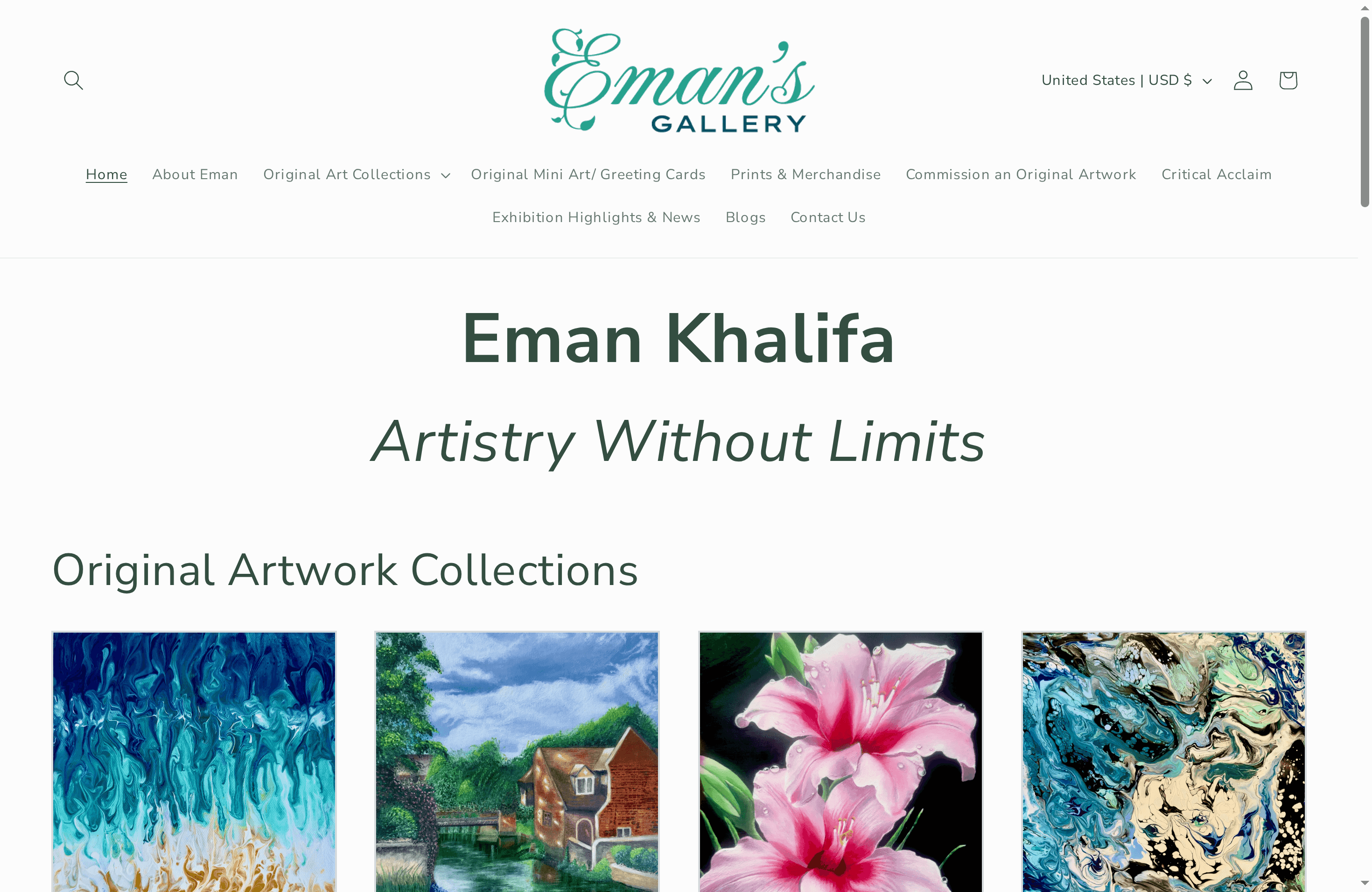
Browse the full collection at Emansgallery and find the work that fits your space and your eye. For readers interested in how Pop-influenced prints function in interiors, the guide to displaying art prints covers placement, scale, and framing in practical terms. Emansgallery ships worldwide, including to the United States, and offers both original paintings and museum-quality canvas prints across a range of sizes and price points.
Sources
- Pop art | Tate
- Pop art | MoMA
- Pop Art Movement Overview | TheArtStory
- Pop art - National Galleries of Scotland
- Pop art - Wikipedia
FAQ
What is the Pop Art movement in simple terms?
Pop Art is a mid-20th-century art movement that used imagery from advertising, comic books, and consumer products as fine-art subject matter, emerging in Britain in the mid-1950s and the United States by the early 1960s.
Who are the most famous Pop Art artists?
Andy Warhol, Roy Lichtenstein, James Rosenquist, and Claes Oldenburg are the central American figures; Eduardo Paolozzi and Richard Hamilton led British Pop Art.
How did Pop Art start?
Pop Art grew from postwar consumer culture and mass media. The Independent Group in London (founded 1952) was its earliest organized forum; Paolozzi’s 1947 collage I Was a Rich Man’s Plaything contains one of the first art-context uses of the word “pop.”
What is the difference between Pop Art and Abstract Expressionism?
Pop Art uses borrowed commercial imagery, flat color, and mechanical techniques; Abstract Expressionism prioritizes gestural brushwork, emotional expression, and the visible trace of the artist’s hand. Pop Art emerged partly as a reaction against Abstract Expressionism’s dominance.
Is Pop Art still relevant today?
Pop Art’s influence is present in graphic design, street art, fashion, and digital culture. Its core question — whether art can be separated from commerce — remains unresolved and is actively debated in contexts from NFTs to contemporary print collecting.
Stay Connected
- ✨ Explore Eman Khalifa's original art, fine art prints and art-inspired merchandise.
- Follow Eman Khalifa's art journey on: Instagram @emans_gallery and Facebook
- Watch Eman Khalifa creating live art on: YouTube @emans_gallery
