


How to Choose Paint Colors for Your Home Through Art
Pick art that complements your wall by following a simple three-step read: choose a supporting color from the piece, create a value gap so it doesn’t disappear into the paint, and match undertones between art and wall. Then place the piece so it functions as an accent rather than a competing focal point.
Try these three checks right now with a piece you already own or are considering:
- Hold-to-wall test: stand the artwork against the wall in daylight and see if it reads as a distinct shape or blends flat.
- Light sweep: look at it again at midday and near sunset. Colors shift more than most people expect.
- Quick frame swap: hold a black mat or a wood frame sample next to it. The color relationship often changes more than the paint would.
Pro Tip: Scale beats color precision almost every time. A piece that’s too small will look wrong no matter how perfectly the color matches.
Key Takeaways
Matching art to your home comes down to three checks: pull a supporting color, create a value gap, and align undertones, then place the piece using the 60-30-10 rule.
| Point | Details |
|---|---|
| Use the three-step read | Pull a supporting color, set a value gap, and match undertones before buying or hanging art. |
| Prioritize scale over color | A correctly sized piece forgives imperfect color matching; an undersized piece rarely recovers. |
| Adjust frames before repainting | Black, wood, or metallic frames can fix an undertone clash for far less than a paint job. |
| Match paint finish to the art | Matte walls suit subtle color gradients; satin suits bolder, simpler pieces. |
| Consider commissioning for exact fit | Eman’s Gallery takes commissions when existing art can’t match your room’s palette and scale needs. |
Table of Contents
- Why This Method Comes From a Working Gallery, Not a Blog Post
- What Is the Three-Step Read and How Do You Run It?
- How Do You Apply This Room by Room?
- How Do Frames and Finishes Affect Color Matching?
- Where Should You Hang Art, and How Do You Protect Its Color?
- Does Paint Finish Change How Art Colors Look Next to It?
- Should an Accent Wall Match the Art or Support It?
- What Color Harmony Schemes Help You Pick Art?
- How Do Existing Furniture and Décor Colors Factor In?
- What the Conventional Advice Gets Wrong
- How Eman’s Gallery Can Help You Get the Match Right
- Sources
- FAQ
Why This Method Comes From a Working Gallery, Not a Blog Post
This three-step read isn’t theory. It’s how Eman Khalifa, a London-based British-Egyptian-American artist, and her team at Eman’s Gallery talk clients through selections every week, whether the request is an original abstract seascape or a museum-quality print.
Eman Khalifa works across oil, acrylic, and mixed media, moving between fluid abstraction, landscapes, and florals. Because Eman’s Gallery ships original paintings and prints worldwide and takes on private commissions, the practical questions this method answers come up constantly: does this undertone work with a warm greige, will this piece hold up over a sofa, does the frame need to change.
A few resources go deeper on specific pieces of this process:
- Choosing color schemes for art to inspire interiors
- How to choose wall art style for your home
- Choosing art for clients: an interior designer’s guide
What Is the Three-Step Read and How Do You Run It?
The three-step read works because it separates three different jobs that people usually try to solve at once: linking color, creating visual presence, and keeping temperature consistent.
Step 1: Pull a supporting color, not the loudest one. Look at the artwork and find a secondary or muted hue, not the color that dominates it. A painting with a bold coral center might have a soft sage green running through its shadows. That sage, not the coral, is what should echo somewhere in the room: a cushion, a vase, a stack of books. Designers frequently skip matching the dominant color on purpose, because it reads as too literal and flattens the composition.
Step 2: Set a value gap. Value means lightness or darkness, separate from hue. If your wall is a mid-tone greige and your artwork sits in a similarly mid-tone palette, the piece can visually vanish, even if the colors technically “match.” Look for at least one strong light-to-dark contrast between art and wall so the piece reads as a distinct object rather than a smudge.
Step 3: Match undertones. Warm walls (yellow, pink, or orange base) pair more naturally with warm-toned art and frames. Cool walls (blue or green base) do better with cooler palettes or neutral framing. If the art’s undertone fights the wall’s undertone, don’t repaint. Adjust the frame or the supporting objects around it instead.
If nothing in your current art collection passes this test, that’s a signal to look for a new piece rather than force a mismatch. A commissioned work lets you set the supporting color and undertone from scratch.
Pro Tip: When in doubt about value gap, squint at the wall and the art together. Squinting blurs hue and exposes contrast, which is exactly what you’re checking for.
How Do You Apply This Room by Room?
The three-step read stays the same everywhere, but how much weight each room gives to color versus mood changes.
- Hallways and entries: These are quick-glance spaces, so choose high-impact pieces with a clear value gap that reads instantly from a few steps away, not intricate detail that needs close viewing.
- Kitchens and bathrooms: Keep art away from direct splash zones and steam. Prints with washable, sealed framing hold up better here than raw canvas edges.
- Gallery walls: A neutral or off-white backdrop supports a busy arrangement of smaller works, while a dark accent wall usually favors one confident large piece instead. Keep spacing consistent, roughly two to three inches between frames, so the grouping reads as one composition.
How Do Frames and Finishes Affect Color Matching?
Frame choice can fix a color mismatch faster and cheaper than repainting a room.
- Black frames ground artwork against cool or neutral walls and sharpen the value gap instantly.
- Natural wood warms a space and pairs best with warm greiges and creams, echoing the undertone rather than fighting it.
- Metallic frames need a warmer surround. Cold walls can make gold or brass read as jarring instead of luxe.
- Glossy finishes bounce more light and can wash out subtle color relationships under strong sun. Matte finishes hold color truer and work better in rooms with big windows.
Pro Tip: If a piece feels “almost right” but not quite, try a frame swap before you touch the paint can. A passe-partout mat in a supporting color from the artwork can bridge an awkward undertone clash for a fraction of the cost of repainting.
Where Should You Hang Art, and How Do You Protect Its Color?
Center height for most walls lands around eye level for an average standing adult, though sofas and low furniture push that center slightly lower, and high ceilings or transit spaces can justify hanging higher for visual balance.
- Use indirect, directional lighting rather than a direct spotlight baking one spot on the canvas.
- UV-filtering glazing protects both the artwork and the wall paint near it from fading over years of sun exposure.
- Before committing to a placement, live with the piece through a full day: morning, midday, and evening light change how a color reads more than most people expect walking into a showroom.
Does Paint Finish Change How Art Colors Look Next to It?
Yes, and it matters more than most homeowners realize when hanging art. Matte and flat finishes absorb light rather than bounce it, which keeps wall color looking true and consistent from every angle. This makes matte a strong backdrop choice for art with subtle undertones, since there’s no competing glare pulling focus from the piece.
Eggshell finishes add a slight sheen that reflects a bit more light without creating obvious glare. It’s a common middle ground for living rooms and hallways where art hangs at eye level, because it holds color depth while still being wipeable enough for daily wear.
Satin finishes reflect more light again, which can make a wall look slightly lighter or shift how saturated it appears depending on the light source. Satin walls behind high-gloss framed prints can create a double reflection that competes with the art itself, so pairing satin walls with matte-framed or unframed canvas often reads cleaner.
The general rule: the glossier the wall, the more the wall competes for light with the art hanging on it. If a piece has delicate color gradients, like a fluid abstract with soft tonal shifts, a matte wall lets those gradients stay the visual focus. If the wall itself is meant to be a design statement, satin can carry that job, but then the art should lean simpler and bolder to hold its own.
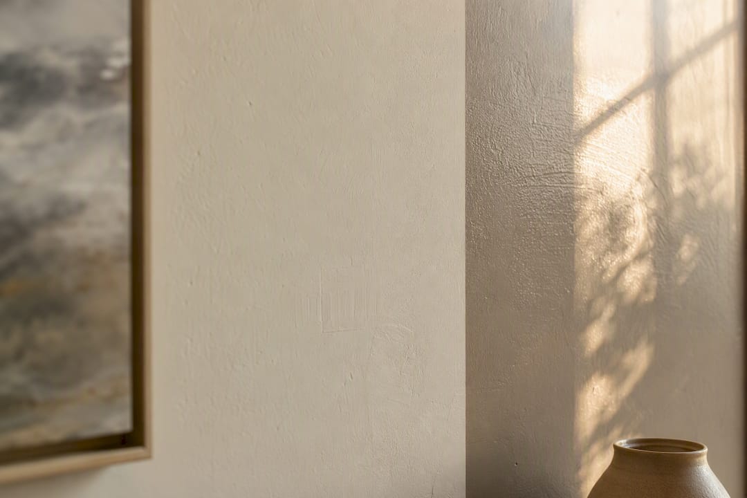
Should an Accent Wall Match the Art or Support It?
An accent wall works best when it takes its cue from the supporting color identified in step one of the three-step read, not the artwork’s dominant hue. Painting a wall the exact shade of a painting’s main color often flattens the piece into the background instead of framing it.
A stronger approach: pull a quieter tone from the art’s shadows or edges; the muted terracotta hiding in a sunset landscape, for instance, rather than the bright orange sky. Paint the accent wall in that quieter tone, and let the art’s dominant color stay the star of the room.
Value gap still applies here. If the accent wall and the art sit at a similar lightness, the piece can blend into its own backdrop despite a beautiful color story. Keep at least one clear light-dark contrast between the wall and the framed piece so it holds its shape from across the room.
For gallery-wall setups specifically, an accent wall usually works better in a neutral or muted tone rather than a bold color, since multiple pieces already create enough visual activity on their own. Save the bold accent wall treatment for spaces built around a single statement piece.
What Color Harmony Schemes Help You Pick Art?
Three classic color relationships give you a shortcut when you’re staring at a wall trying to decide what will work.
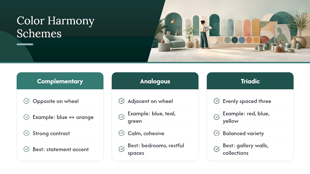
Complementary pairs colors opposite each other on the color wheel, like blue and orange, or red and green. This creates the strongest contrast and works well when you want art to feel like a deliberate accent rather than a blend, a good approach for a living room built around one statement piece.
Analogous schemes use colors sitting next to each other, like blues, teals, and greens together. This produces a calmer, more cohesive feel, which suits bedrooms and other rest-oriented spaces where you want the art to feel integrated rather than jarring.
Triadic schemes use three colors evenly spaced around the wheel, offering more variety than analogous while staying more balanced than a straight complementary clash. This works well for gallery walls or eclectic collections where several pieces need to coexist without looking chaotic.
None of these schemes require an exact color match between art and wall. They’re tools for deciding how much tension or harmony you want in the room, then choosing supporting colors and undertones that deliver it.
How Do Existing Furniture and Décor Colors Factor In?
Wall paint is only one variable. Sofas, rugs, curtains, and even cabinet hardware all carry color and undertone that art has to sit alongside, not just the paint behind it.
Walk the room and list the two or three dominant colors outside the wall itself, a navy sofa, a warm oak floor, brass light fixtures. Apply the same undertone check from the three-step read to these pieces collectively, not just the paint. A room can have a cool-toned wall but warm-toned furniture, and art needs to navigate both rather than matching one and ignoring the other.
This is where the 60-30-10 rule earns its keep again: let the wall and largest furniture pieces establish the 60 and 30 percent, then choose art that either echoes the 30 percent secondary tone or delivers the 10 percent accent color the room is missing entirely. If the room already has plenty of blue in its textiles, a piece that leans into warm gold or rust often does more for the space than another blue-toned work.
What the Conventional Advice Gets Wrong
Most guidance on matching art to a room still pushes color-matching as the goal, find art in the same palette as your walls. That advice produces safe, forgettable rooms. The research on how designers actually work tells a different story: they deliberately introduce a slight disagreement between art and room, because exact matching drains a space of energy.
What gets underestimated is scale. Homeowners consistently choose art too small for the wall, then wonder why the piece looks like an afterthought rather than a presence. Undertone and value gap matter, but a piece sized correctly forgives a lot of imperfect color matching. A piece sized wrong rarely gets rescued by perfect color.
If there’s one thing to prioritize first, it’s this: stop hunting for a paint-matched print and start looking at how a piece behaves at scale in the room. Color can be adjusted with framing. Scale can’t be adjusted after the art is already on the wall.
How Eman’s Gallery Can Help You Get the Match Right
Eman’s Gallery offers original handmade paintings, museum-quality canvas prints, and large-scale wall art, plus commission work when you need color, scale, and undertone built to the exact specifications of your room. That last option matters more than it sounds: commissioning lets you set the palette from the start instead of hunting for an existing piece that happens to fit.

A few examples show how this plays out in real rooms. Good Tidings, a large fluid blue and gold ocean piece, suits a living room built around one statement wall. Mystic Sea pairs calming blues with warm gold accents, a fit for a bedroom that needs restful color without going flat. The Private Eye canvas print offers a modern, conceptual option for tighter budgets or contemporary spaces.
For more on applying color theory to your own walls, the gallery’s guide to choosing color schemes for art and best paintings for living room spaces go further into sizing and palette specifics. If a commission fits your project better than an existing piece, reach out through Eman’s Gallery to start that conversation.
Sources
FAQ
How do I match art to my wall color without it looking too matchy?
Pull a supporting or secondary color from the artwork rather than its dominant hue, and let that quieter tone echo elsewhere in the room instead of on the wall itself.
What is a value gap and why does it matter?
A value gap is the difference in lightness or darkness between the art and the wall behind it; without one, even well-matched colors can make the piece visually disappear.
Should I match warm or cool undertones exactly?
Match the undertone family (warm or cool) rather than the exact shade, and use framing or accent objects to bridge small differences instead of repainting.
Is it better to buy a print or commission an original for a tricky color match?
A commission through a gallery like Eman’s Gallery lets you set color, scale, and undertone from scratch, which is worth considering when no existing piece fits the room.
How big should art be over a sofa or bed?
Go larger than your first instinct suggests, since undersized art is a more common mistake than oversized art.
Stay Connected
- ✨ Explore Eman Khalifa's original art, fine art prints and art-inspired merchandise.
- Follow Eman Khalifa's art journey on: Instagram @emans_gallery and Facebook
- Watch Eman Khalifa creating live art on: YouTube @emans_gallery
