


The Best Paint Schemes for Bedrooms Start With Emotion
Original paintings and museum-quality prints chosen through an emotion-first lens create the most restful, collectible paint schemes for bedrooms, and the pairing that performs best across studies is a natural or pastoral theme in low-saturation cool color. The Theme-Color-Emotion (TCE) framework found that this combination predicts emotional response with 87.6% accuracy, well above intuition alone.
- Theme: natural, pastoral, or seascape subjects outperform abstract or geometric ones for rest.
- Color: low-saturation blues, blue-greens, and soft greens beat high-contrast or warm-saturated palettes.
- Scale and finish: one large anchor piece or a balanced pair, in matte or soft-gloss, reads calmer than a busy gallery wall.
If you want a piece that already fits this formula, Eman’s Gallery offers originals and prints built around exactly this pairing. The checklist below shows you how to vet any candidate artwork the same way.
Key Takeaways
Choosing bedroom art through an emotion-first TCE approach, naming the target feeling before picking theme or color, produces more restful and collectible results than decorating by trend or duvet match.
| Point | Details |
|---|---|
| Lead with emotion | Name the target feeling (calm, joy, hope, contemplation, awe) before choosing theme or color. |
| Favor pastoral and cool tones | Pastoral landscape plus soft blue scored highest for healing response at 4.72 out of 5.00. |
| Size against the headboard | Keep artwork width at 50% to 66% of the headboard and hang it 20 to 25 centimeters above it. |
| Match material to goal | Choose originals for collectability and texture, prints for budget and faster turnaround. |
| Start with Eman’s Gallery | Eman’s Gallery offers TCE-aligned originals like Good Tidings and Nocturned plus worldwide-shipped commissions. |
Table of Contents
- How to choose bedroom colors and themes using the TCE method
- Which color and theme pairing matches each bedroom mood?
- Where should you hang art relative to the bed?
- Should you buy an original or a museum-quality print?
- Three bedroom schemes built around Eman Khalifa originals
- How Eman approaches a bedroom commission
- What most bedroom art advice gets wrong
- Get an Original or Commissioned Piece for Your Bedroom
- Sources
- FAQ
How to choose bedroom colors and themes using the TCE method
The TCE framework didn’t just theorize this pairing; it measured it. Researchers scored viewer emotional response across theme and color combinations and found that pastoral landscape plus soft blue scored 4.72 out of 5.00 for healing response, the highest of any pairing tested in the TCE study. That is not a stylistic preference. It is a measurable pattern you can apply to any bedroom brief.
Here’s the checklist, in order:
- Name the target emotion first. Calm, contemplation, joy, hope, or awe. Everything downstream depends on this choice.
- Match theme to emotion. Natural and pastoral themes serve calm and hope; florals serve joy; cool abstracts serve contemplation.
- Choose color by saturation and brightness, not just hue. A muted blue-green calms; the same blue at high saturation can feel active rather than restful.
- Check composition and contrast. Low-contrast, softly blended compositions support rest; hard edges and competing focal points work against it.
- Confirm scale and orientation against the wall. A piece too small for its wall reads as an afterthought; too large and it can dominate rather than anchor.
Style matters as much as color. Neuro-aesthetic research from early 2026 found that Impressionist and Romantic styles evoke more positive emotional responses in bedroom-like settings than stark contemporary or minimalist work, which some participants described as cooler and more tense. If you’re choosing between a hard-edged minimalist print and a softer, atmospheric painting for the same wall, the research favors the latter.
On materials: an original oil or acrylic carries texture and light response a print can’t fully replicate, and it holds long-term collectability. A museum-quality canvas print costs less, ships more easily, and suits a designer working across multiple rooms or a client testing a palette before committing to an original.
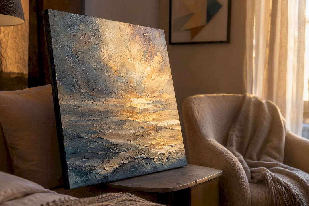
Lighting changes how a color reads. Soft, indirect picture lights and warm-white bulbs preserve the intended palette; UV-filtering glazing protects an original’s pigment over years of daylight exposure.
Pro Tip: Prop the candidate artwork against the actual wall and check it in morning, midday, and evening light before you commit. Color-matching guidance consistently shows that bedside lamp light and daylight shift how a blue or green reads, sometimes dramatically.
Which color and theme pairing matches each bedroom mood?
Not every bedroom is chasing the same feeling. A guest suite built for calm needs a different palette than a reading nook meant for quiet contemplation. The TCE heatmap data maps five emotional targets to specific theme and color combinations, and each translates into a different kind of artwork.
| Emotion Target | Optimal Theme | Color Characteristics | Bedroom Usage Note |
|---|---|---|---|
| Calm | Pastoral / seascape | Low-saturation blue-green | Large horizontal piece above the bed, matte finish |
| Joy | Floral | Higher-saturation warm tones | Best on an accent wall away from direct sightline at rest |
| Hope | Pastoral | Soft, medium-bright tones | Works well opposite the bed for a morning view |
| Contemplation | Cool-toned abstract | Low contrast, muted hues | Smaller scale, suited to a reading corner or tonal grouping |
| Awe | Gilded, deep-contrast | Rich metallic or dark accents | Use sparingly, as a single statement piece, not above the headboard |
For calm and hope targets, a piece like Good Tidings, a fluid blue-gold ocean composition, delivers the pastoral-to-seascape shift the TCE data rewards. For contemplation, a tonal, low-contrast night scene such as Nocturned fits the brief better than a bright floral ever could. Seascape-specific placement guidance covers how these ocean themes read at different scales.
Pro Tip: Reserve awe-driven, high-contrast pieces for spaces you pass through, not the wall you face while trying to fall asleep.
Where should you hang art relative to the bed?
Sizing and placement decisions matter as much as color choice. Get the scale wrong and even a perfectly chosen palette feels off.
- Width rule: the artwork, or a grouped set, should span roughly 50% to 66% of the headboard’s width.
- Height rule: hang the piece so its bottom edge sits about 20 to 25 centimeters above the headboard.
- Eye-level rule: for walls without a headboard reference, center the artwork around 145 to 152 centimeters from the floor.
- Grouping: symmetrical pairs work well flanking a headboard; asymmetrical gallery walls suit a reading corner better than the primary sightline from bed.
Framing changes how the whole scheme reads. Natural oak or light wood warms a cool palette, black frames add crisp definition against pale walls, and low-profile metal frames suit contemporary interiors without competing with the artwork. Non-reflective, UV-protective glazing keeps color fidelity intact under bedside lighting and protects an original from fading.
Orientation matters too. Landscape-format pieces generally suit the wall above a bed better than tall portrait works, which tend to draw the eye upward rather than settle it. Leave breathing room around any piece. Crowding a wall with multiple busy compositions works against the goal of a restful bedroom wall painting scheme, however good each individual piece is.
Before you buy or commission anything:
- Measure the wall and the furniture beneath it.
- Tape kraft paper to the wall in the exact footprint of the candidate artwork.
- Live with that outline for a few days before finalizing scale.
Pro Tip: This kraft-paper trick catches oversizing and undersizing mistakes that photos and mockups almost always hide.
Should you buy an original or a museum-quality print?
Originals and prints serve different goals, and the right answer depends on budget, timeline, and how much you value one-of-a-kind ownership.
- Originals: unmatched texture and light response, strongest resale and collectability, higher price point, need careful shipping and insurance.
- Museum-quality prints: lower cost, faster turnaround, easier to scale across multiple rooms or properties, limited resale value.
A commission timeline typically runs through five stages: brief, sketch approval, execution, finishing and framing, then shipping. Originals take longer than prints simply because there’s one canvas being made by hand.
Budget factors to plan for:
- Artist fee, which scales with size and complexity.
- Framing and glazing.
- Shipping and transit insurance for originals.
- Custom sizing if the wall doesn’t match a standard format.
- Professional installation for large or heavy pieces.
A strong commission brief states the target emotion, a preferred color range by saturation and brightness (not just “blue”), the exact scale needed, any sightline constraints from the bed, and delivery and installation preferences. Eman’s Gallery ships worldwide and can talk through insurance and installation needs as part of that brief.
Three bedroom schemes built around Eman Khalifa originals
The Seascape Retreat. For a primary suite aimed at pure calm, Good Tidings, a fluid blue-gold ocean original, hung as a single large horizontal piece above the headboard, delivers the exact pastoral-blue pairing the TCE research ranks highest.
The Contemplative Corner. Nocturned, a tonalism moonlit scene, suits a reading nook or the wall facing the bed rather than above it, its muted blues and low contrast rewarding a slower, closer look.
The Layered Abstract Bedroom. Pair Mystic Sea as the anchor with a smaller Fragments of Memory canvas print nearby for texture without visual noise, keeping the palette in the same cool family throughout.
- Prints suit secondary walls; originals earn the primary sightline from bed.
Pro Tip: Keep every piece in a shared bedroom scheme within one color family, even across different artworks. It reads as intentional rather than accumulated.
How Eman approaches a bedroom commission
When I work on a bedroom piece, atmosphere comes before anything else. I think about how the color will sit in low evening light, not just how it looks under a gallery bulb, and I scale every commission to the wall it’s meant to hold rather than a standard canvas size.
- Commissions start with a short conversation about mood, not measurements.
- Every original ships worldwide with museum-quality framing options included in the brief.
Reach out through the commission page to start that conversation.
What most bedroom art advice gets wrong
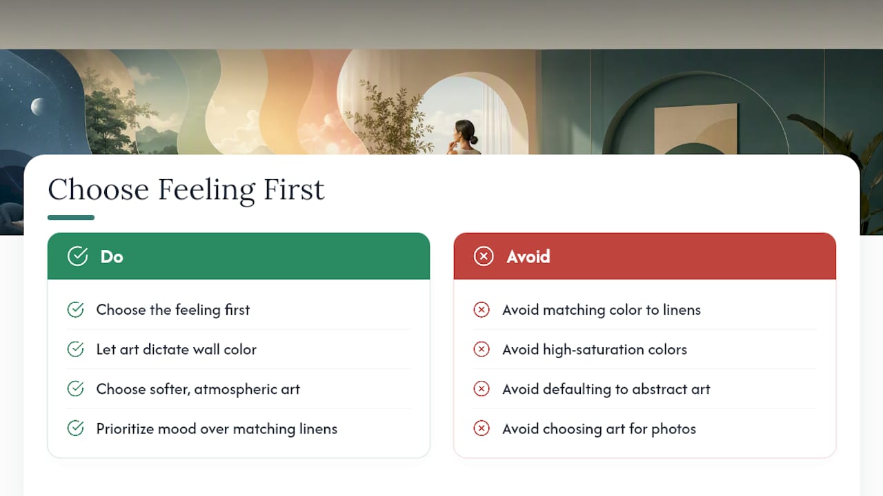
Most guidance on bedroom art still treats color as decoration, something chosen to match a duvet rather than to shape how a room feels at 11 p.m. The TCE research suggests the opposite order matters more: pick the emotional target first, then let theme and color follow from that decision. A blue that matches your linens perfectly can still be the wrong blue if its saturation is too high for a room meant to calm you down.
The other common mistake is defaulting to abstract or geometric art because it photographs well for a portfolio. It often does, but a stark, high-contrast composition can work against rest, according to the neuro-aesthetic findings on style and mood. A softer, more atmospheric painting frequently does the emotional job better, even if it’s the less flashy choice in a listing photo.
If you take one thing from this framework, let it be this: choose the feeling first, and let everything else, including the paint on the wall, follow the art rather than the other way around.
Get an Original or Commissioned Piece for Your Bedroom
Eman’s Gallery gives you direct access to originals and museum-quality prints already built around the calming, natural themes and cool low-saturation palettes that bedroom schemes need, without hunting through generic stock art or committing to a print sight unseen.

Every piece ships worldwide with framing options suited to bedroom lighting, and collectors working with a designer get support choosing scale and sightlines before anything is shipped. Browse original paintings and art-inspired pieces, or start with Good Tidings if a calming seascape fits your brief. To commission a custom piece sized to your exact wall, reach out through Emansgallery and describe your target mood, palette range, and dimensions to get started.
Stay Connected
- ✨ Explore Eman Khalifa's original art, fine art prints and art-inspired merchandise.
- Follow Eman Khalifa's art journey on: Instagram @emans_gallery and Facebook
- Watch Eman Khalifa creating live art on: YouTube @emans_gallery
- Neuro-aesthetic studies on art style and emotional response (2026)
- How to Choose Wall Art That Matches Your Paint Colors
- Bedroom Wall Decor Ideas — What to Hang, Where, and Why It Matters (2026) | Home Decor Hub
Sources
FAQ
What is the TCE framework in bedroom art selection?
The Theme-Color-Emotion framework maps specific art themes and color palettes to emotional outcomes, and its model predicts viewer emotional response with high accuracy as shown in the TCE study.
What color palette works best for a calming bedroom scheme?
Should I choose an original painting or a print for my bedroom?
Choose an original for texture, light response, and long-term collectability; choose a museum-quality print for a lower price and faster delivery, as offered through Eman’s Gallery.
How high should art hang above a bed?
Can Eman’s Gallery create a custom piece for a specific bedroom palette?
Yes, Eman’s Gallery accepts commissions built around a stated target emotion and color range, with worldwide shipping and framing options included in the brief.
