


2026 Trend: Art Led Dining Room Paint Schemes in Earth and Jewel Tones
For most dining rooms, choose a rich jewel tone, a warm earth tone, or a light warm neutral, then narrow to the exact shade based on mood and lighting. Dining rooms tolerate deeper, more saturated color than almost any other room in the house, which is why navy, terracotta, and warm greige all work so well here. Use the shortlist below to match a scheme to your space.
TL;DR:
- Choose a rich jewel tone, warm earth tone, or light warm neutral based on the room’s lighting and desired mood, as dining rooms tolerate saturated colors well.
- Test paint samples in the actual room under evening lighting before committing, since colors can look significantly different on walls than on swatches.
- Use eggshell or satin finish for walls for easier cleaning and durability, and opt for semi-gloss on trim and wainscoting to enhance architectural features.
- Consider accent walls, painted ceilings, or textured paint to add visual interest without overwhelming a small or casual dining space.
- Select artwork that draws from the room’s palette to create an intentional, coordinated look and to reinforce the chosen color scheme.
Table of Contents
- Dining Room Paint Schemes That Work Best for Every Style
- How to Choose the Right Dining Room Paint Scheme
- Which Paint Finish Works Best for a Dining Room
- Accent Walls, Two-Tone Schemes, and Painted Ceilings
- Matching Artwork to Your Dining Room Palette
- How to Prepare Dining Room Walls Before Painting
- Common Mistakes to Avoid When Choosing Dining Room Paint Colors
- Why Dining Room Color Rules Deserve to Be Broken More Often
- Finish the Room With Original Art From Eman’s Gallery
- Sources
- FAQ
Dining Room Paint Schemes That Work Best for Every Style
Dining rooms get used for a couple of hours at dinner time and hold their own for parties, holidays, and everyday breakfast in between. That gives you more room to experiment than you’d take in a living room, and designers lean into it. Here are the schemes worth considering, grouped by the mood they create.
Formal and moody. A deep navy or hunter green wall, paired with white or cream trim in semi-gloss, reads instantly elegant. Navy in particular pairs with nearly every wood tone on the market, from honey oak to espresso walnut, and it makes white china and brass fixtures pop against it. Pair it with polished brass hardware and a mahogany or walnut table for a scheme that photographs like a restaurant dining room.
Warm and inviting. This is where the 2026 trend actually lives: sandy khakis, terracotta, and mushroom shades are replacing the cool gray that dominated the last decade. Terracotta walls with satin finish, paired with black iron chandeliers and rattan or cane chairs, give a room warmth without tipping into “orange.” This palette also happens to be one of the most flattering for skin tones under candlelight or dimmed pendants.
Light and airy. Warm white or soft greige keeps a small or dark dining room from feeling boxed in. Add a whitewashed or light oak table and woven jute placemats, and the room stays bright even without much natural light. This scheme flows easily into an open-concept kitchen or living room, which matters if your dining area doesn’t have its own walls to work with.
Calm and natural. Sage and other muted greens create what one Martha Stewart feature calls a jewel-box effect, especially when paired with molding or a glossy trim that catches light differently than the matte wall. Sage pairs well with natural linen chair upholstery and unlacquered brass.
Playful and modern. Blush pink or dusty rose, kept to one accent wall or paired with black trim, gives a dining room personality without the formality of jewel tones. This works particularly well in smaller urban dining nooks where a full-room deep color would feel heavy.
- Formal: Navy or hunter green, semi-gloss trim, brass and dark wood
- Warm: Terracotta or clay, satin finish, black iron and rattan
- Airy: Warm white or greige, eggshell finish, light oak
- Natural: Sage or muted green, glossy molding, linen and brass
- Modern: Blush or dusty rose, accent wall, black trim
How to Choose the Right Dining Room Paint Scheme
Picking a color before checking your light is the single biggest mistake homeowners make. Here’s the order that actually works.
- Check your exposure. North-facing rooms get cooler, flatter light all day; south-facing rooms get warm, direct light. This changes how a color reads on the wall versus on the paint chip.
- Set a target LRV. Light Reflectance Value tells you how much light a color bounces back. Small or north-facing rooms benefit from higher LRV (lighter, warmer neutrals), while bright, larger rooms can handle a lower LRV and much darker, moodier color.
- Decide your formality level. A weekly family dinner table has different needs than a room reserved for holidays and dinner parties.
- Look at your existing wood tones. Your table, chairs, and floor already set a direction. Warm wood pulls toward terracotta and warm greens; cool wood pulls toward navy or charcoal.
- Check flow with adjacent rooms. Designers consistently advise picking colors that are conducive to eating, calming and comforting rather than jarring, and that transition smoothly from the kitchen or hallway next door.
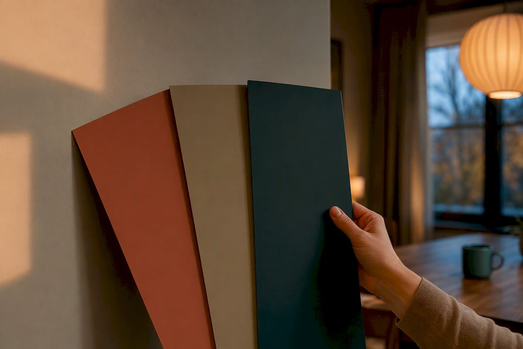
- Sample it at dinner time. Paint a large swatch and look at it under the same lighting you’ll actually use the room in, since pendant lighting and candlelight change how color reads compared to daytime light.
- Decide full room versus accent. Committing one wall first is a lower-risk way to test a bold color before painting the whole room.
Pro Tip: Paint a two-foot square directly on your wall instead of relying on a small chip. Colors intensify at scale, so a shade that looks perfect on a swatch can read three shades darker across an entire wall.
Which Paint Finish Works Best for a Dining Room
Sheen matters almost as much as hue. Dining rooms see spills, splatters, and constant chair-scooting, so a flat finish that looks elegant in a photo will show scuffs within a month and resist cleaning.
- Eggshell or satin for walls. Both offer enough sheen for easy wipe-downs while still looking soft rather than plasticky, and they’re the finish most designers recommend for dining room walls.
- Semi-gloss for trim and wainscoting. The higher shine makes moldings pop against a matte wall and stands up to the wear trim takes near chairs and doorways.
- Skip flat finishes entirely. They’re the hardest sheen to clean and the quickest to show wear in a room built around food.
Paint finish choices carry as much weight for perceived color and durability as the hue itself, which is why the same terracotta can look flat and chalky in one sheen and rich and warm in another. Warm undertones like terracotta, warm beige, and warm khaki also tend to flatter food and skin under evening light, which is worth weighing if your dining room hosts dinner parties after dark. Swap in warm-toned bulbs (2700K to 3000K) and a dimmer, and even a modest neutral will feel considerably more flattering by candlelight.
Accent Walls, Two-Tone Schemes, and Painted Ceilings
Not every dining room needs full commitment to a bold color. An accent wall works best on the first wall you see when entering the room, and it lets you try navy or terracotta without repainting the whole space if you change your mind later.
- Accent wall: paint the wall behind the buffet or the one facing the entry doorway
- Chair rail or wainscoting split: deep color above, white or cream below, for a formal, architectural look
- Painted ceiling: matching the wall color on the ceiling makes a small dining room feel enveloping rather than cramped
- Textured paint or wallpaper: layer these on one wall only, keeping the rest of the room in a supporting neutral
Matching Artwork to Your Dining Room Palette
Pulling color from the room’s art, rather than picking the art last, gives a dining room a finished, intentional look. Start by identifying the dominant and secondary tones in a piece you love, then let those tones show up again in your chair cushions or table runner. A practical trick here is to pull a secondary, low-saturation color from the artwork or linens rather than the boldest one, since that creates contrast without visually competing with your wall color.
- Scale the art to roughly two-thirds the width of your table or buffet
- Hang the piece at eye level from a seated position, not standing
- For jewel-tone walls, look for art with gold, cream, or deep blue undertones
- For warm earth palettes, terracotta and ochre-based abstract or landscape pieces tend to anchor the room
Emans Gallery’s guide on wall art color tips for luxury interiors covers scaling and placement in more depth if you’re working with a larger dining space or high ceilings.
How to Prepare Dining Room Walls Before Painting
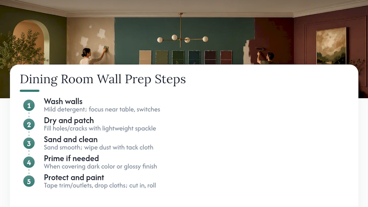
Skipping prep is the fastest way to ruin an otherwise perfect color choice. Grease, food splatter, and handprints near light switches build up in dining rooms faster than in almost any other room, and paint applied over that residue won’t adhere properly or look smooth once it’s dry.
Start by washing walls with a mild detergent solution and a sponge, paying extra attention to areas near the table, light switches, and doorframes. Let walls dry fully before moving on. Fill any nail holes, dents, or cracks with lightweight spackle, sand smooth once dry, and wipe away dust with a tack cloth.
If you’re painting over a dark color with a lighter one, or covering a glossy old finish, prime first. Primer blocks stains and old color from bleeding through and helps a new sheen, especially eggshell or satin, go on evenly. Skip priming on a same-color repaint in good condition; it’s not necessary there.
Tape off trim, outlets, and switch plates, and lay down drop cloths before you open a can. Cut in the edges with a brush first, then roll the larger wall areas, working in sections so you can maintain a wet edge and avoid visible lap marks once the paint cures.
Common Mistakes to Avoid When Choosing Dining Room Paint Colors
The most common mistake is choosing a color from a small paint chip under store lighting, then discovering it looks completely different once it’s on your actual walls under your actual bulbs. Always test a large swatch in the room itself, ideally at the time of day or evening you’ll use the space most.
The second mistake is ignoring flow. A dining room that opens into a kitchen or living area needs a color that transitions logically rather than one that stops abruptly at a doorway, creating a jarring seam between rooms.
Choosing flat finish for the sake of a softer look is another frequent misstep, since it sacrifices cleanability in a room that sees regular spills. Going too trendy without checking it against your existing wood tones and metals is a fourth trap. A color can be beautiful in isolation and still clash with a table finish or chandelier you already own.
Finally, many homeowners paint the whole room in a bold color before testing it as an accent wall first. If you’re unsure a jewel tone or saturated earth tone is right for your space, commit to one wall before committing to all four.
Why Dining Room Color Rules Deserve to Be Broken More Often
The conventional wisdom that dining rooms need “safe” neutrals never held up under scrutiny. This is a room used for a few hours at a time, almost always with warm, dim, flattering light, and it can carry far more saturation than a bedroom or home office ever could. The 2026 shift toward earth tones over cool gray confirms what designers already knew: warmth reads as generosity at a dinner table, while cool undertones tend to feel clinical.
Where most guides fall short is treating paint color and artwork as separate decisions made in sequence. They rarely are, in practice. A navy wall without warm-toned art or brass accents can tip into cold instead of formal. A terracotta wall without anything pulling its undertone through the room can feel more like an accident than a choice.
If you take one thing from this guide, prioritize testing your color under evening light before anything else. Everything else, the trim finish, the accent wall, the art you hang, follows from getting that first decision right.
— Eman
Finish the Room With Original Art From Eman’s Gallery
Once your walls are painted, the fastest way to make a dining room feel finished is original art that pulls directly from your palette instead of art chosen separately from it. Eman’s Gallery specializes in fluid abstract and tonalism pieces built around exactly the kind of deep, atmospheric color that pairs with jewel-tone and warm-earth dining schemes.

For a navy or blue dining room, Good Tidings brings a fluid blue-and-gold ocean composition that echoes the depth of a navy wall without competing with it. If your palette leans toward moody, low-lit evening dinners, Nocturned offers a tonalism moonlit scene suited to darker, more intimate rooms. For a modern or minimalist dining space painted in warm neutrals, the Private Eye canvas print adds conceptual contrast without fighting the wall color.
Browse the full collection of original paintings and fine art prints to find a piece scaled to your table and sized correctly for your wall, or reach out about a bespoke commission built around the exact palette you’ve chosen.
Sources
- Dining room paint colors | PaintDB
- 15 Best Dining Room Paint Colors for Every Style (2026) | Paint Color HQ
- The 34 Best Dining Room Wall Paint Ideas, According to Designers | HouseBeautiful
- Dining room paint colors we absolutely love | Martha Stewart
FAQ
What are the best colors to paint a dining room?
Navy, terracotta, sage green, and warm greige consistently rank as the best choices because dining rooms tolerate richer, more saturated color than most other rooms in the house.
What are some good dining room color ideas for 2026?
Warm earth tones, sandy khakis, terracotta, and mushroom shades, are replacing cool gray as the dominant direction, especially when paired with eggshell or satin walls and semi-gloss trim.
What color should not be used in a dining room?
Avoid stark, cool grays or overly bright, high-energy colors; designers favor tones that are calming and conducive to eating rather than jarring or clinical.
What paint finish is best for a dining room?
Eggshell or satin works best for walls because it cleans easily without looking glossy, while semi-gloss suits trim and wainscoting; flat finish should be avoided since it shows scuffs and resists cleaning.
How do I choose a dining room color based on lighting?
Check whether the room faces north or south, then choose a lighter, warmer neutral in darker rooms and a darker, moodier color in rooms with strong natural light.
Stay Connected
- ✨ Explore Eman Khalifa's original art, fine art prints and art-inspired merchandise.
- Follow Eman Khalifa's art journey on: Instagram @emans_gallery and Facebook
- Watch Eman Khalifa creating live art on: YouTube @emans_gallery
